While your logo should be the crown jewel of your brand identity, what intrigues me is how this visual language embedded in the mark or a logotype translates into a larger identity system. How a little curve adjustment, a type alteration, or a subtle design trick that goes unnoticed, plays a crucial role as the glue that holds all the elements of the identity system together.
Here are some of the brand identity systems I am proud of.
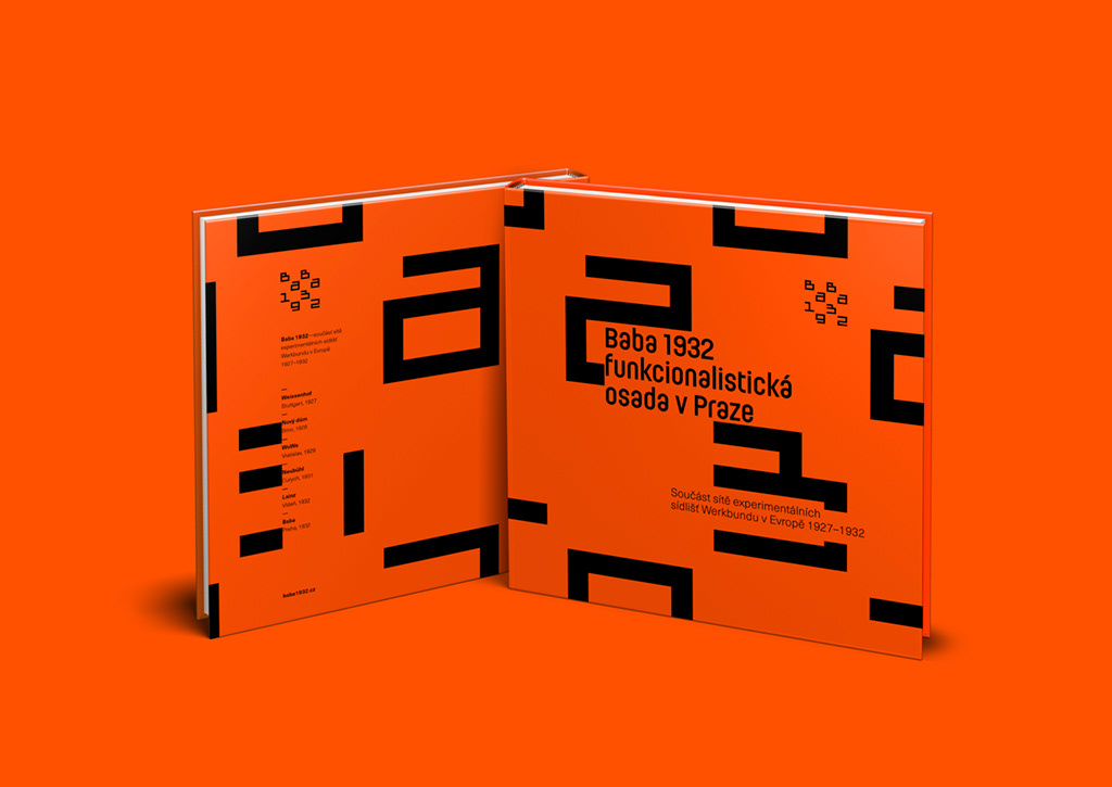
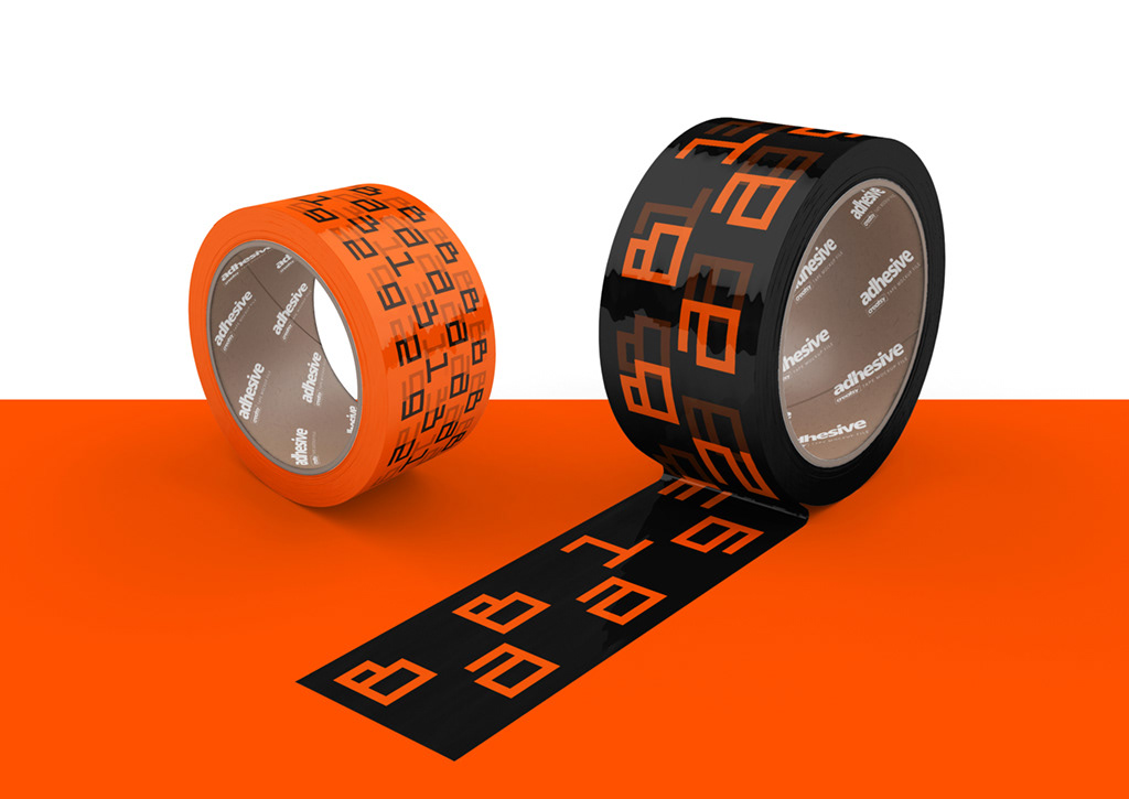
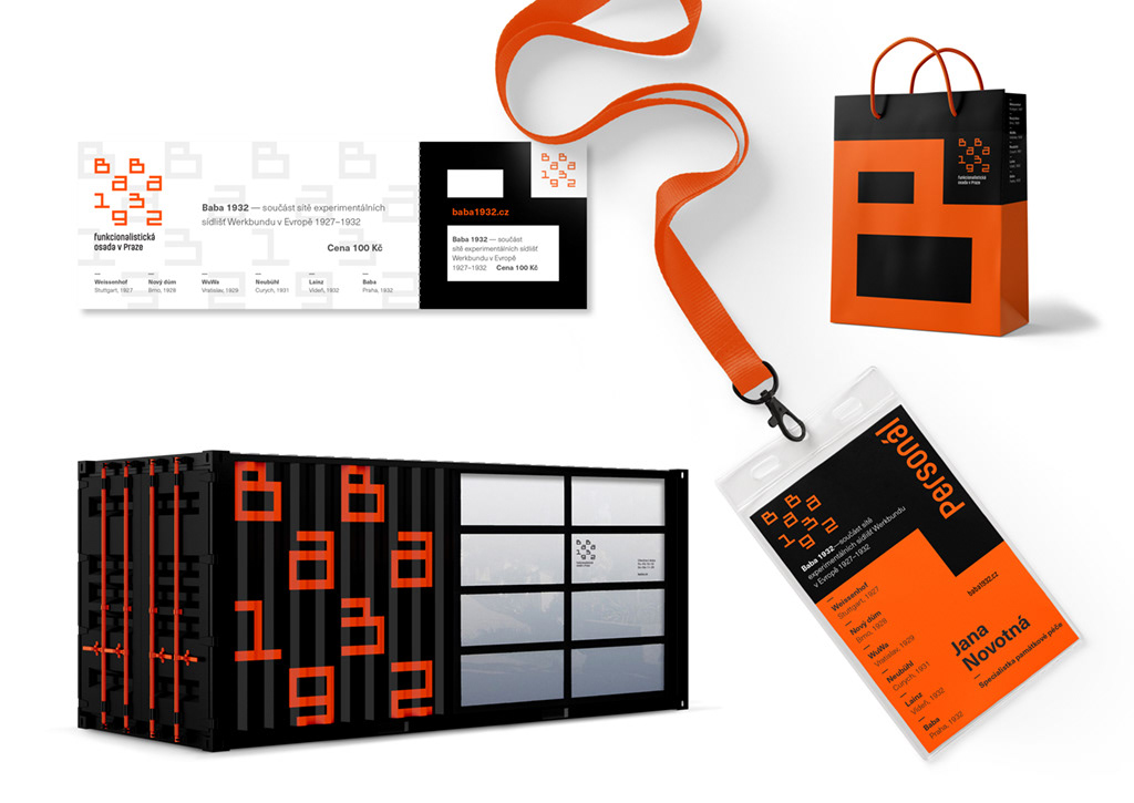
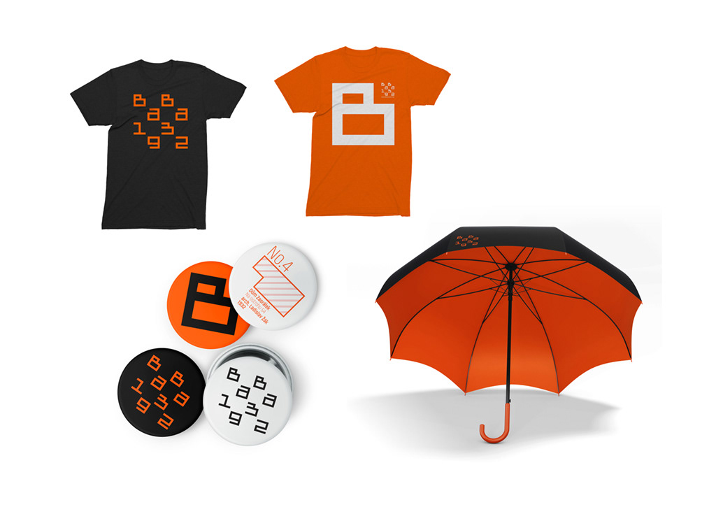
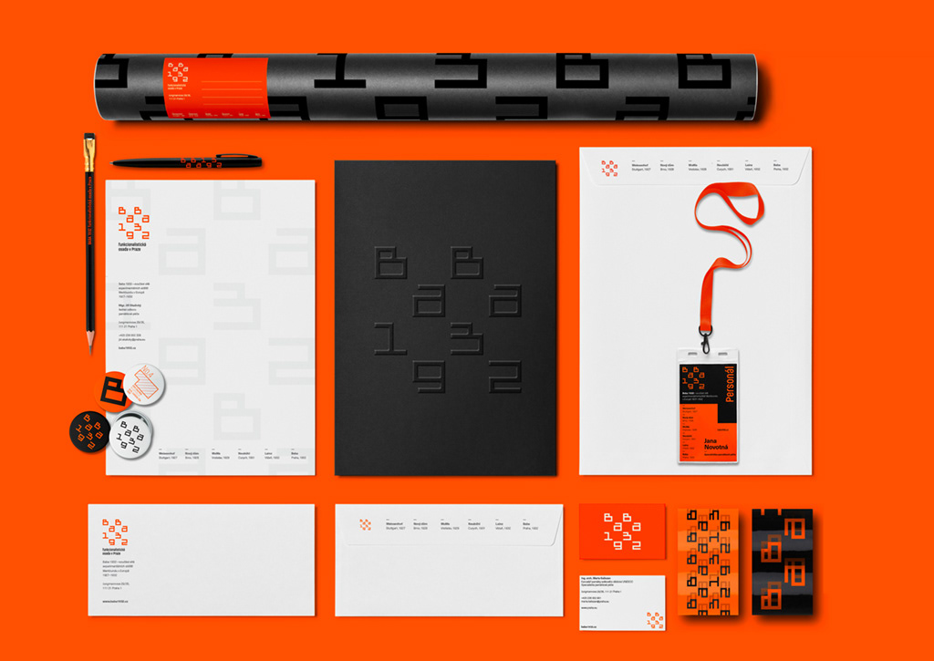
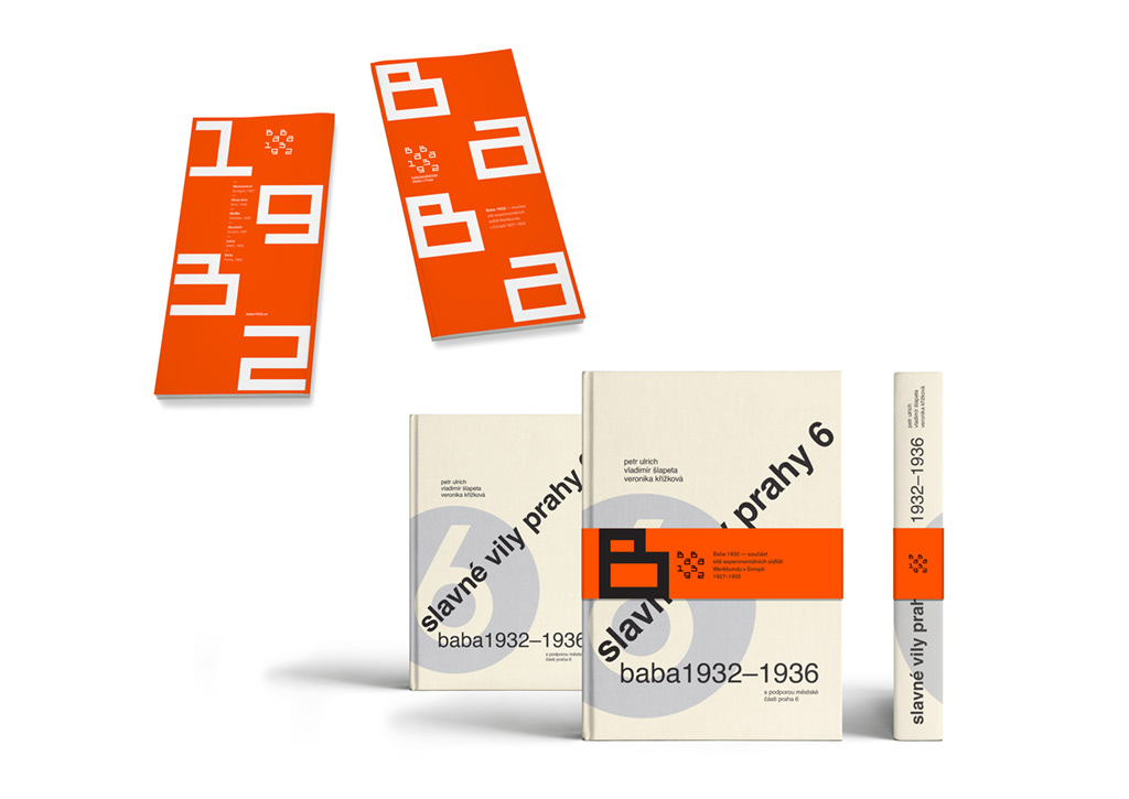
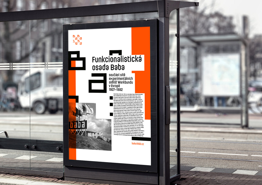
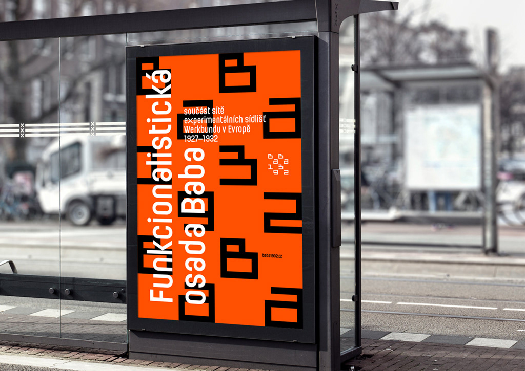
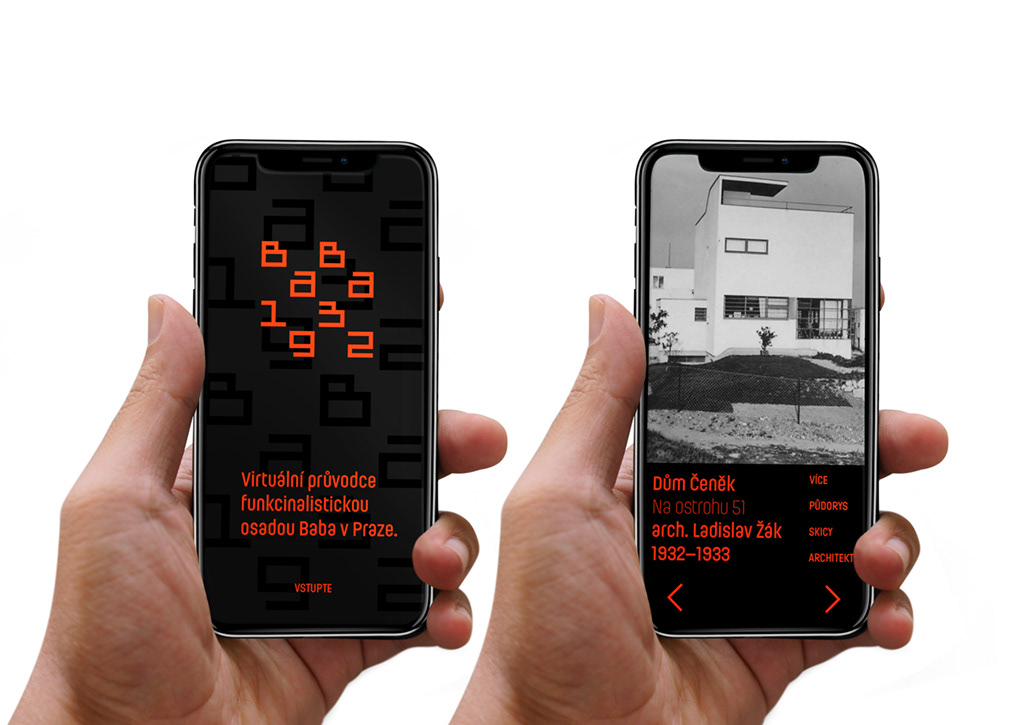
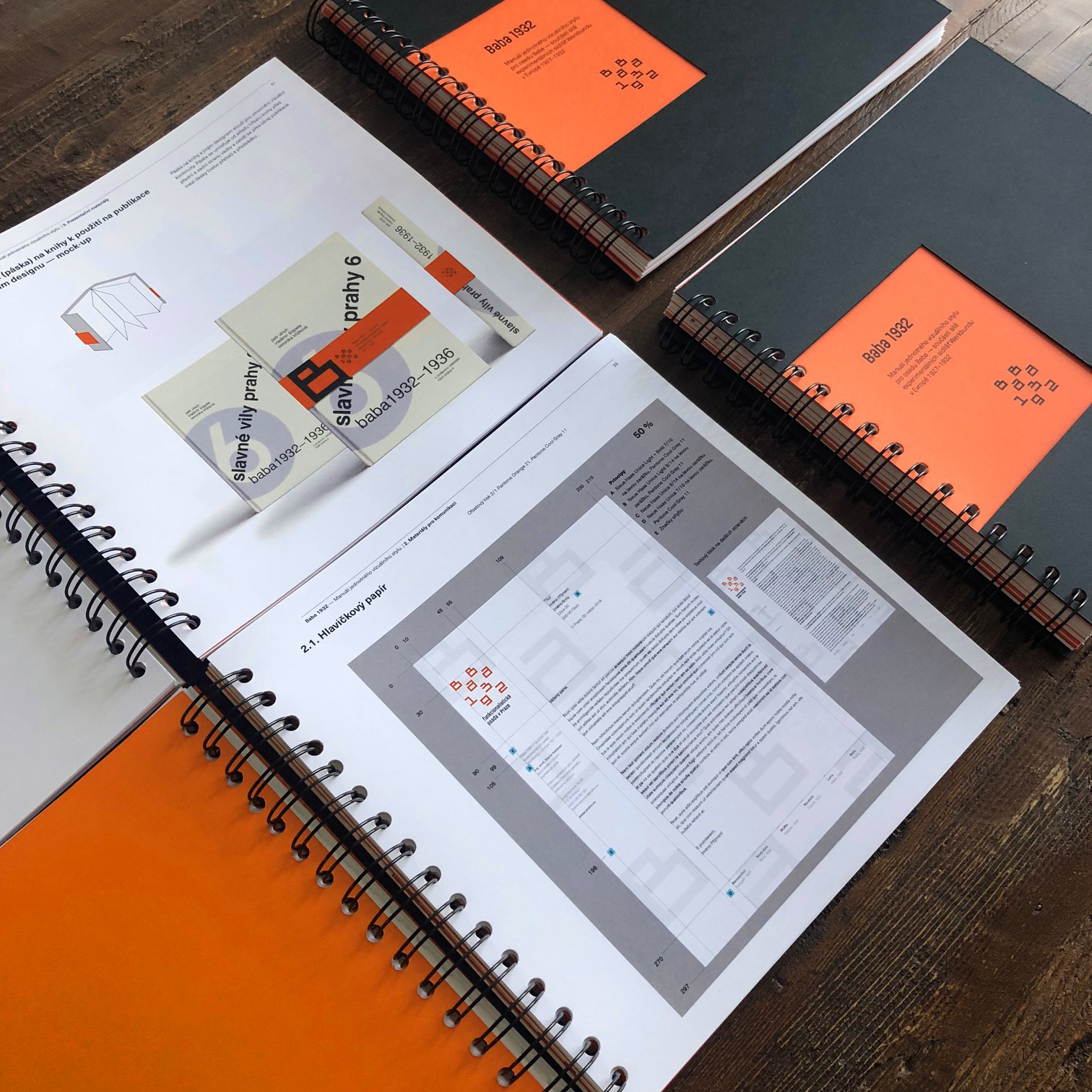
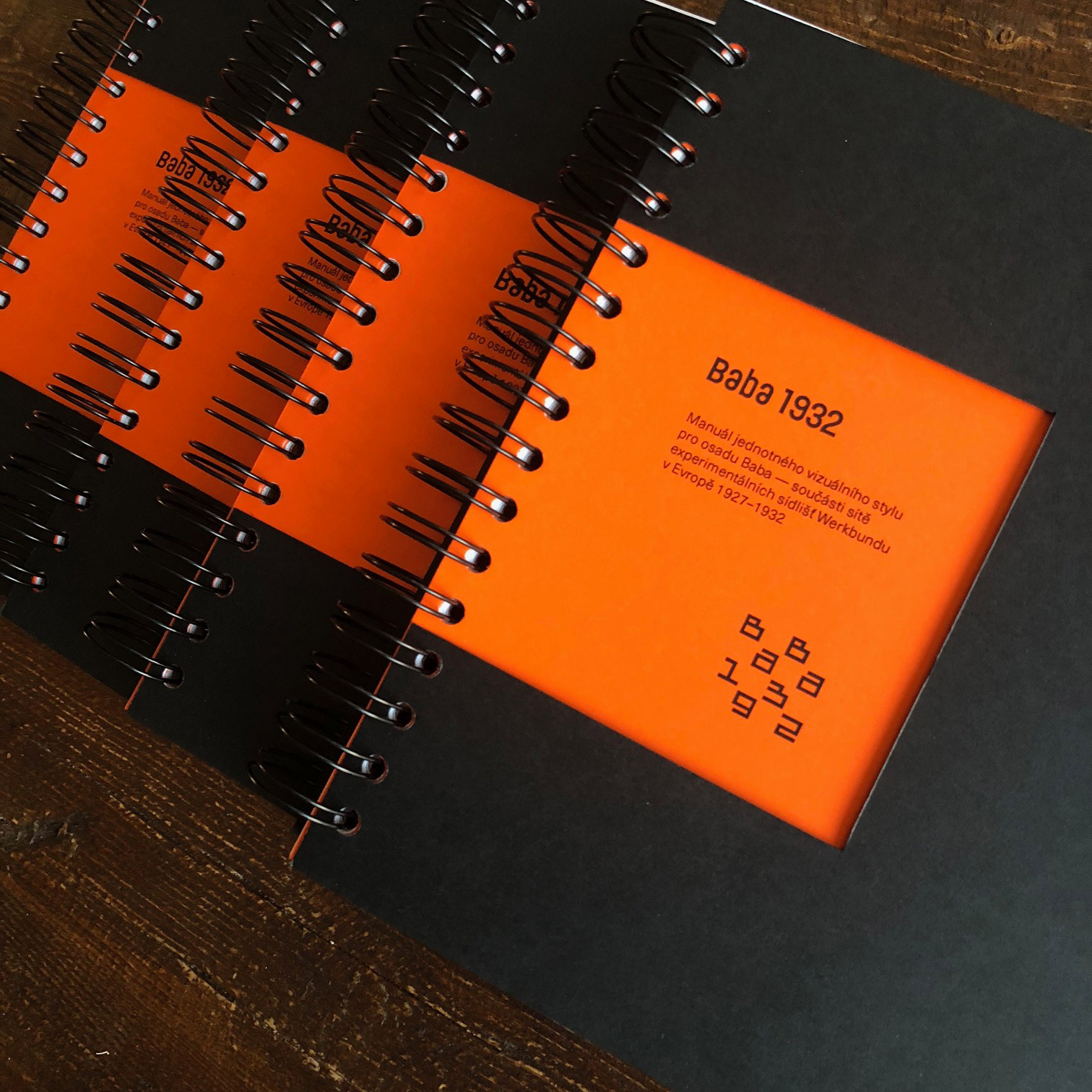
Baba 1932
Logo, identity, and brand guidelines for a 1932 Werkbund estate in Prague.
The Baba settlement in Prague is one of Werkbund's six experimental settlements in Europe. This identity supports the efforts of the city of Prague to be awarded a European Heritage Label recognition for this unique collection of 33 functionalist buildings.
The whole identity system is based on a square. The custom letterforms are inspired by the buildings themselves as well as Piet Zwart's typography and the letters are organized in a chessboard-like manner as a nod to the original zoning plan designed by the Czech architect Pavel Janák. Color palette is simple, utilitarian, and bold.
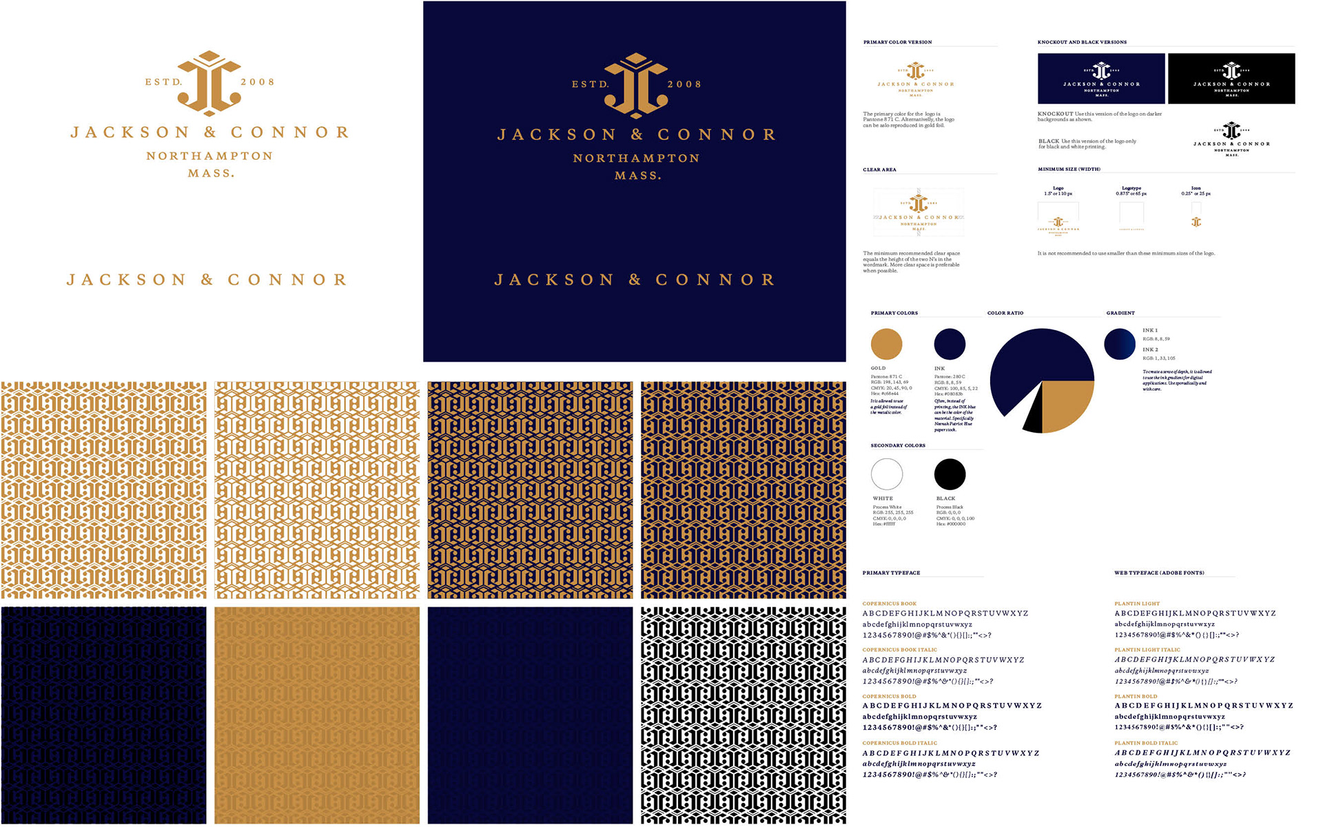
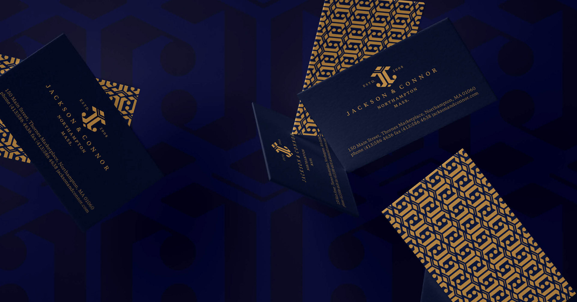
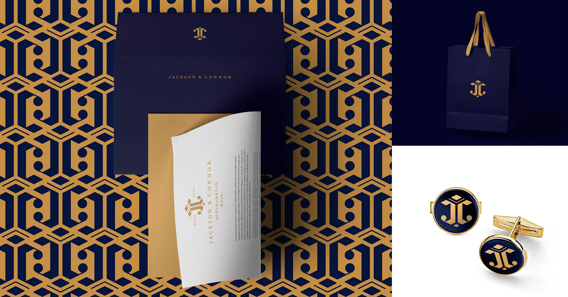
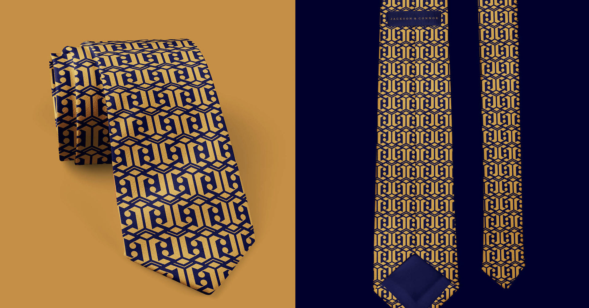
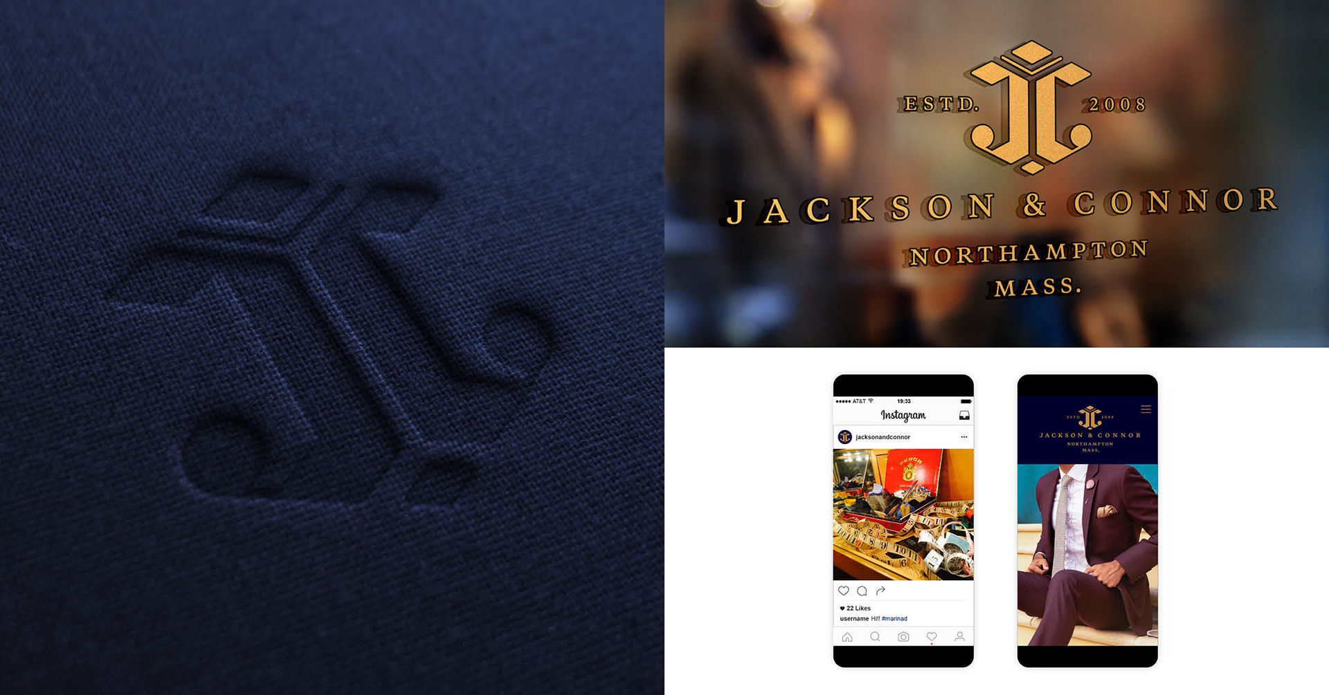
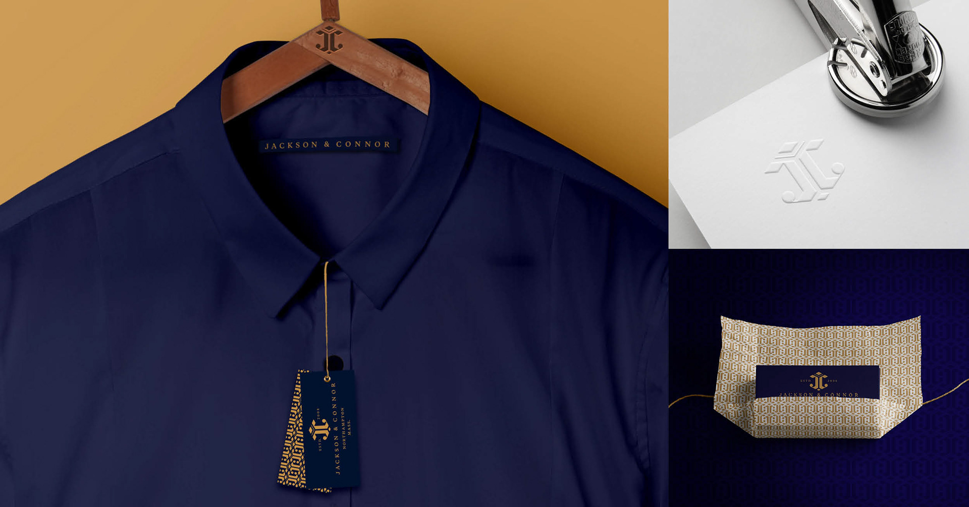
Jackson & Connor
Northampton's Savile Row.
Identity redesign for Western Massachusetts premier menswear destination.
Jackson & Connor approached me with an assignment to elevate their brand identity to better align with the customer experience, the store offerings, and the owner's vision. I created an identity system that would better position Jackson & Connor as a unique destination dedicated to a curated selection of superior quality products, impeccable tailoring, and expert styling. An iconic mark combined with the minimal, yet sophisticated color palette and classic typography supports Jackson & Connor’s blend of Western Massachusetts authenticity paired with Savile Row's international style and class.
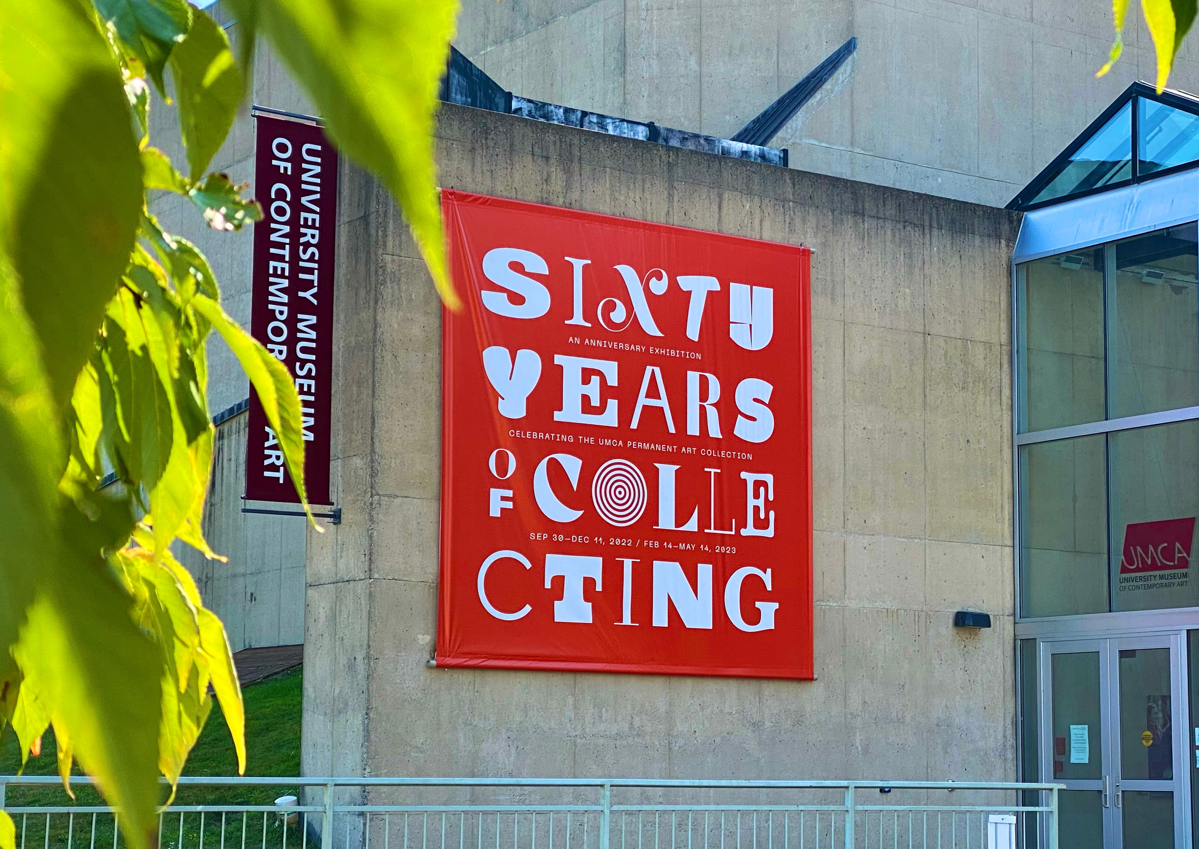
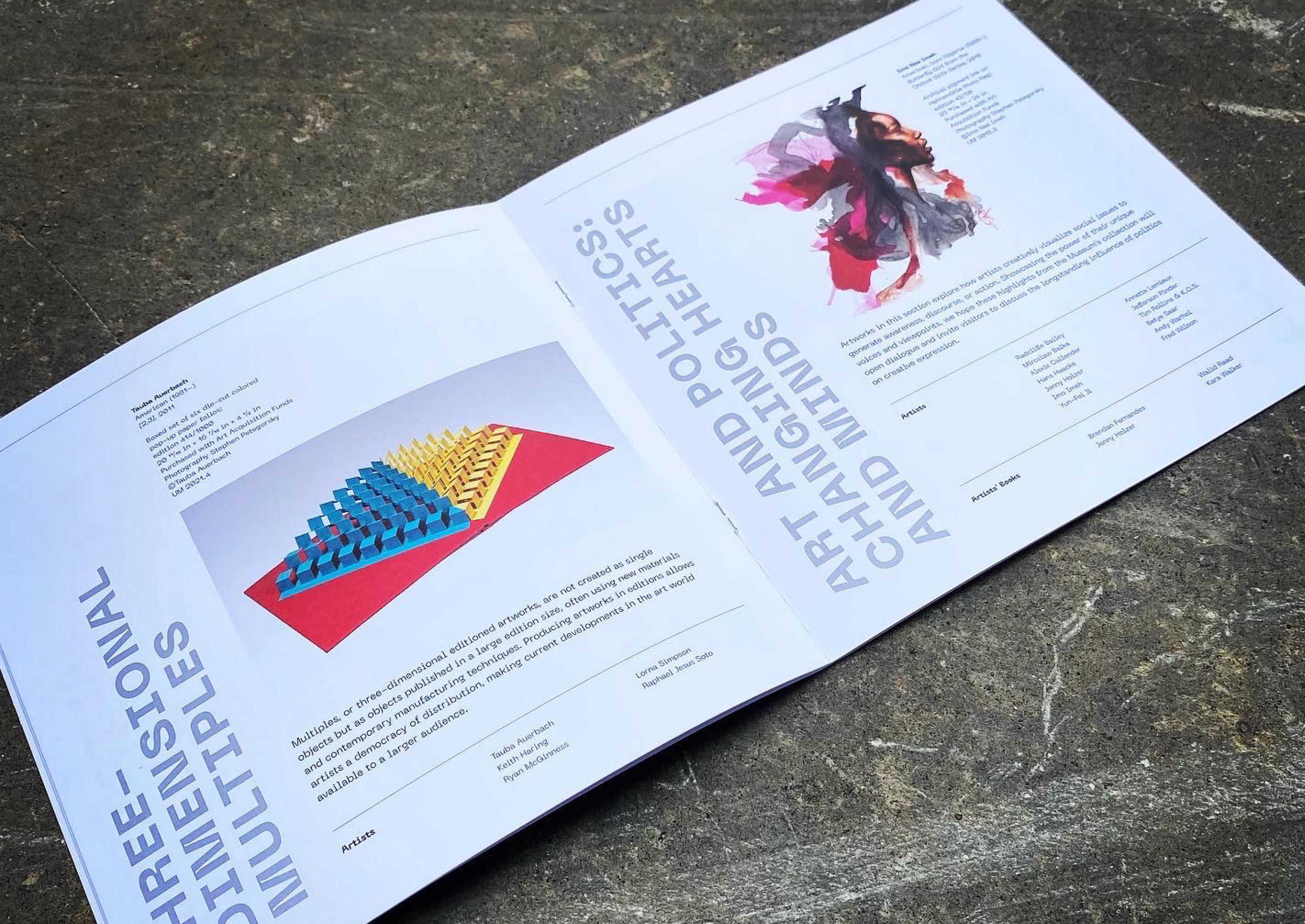
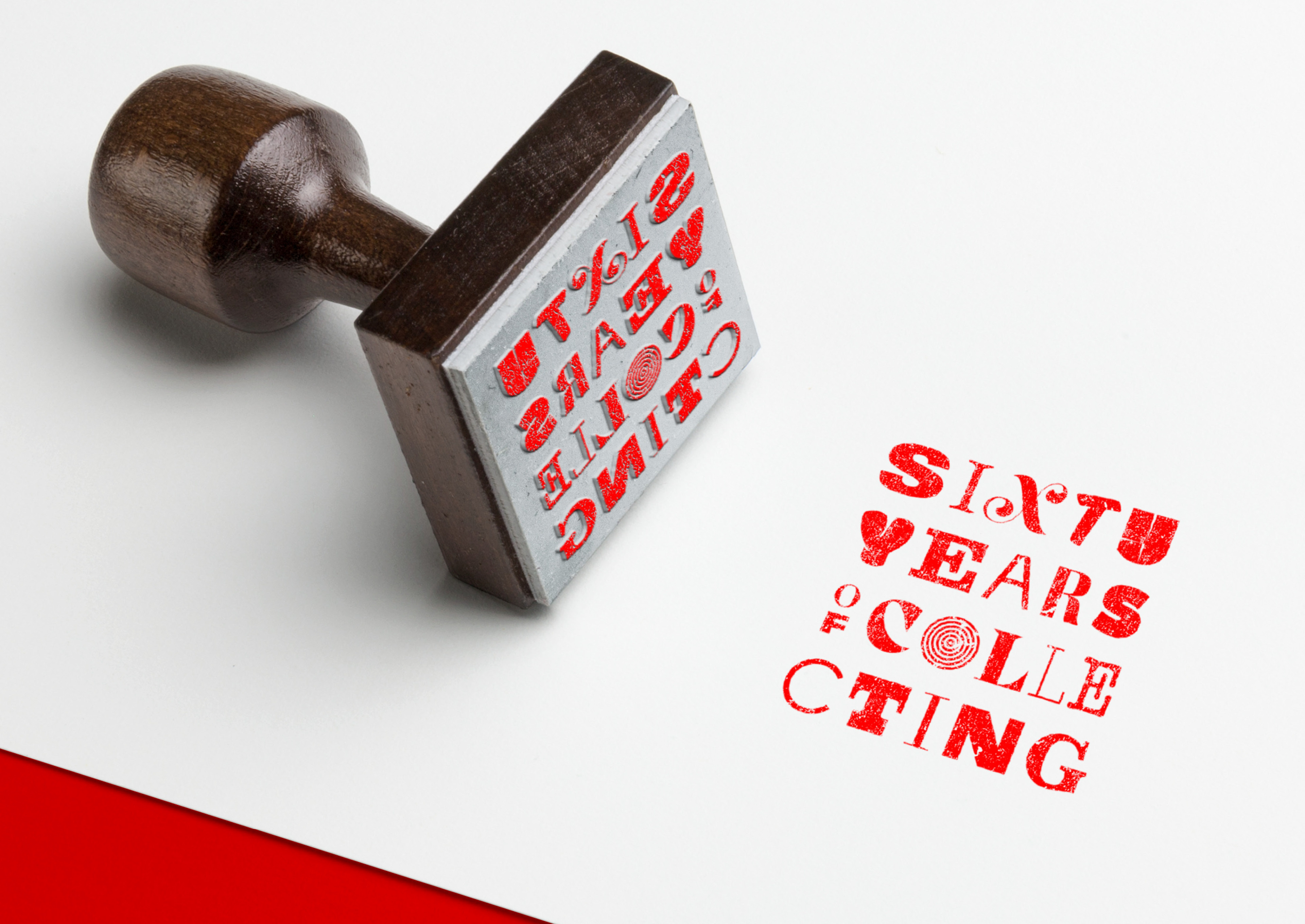
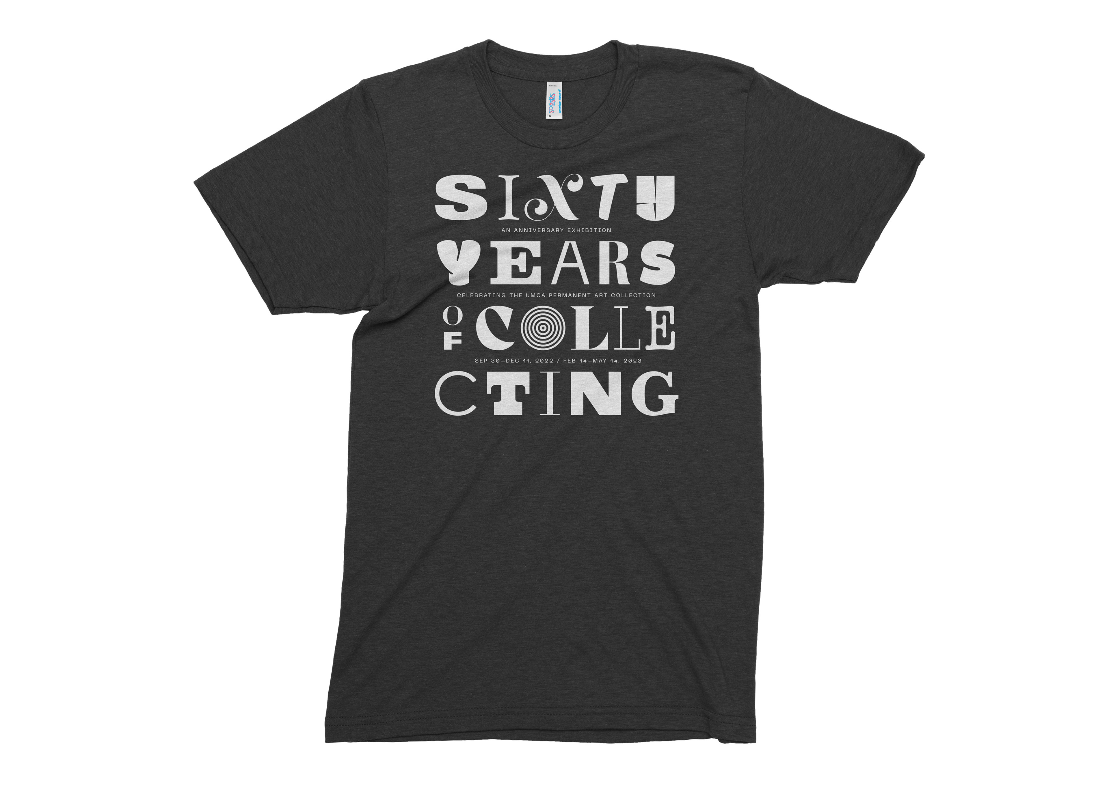
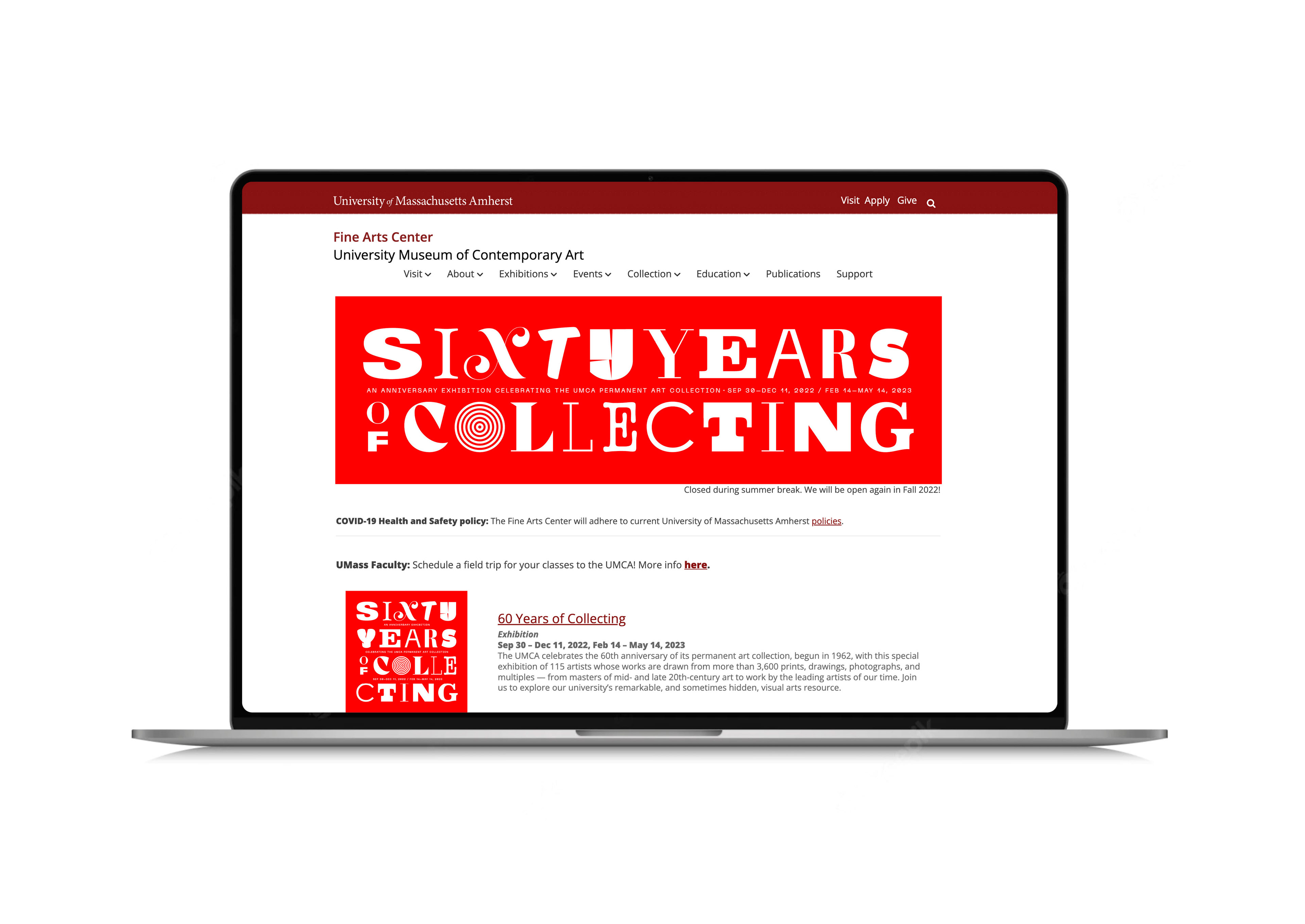
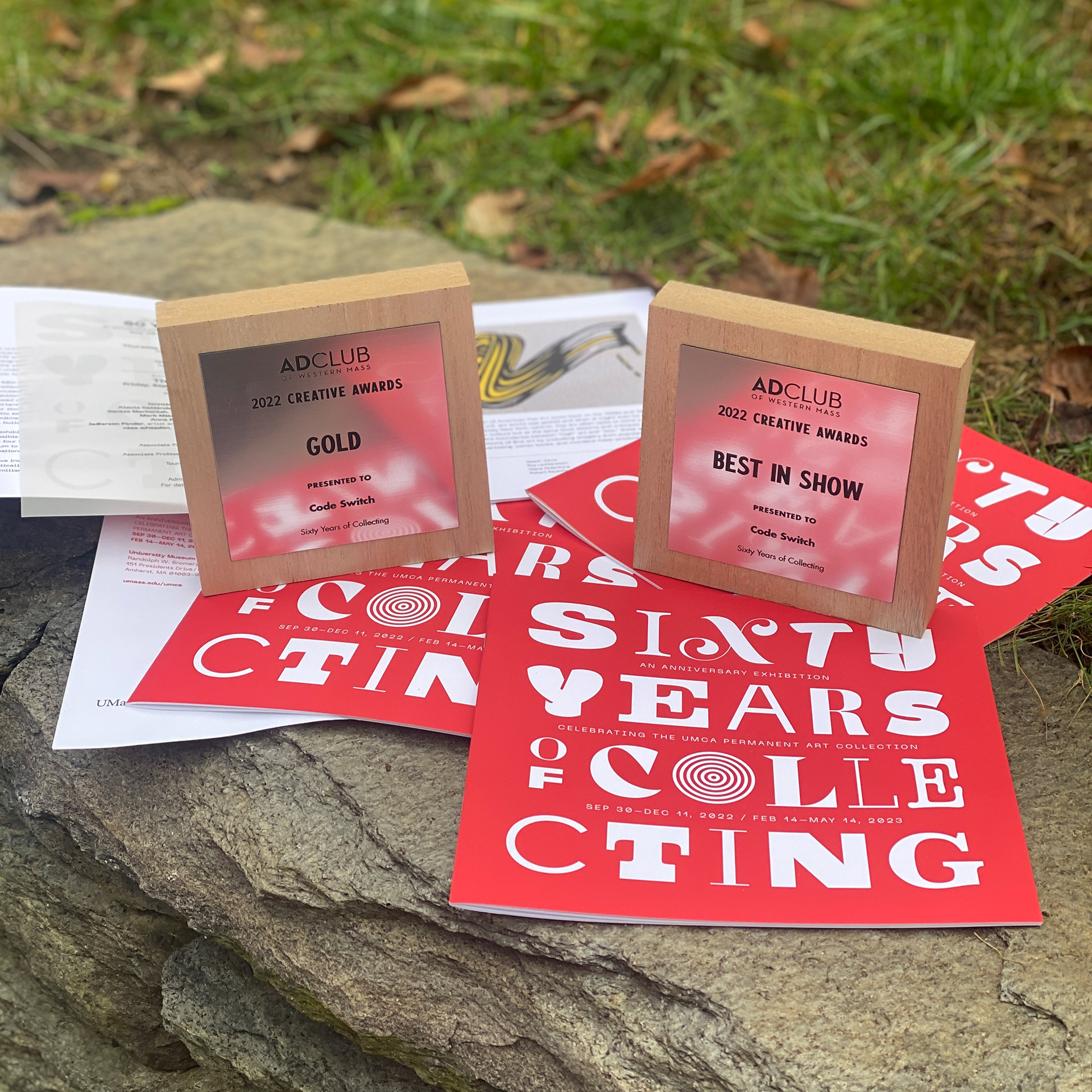
Sixty Years of Collecting
Identity for an anniversary exhibition Sixty Years of Collecting at the University Museum of Contemporary Art, University of Massachusetts Amherst.
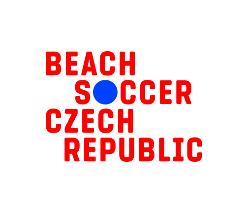
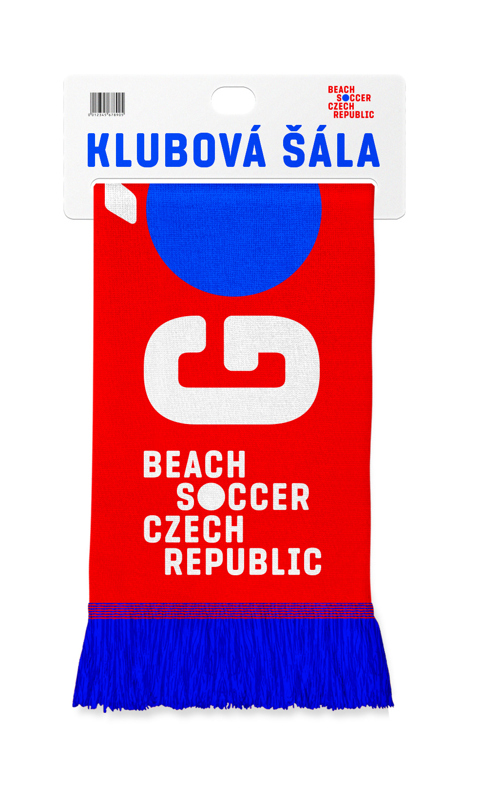
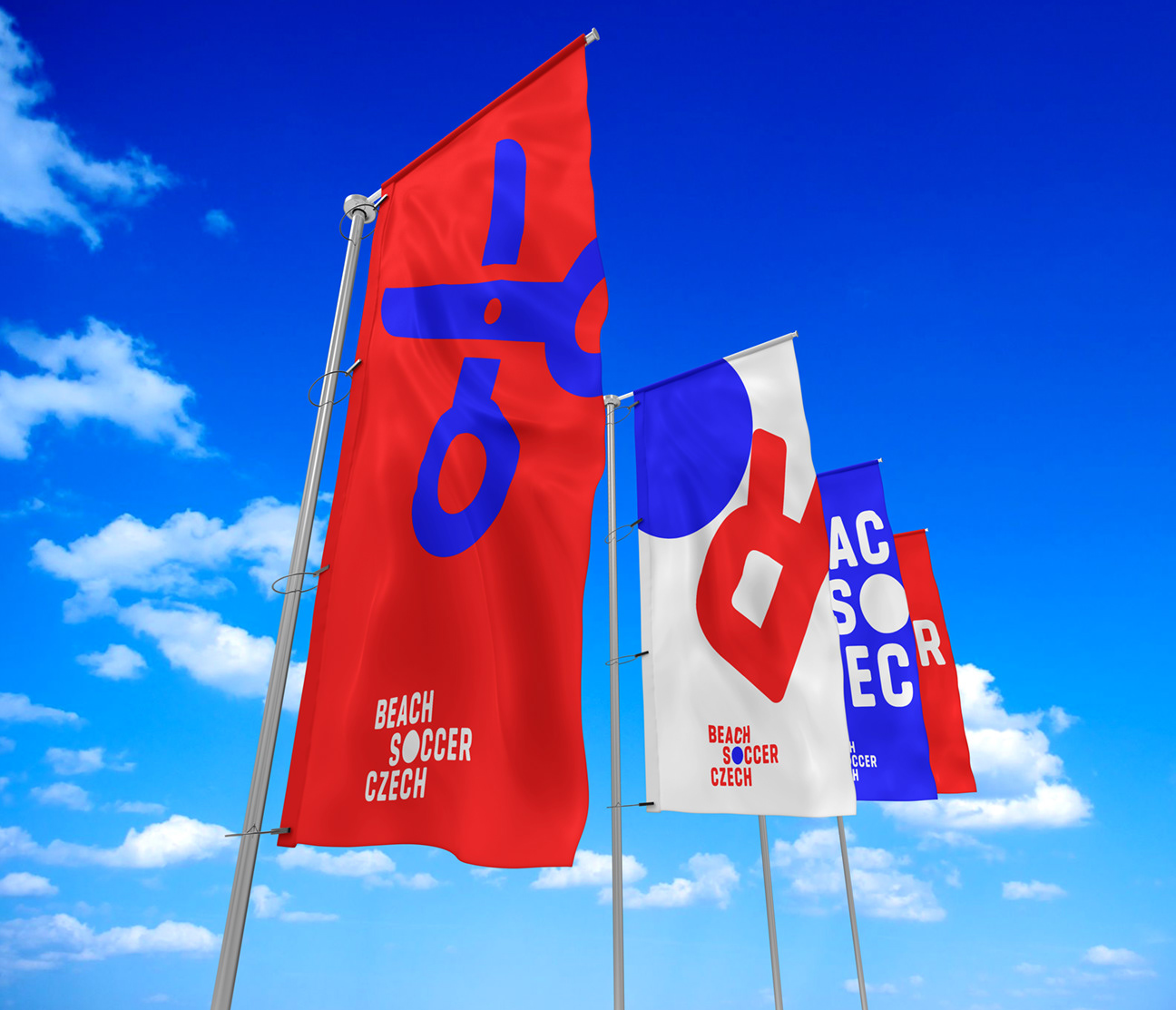
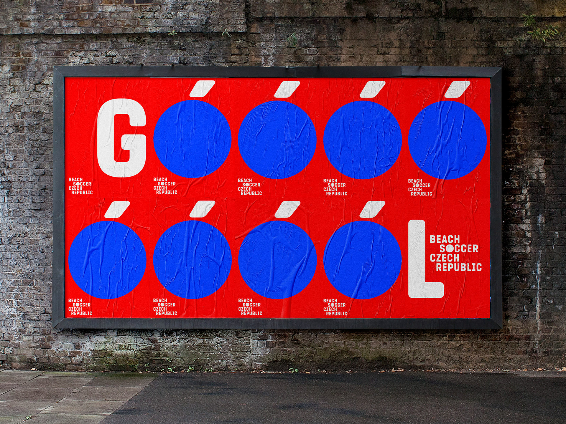
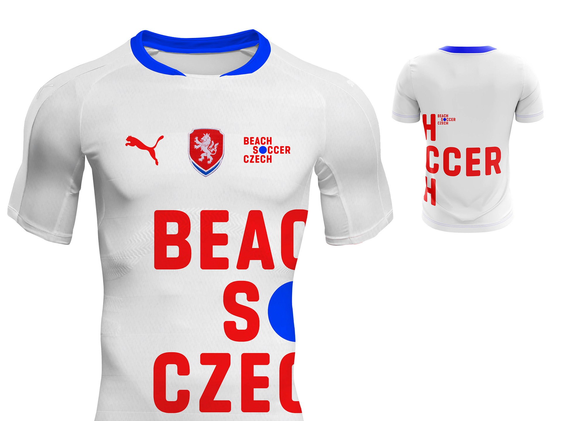
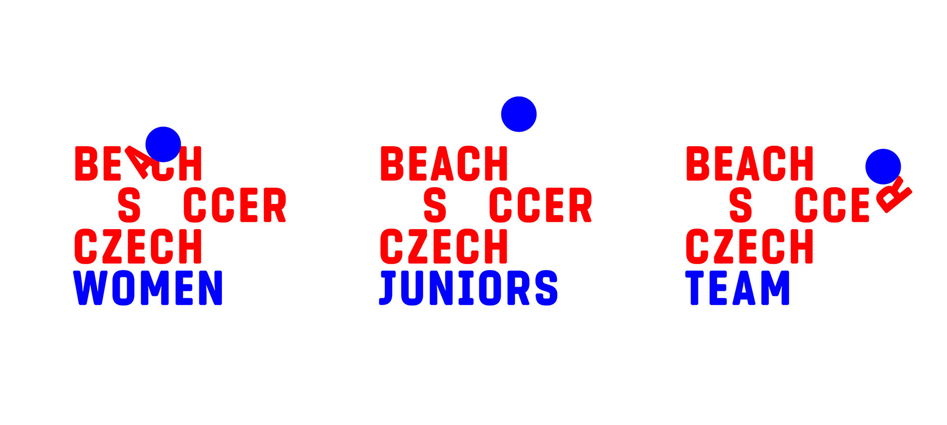
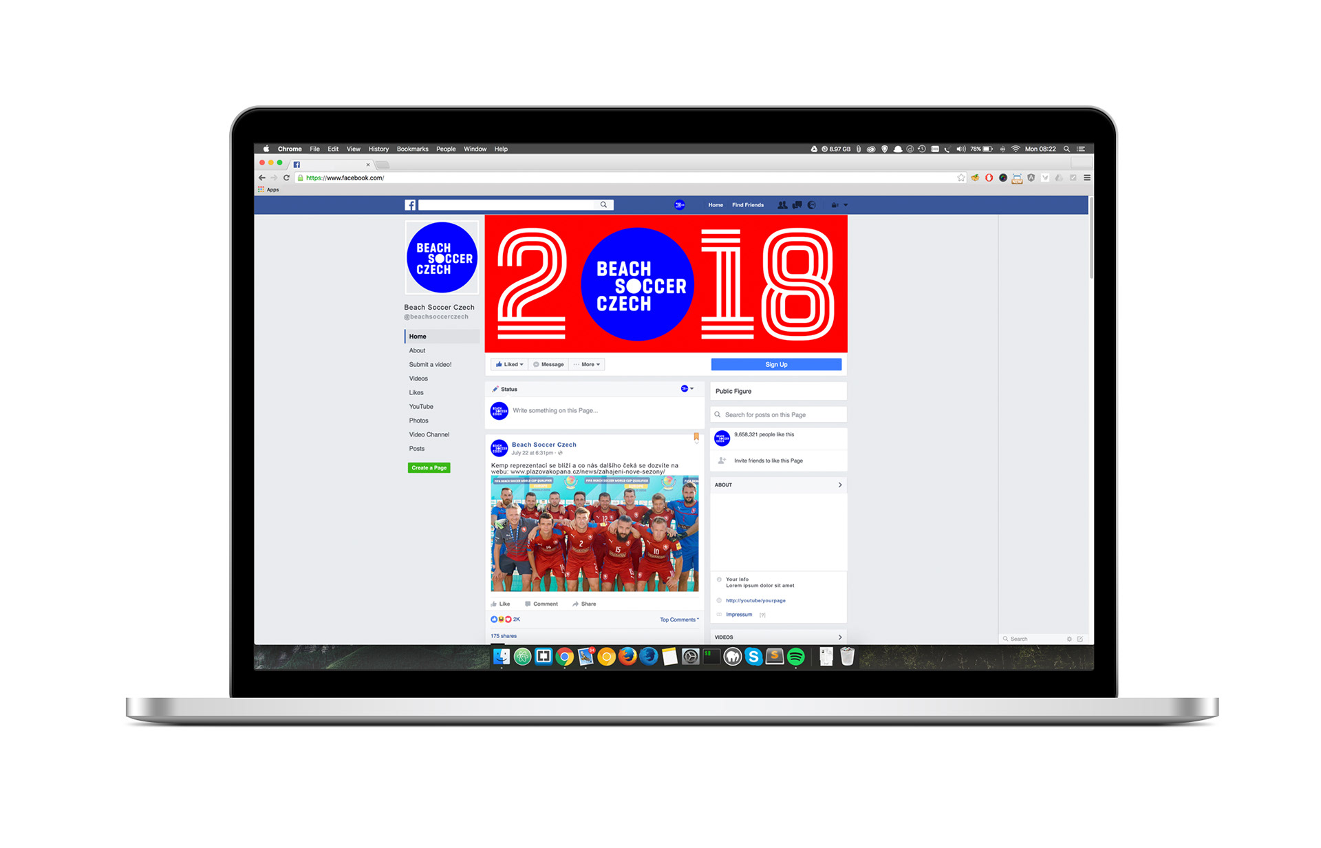
Beach Soccer Czech Republic Identity
When Beach Soccer Czech Republic approached me with a logo and identity assignment, I knew I wanted to stay away from the overused motifs of palm trees, sun, ocean and a silhouette of a beach soccer player doing the signature bicycle kick (or "scissors" kick as it is known in Czech.) This visual language wouldn't feel believable and authentic in the Czech (a land-lock country) environment and it wouldn't stand out among all the other world beach soccer clubs.
Playful logo and identity based on a typeface specifically designed for that purpose proved to be a good idea and I'm happy that the leadership of Beach Soccer Czech decided to go with this for their industry unusual solution. I hope that their new identity will help them attract new fans and sponsors and that it will increase their visibility in the fun and entertaining world of beach soccer.
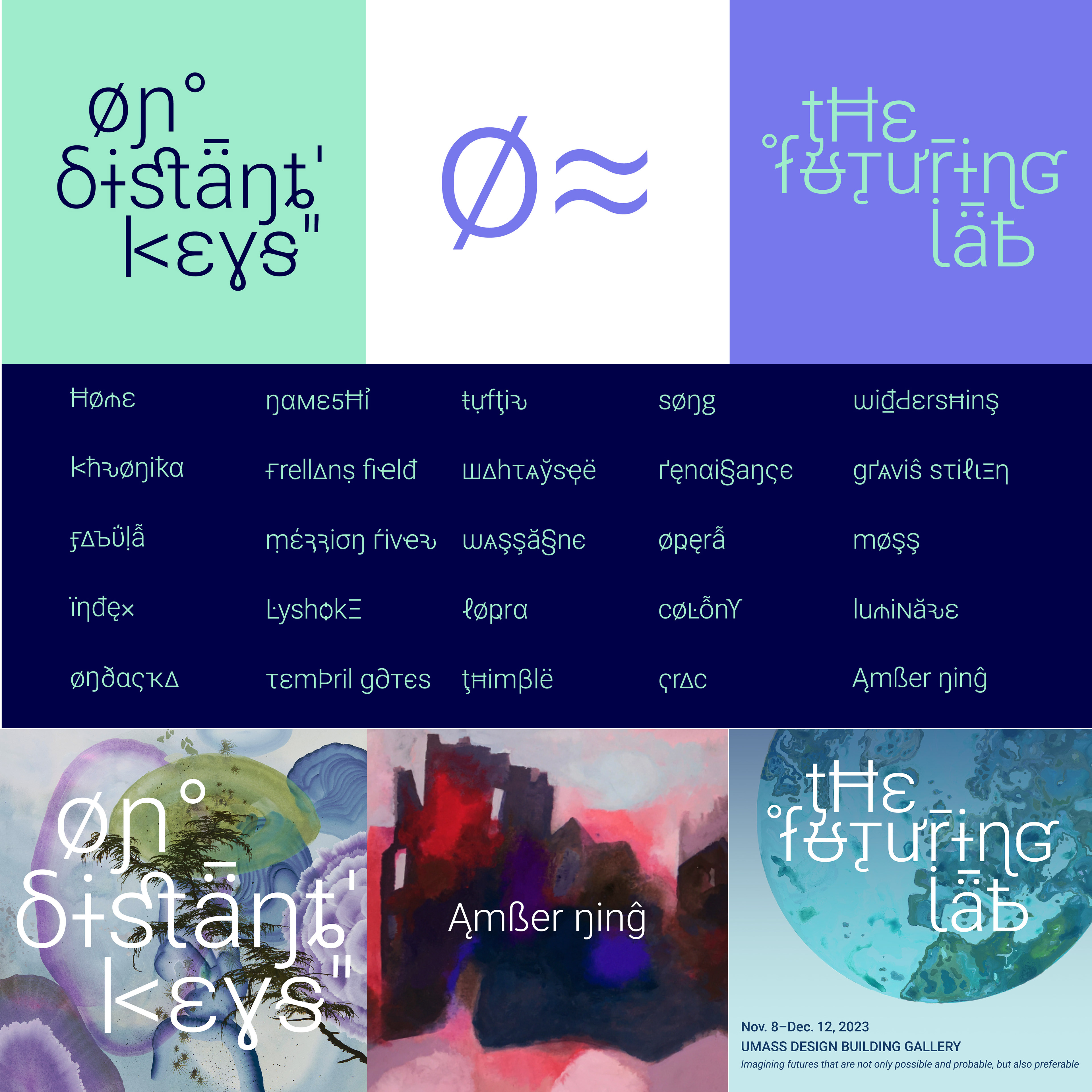
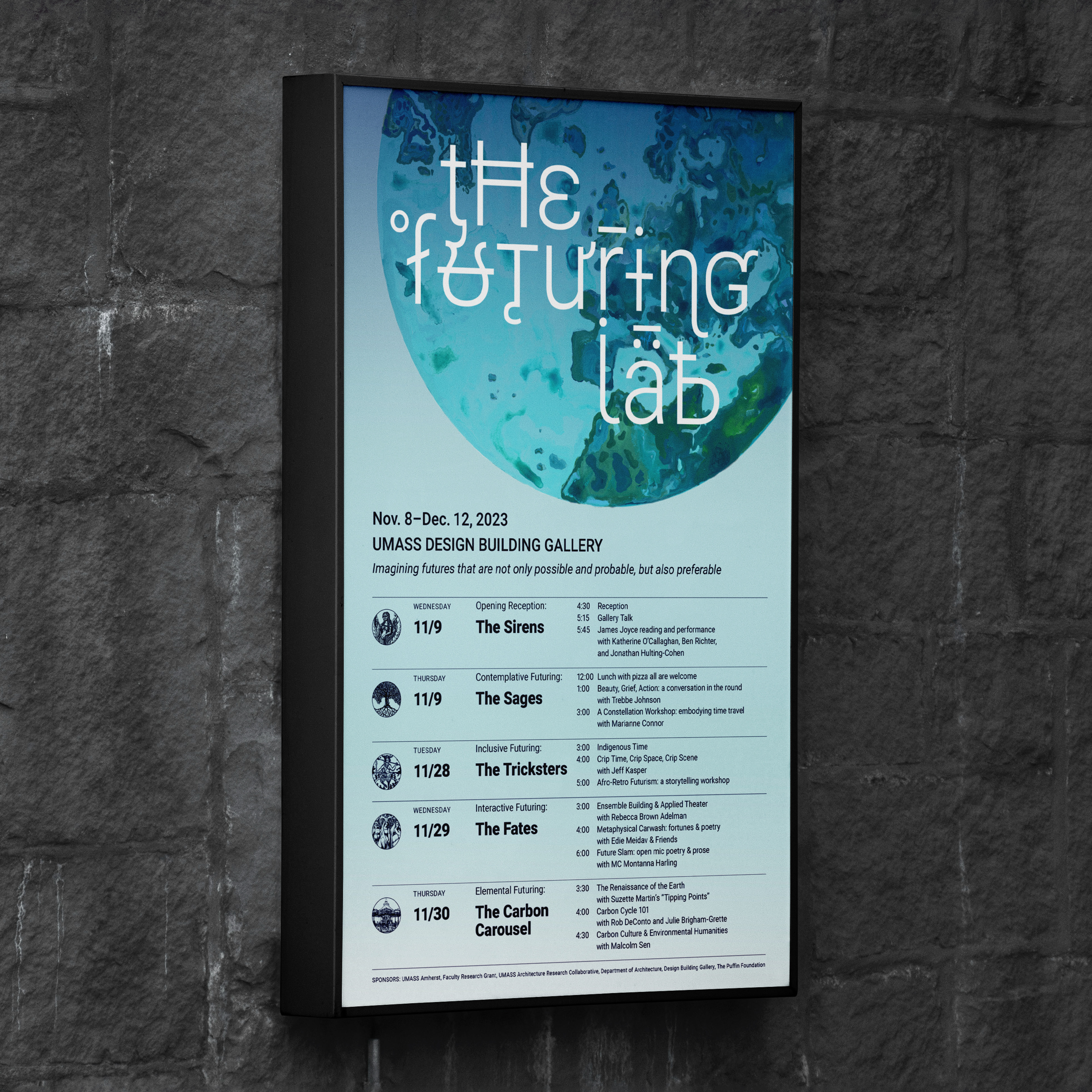
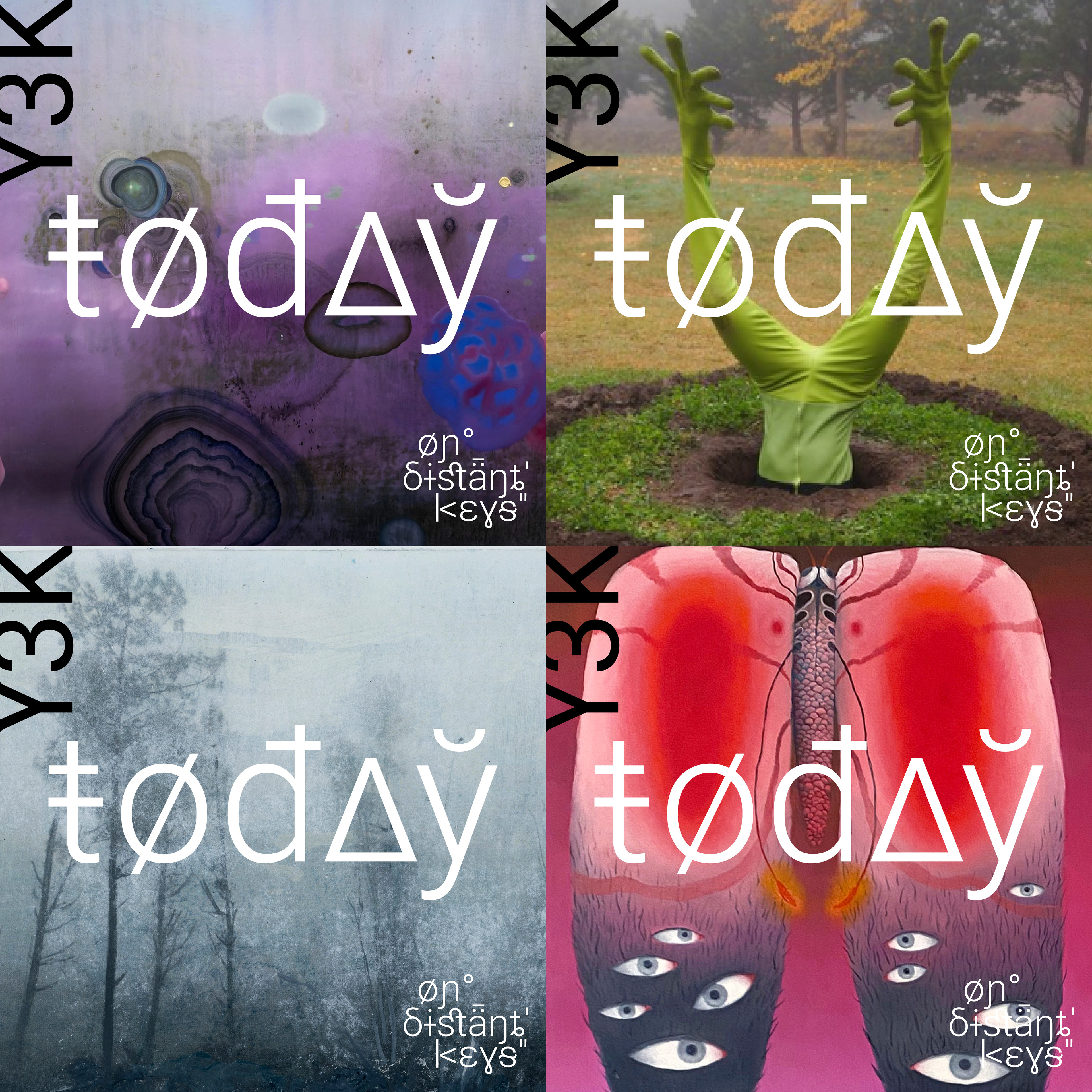
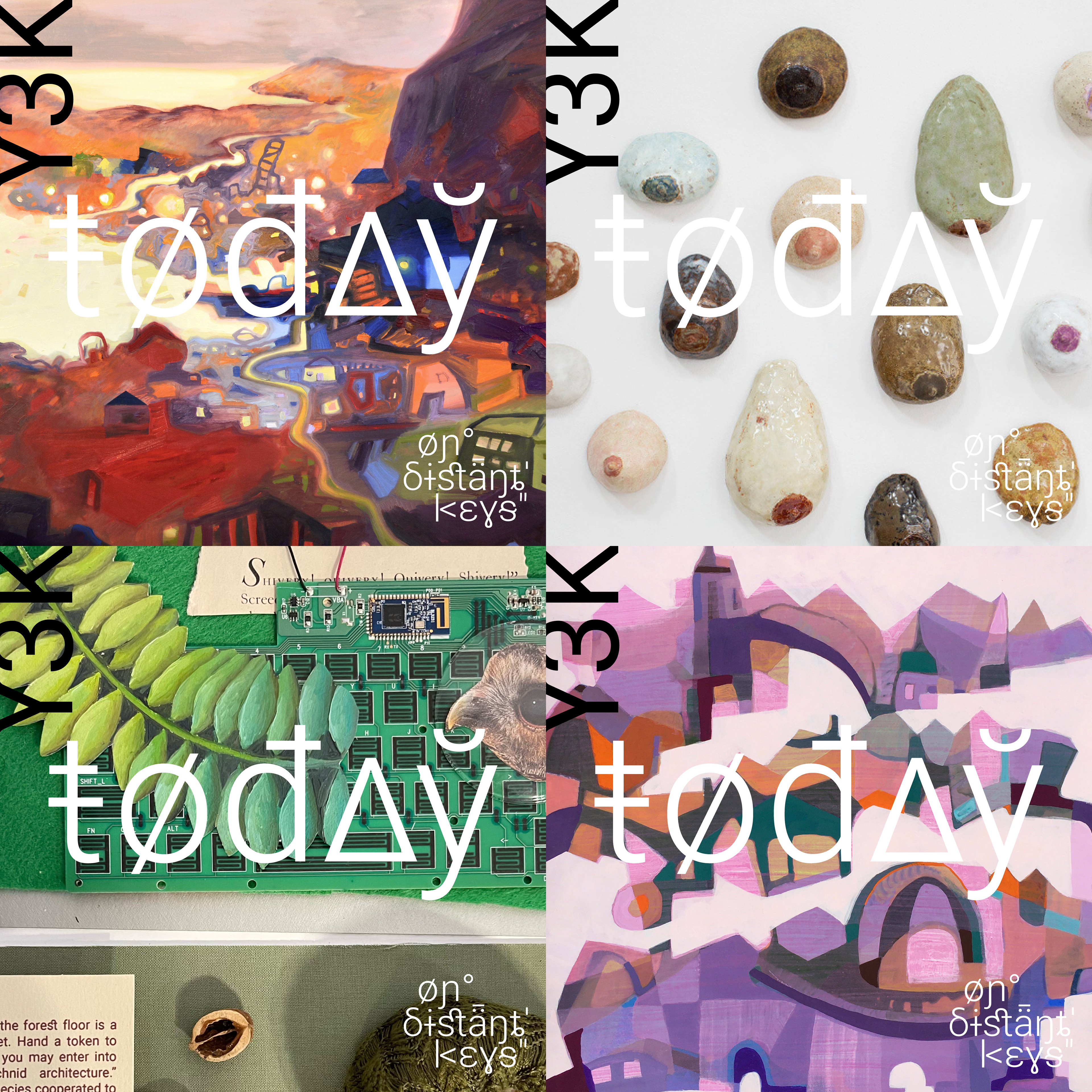
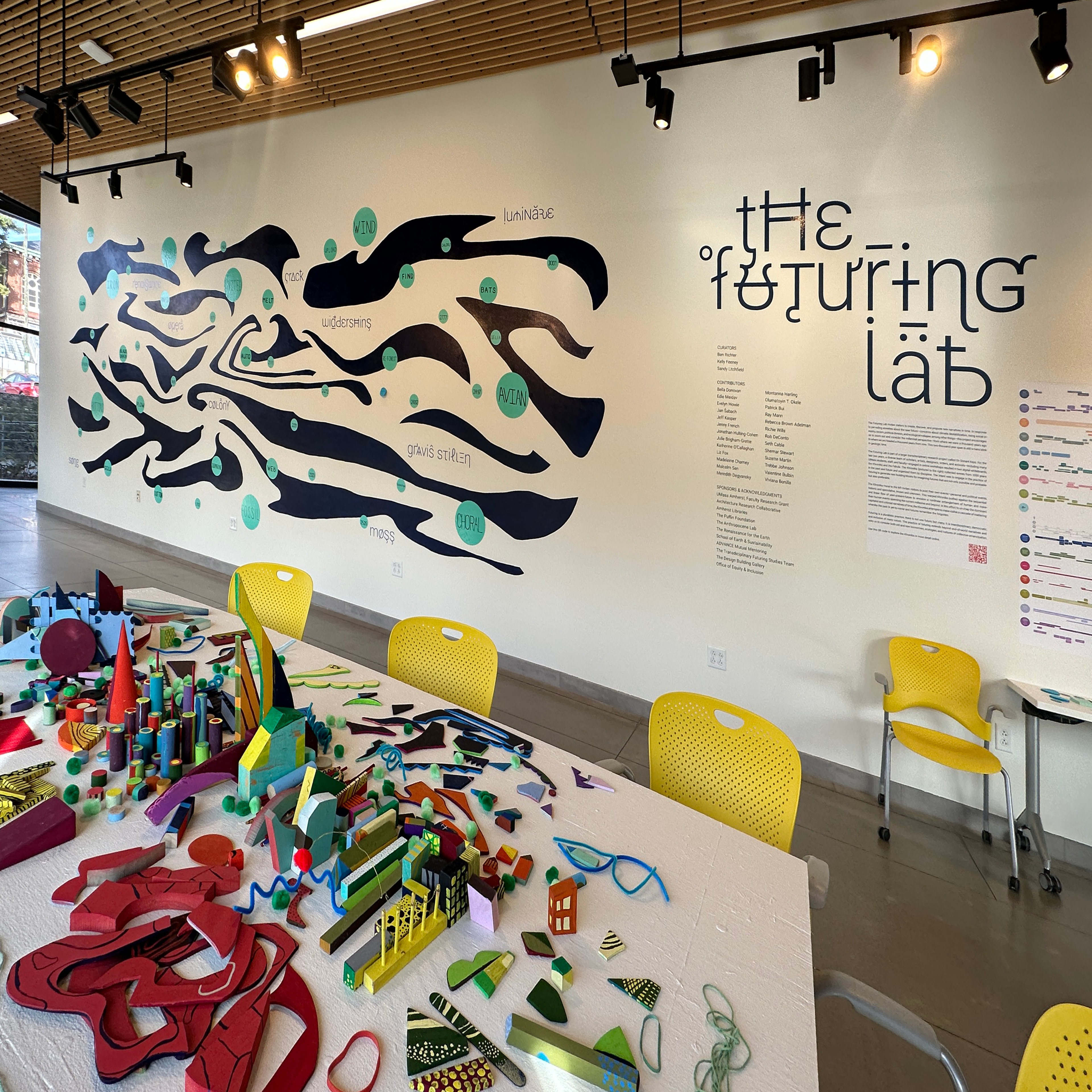
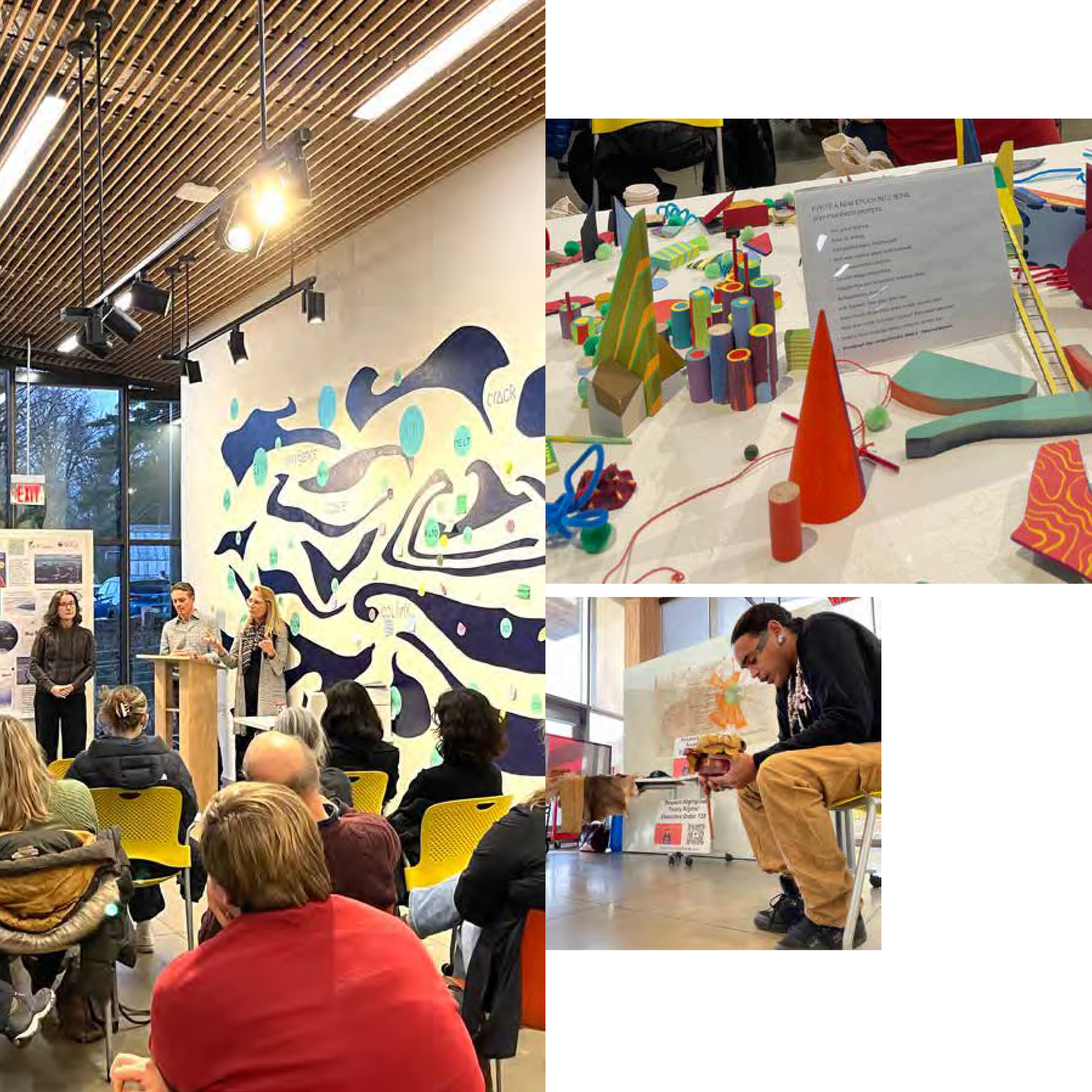
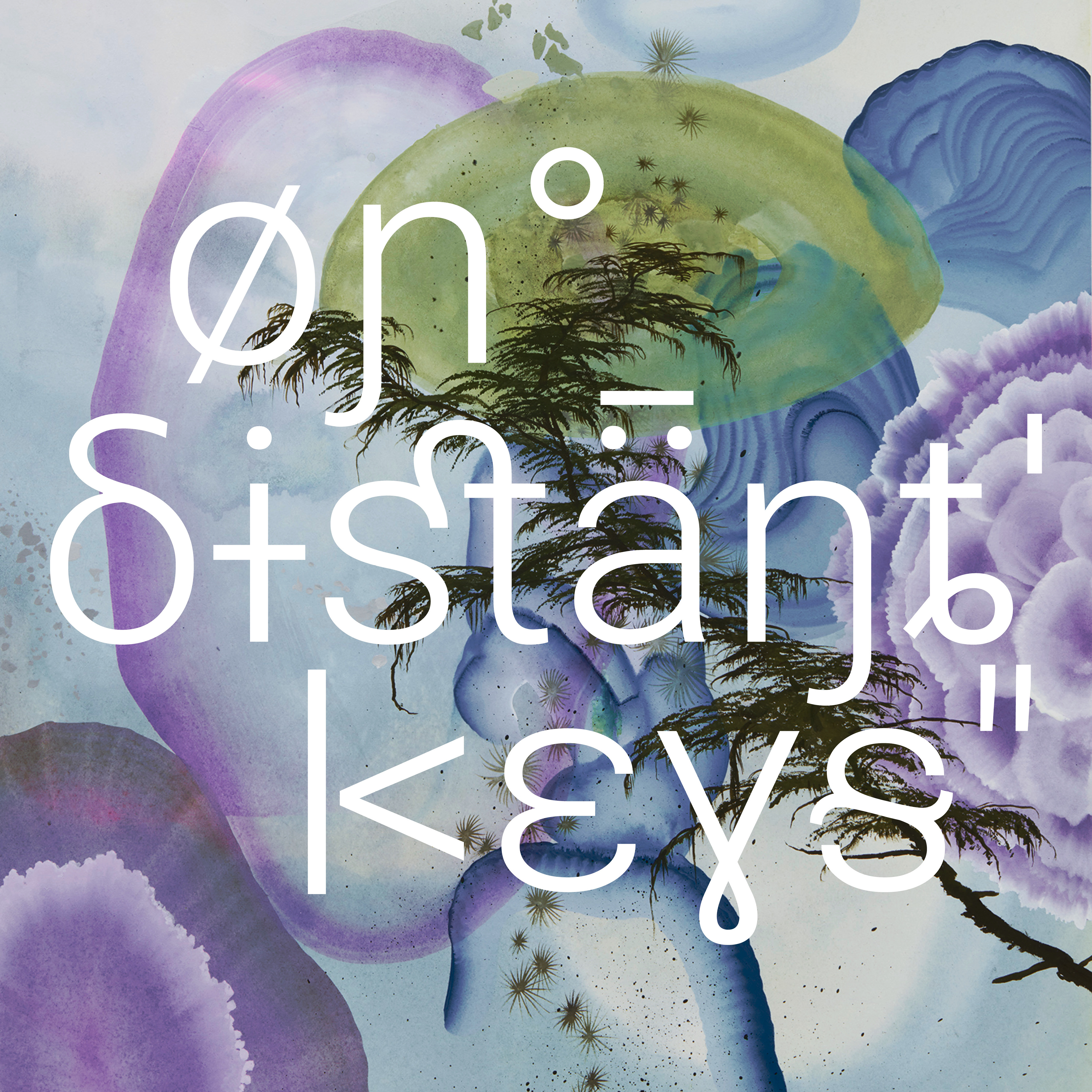
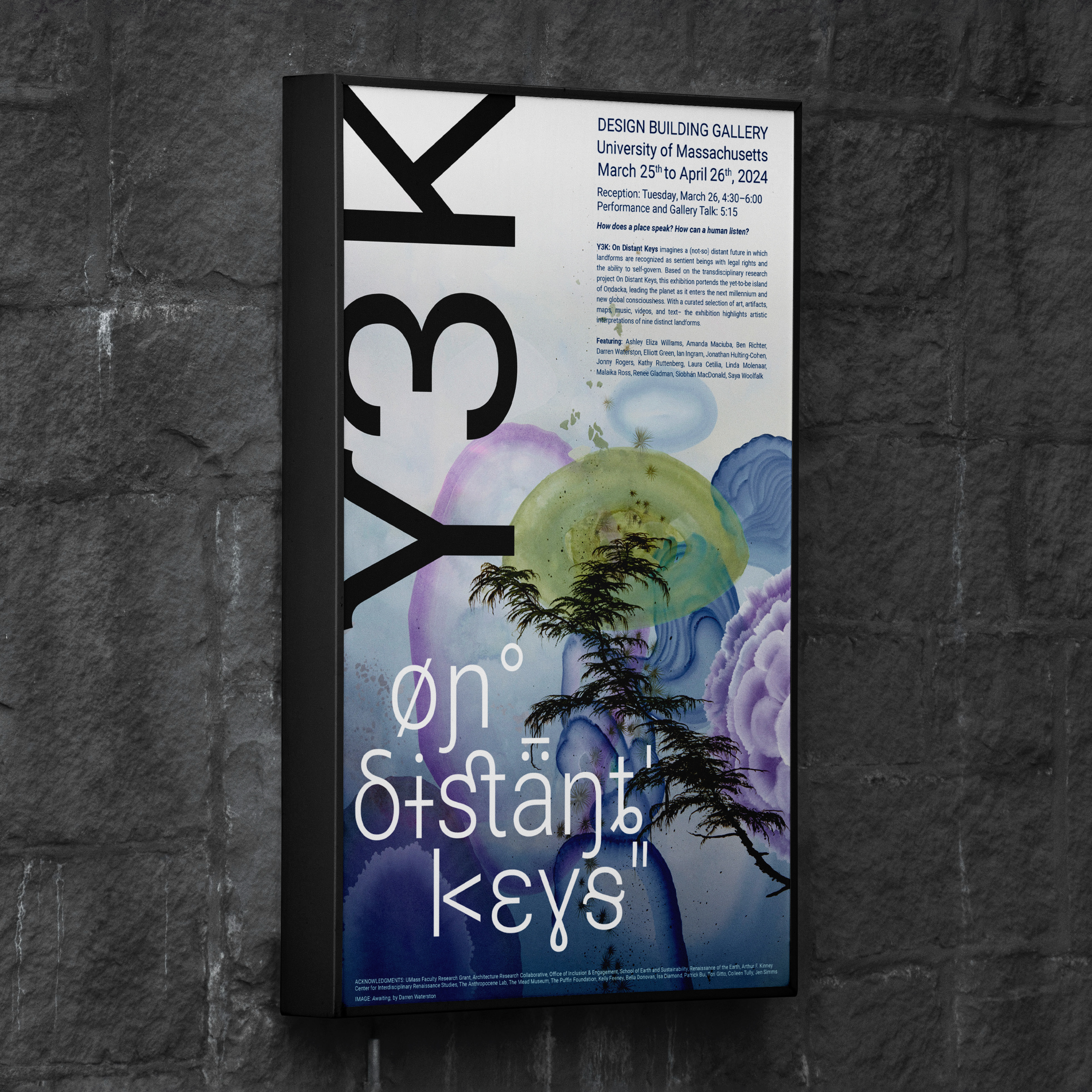
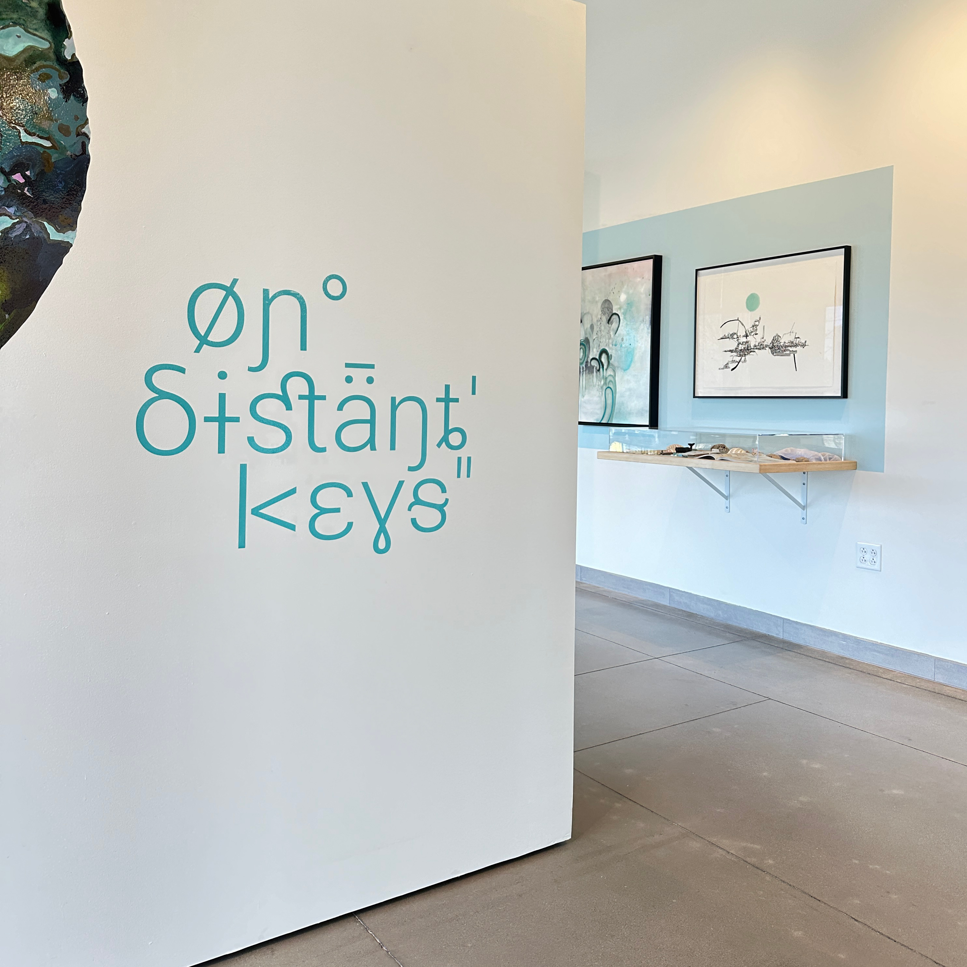
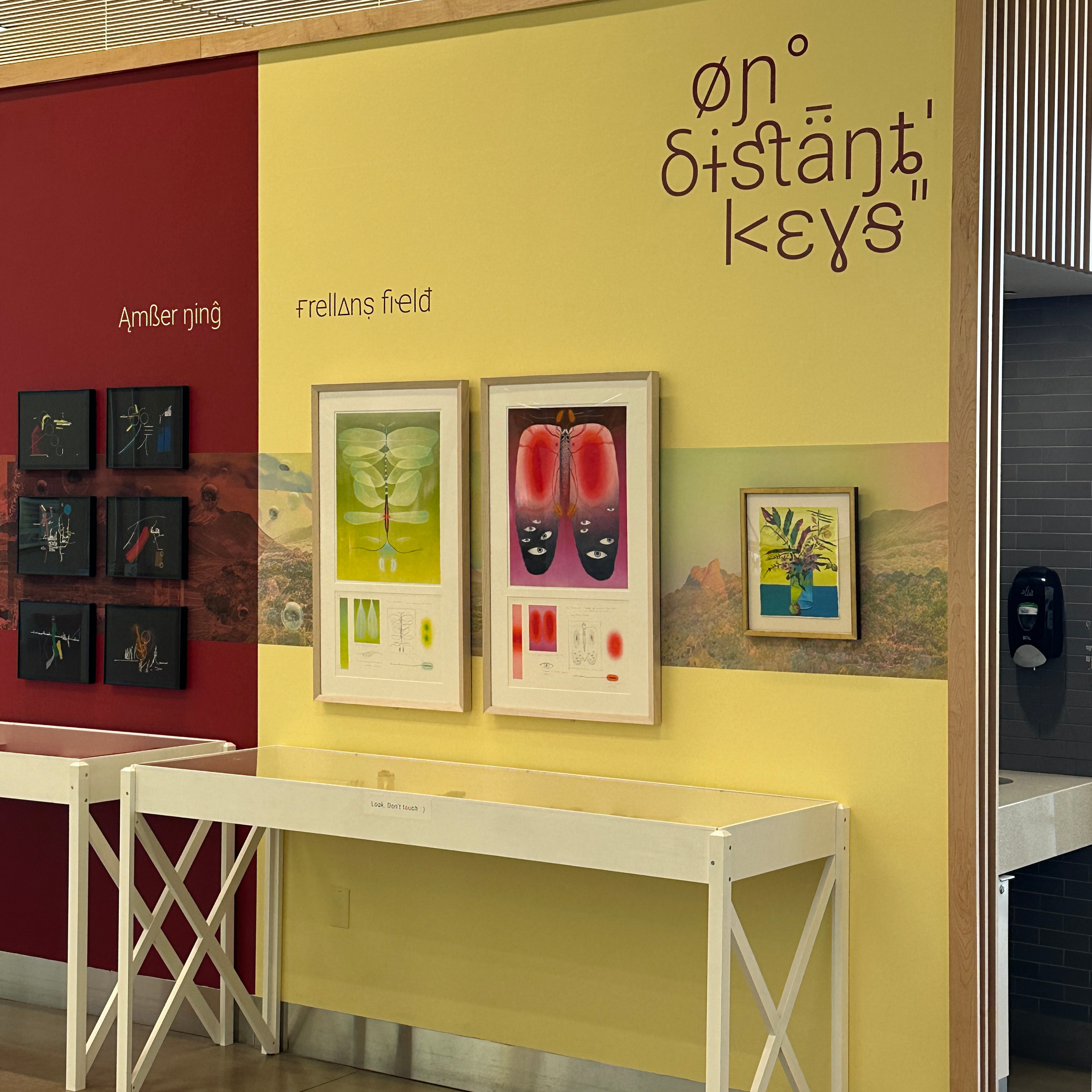
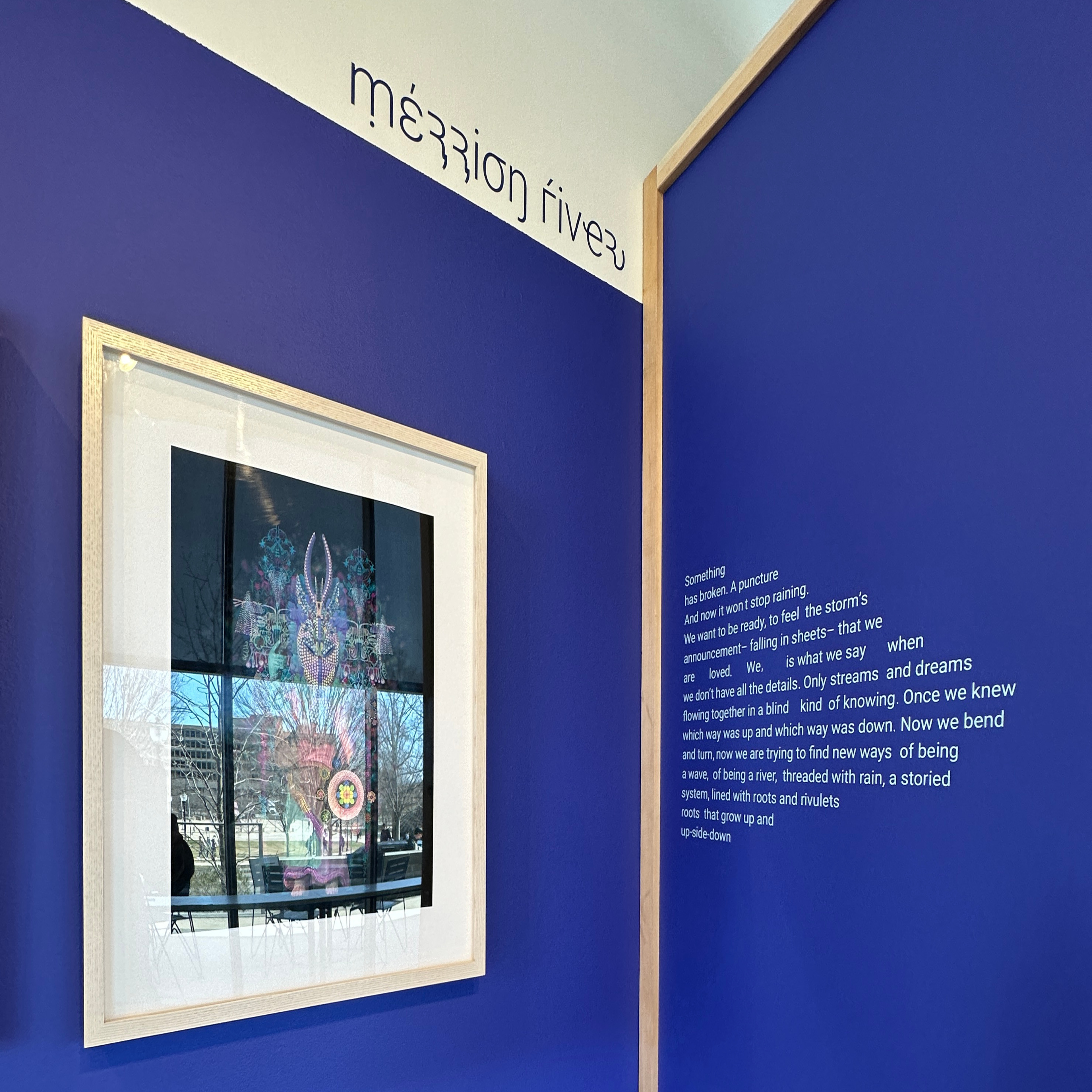
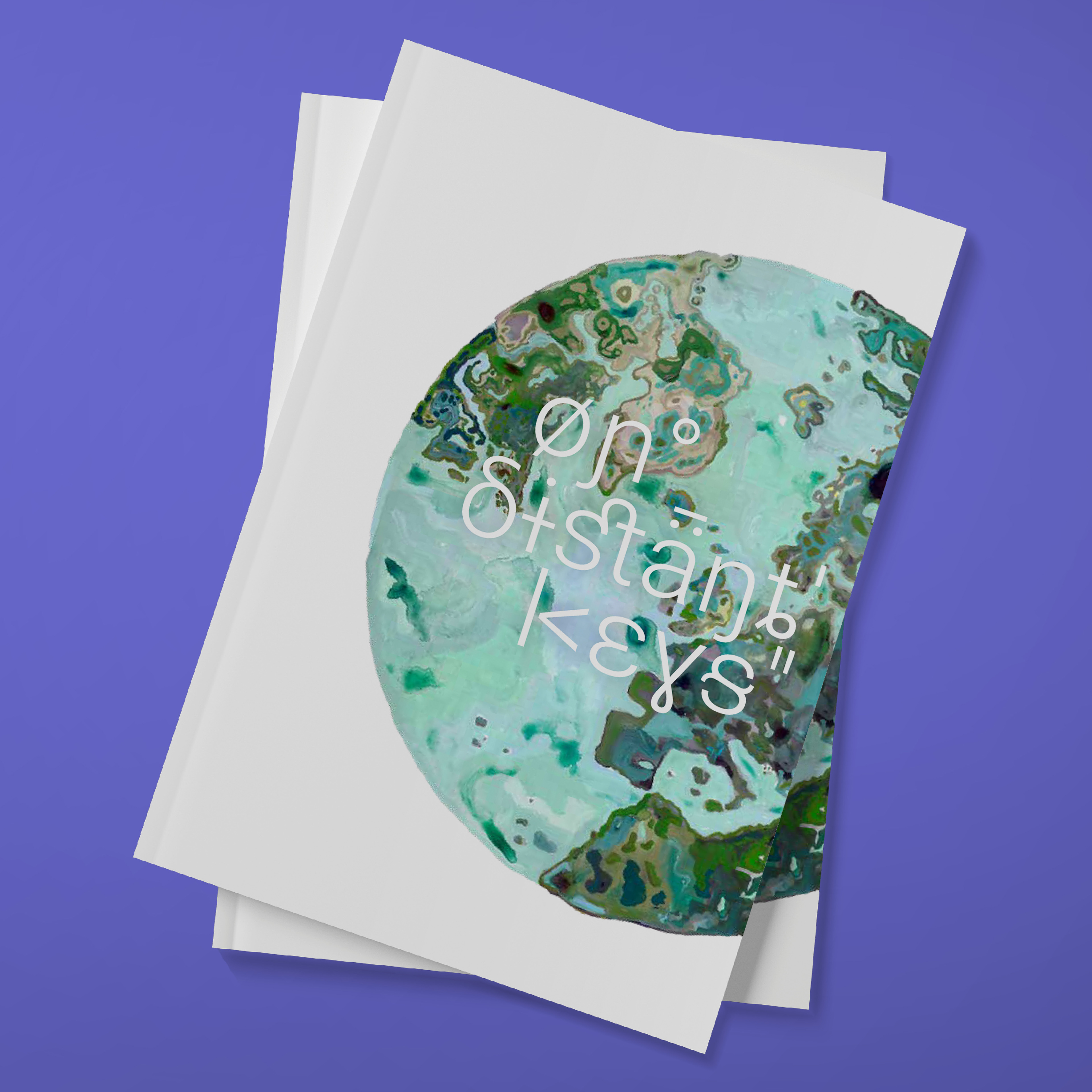
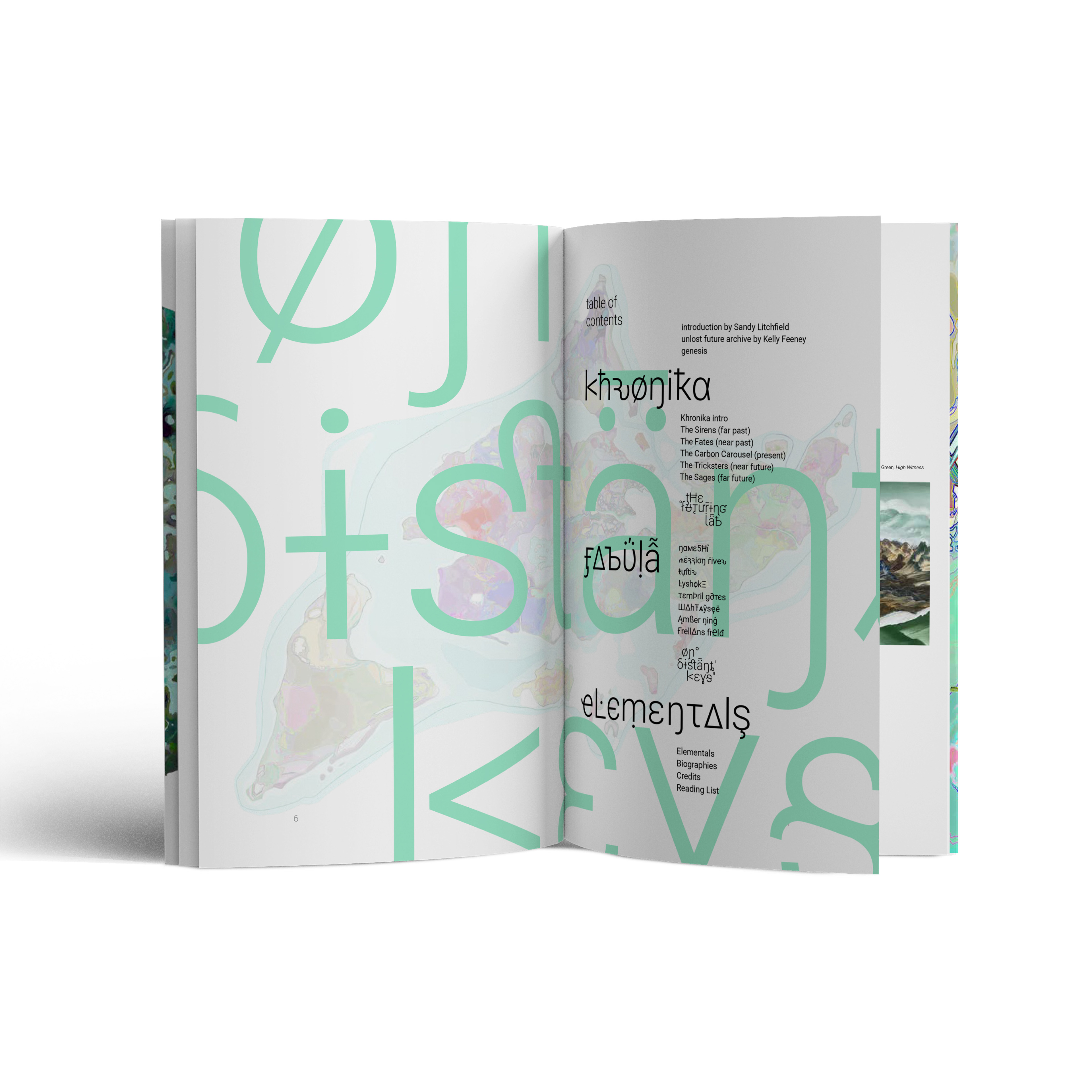
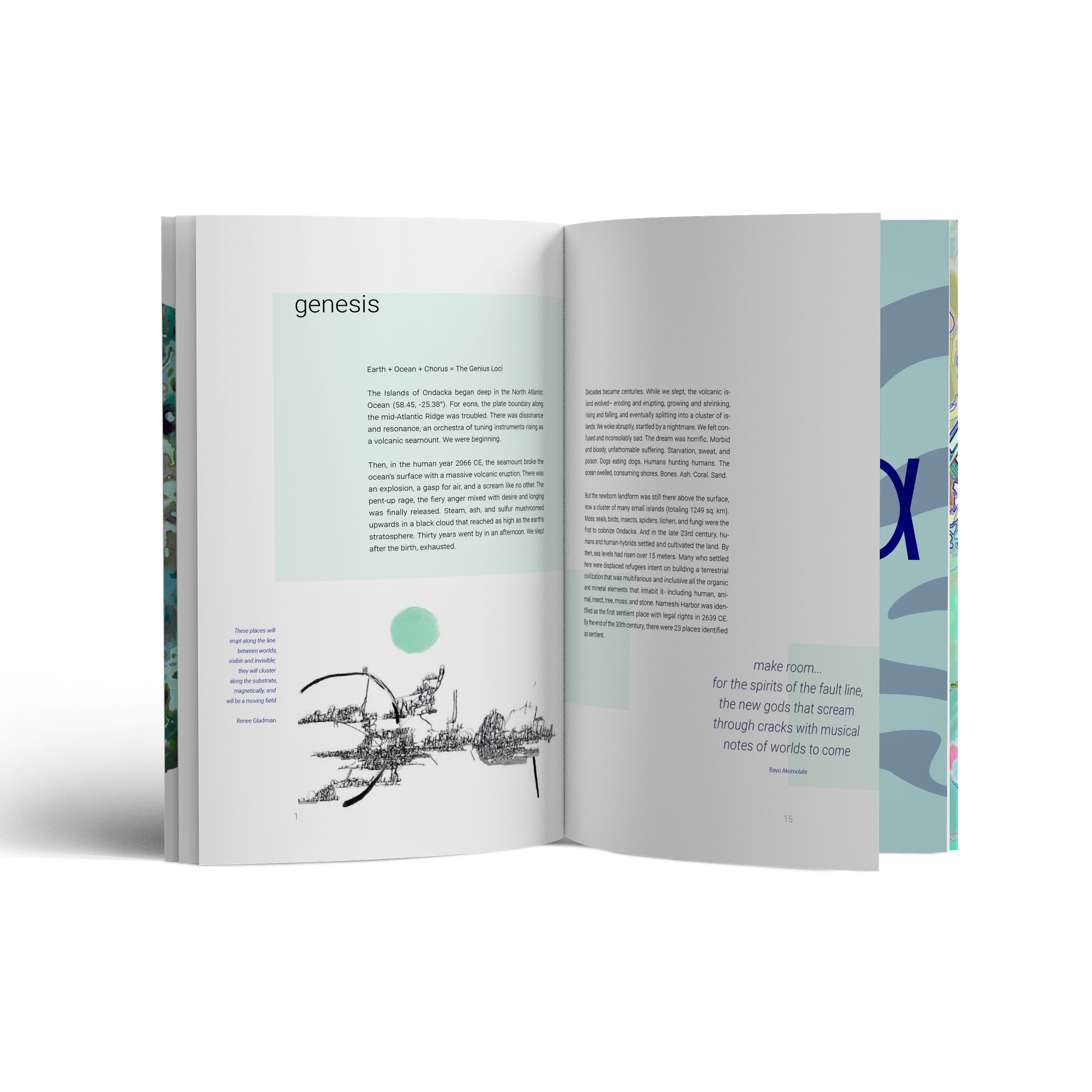
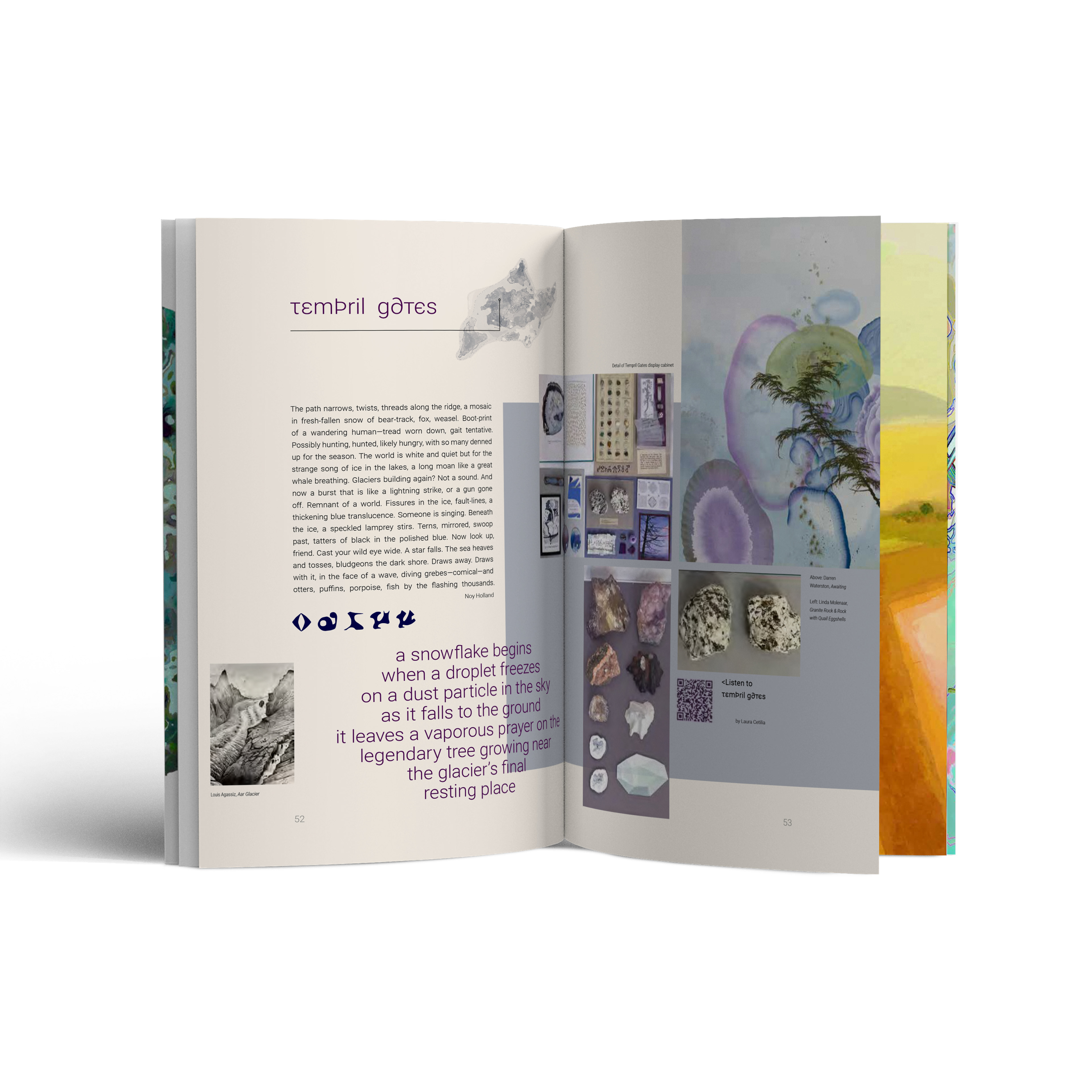
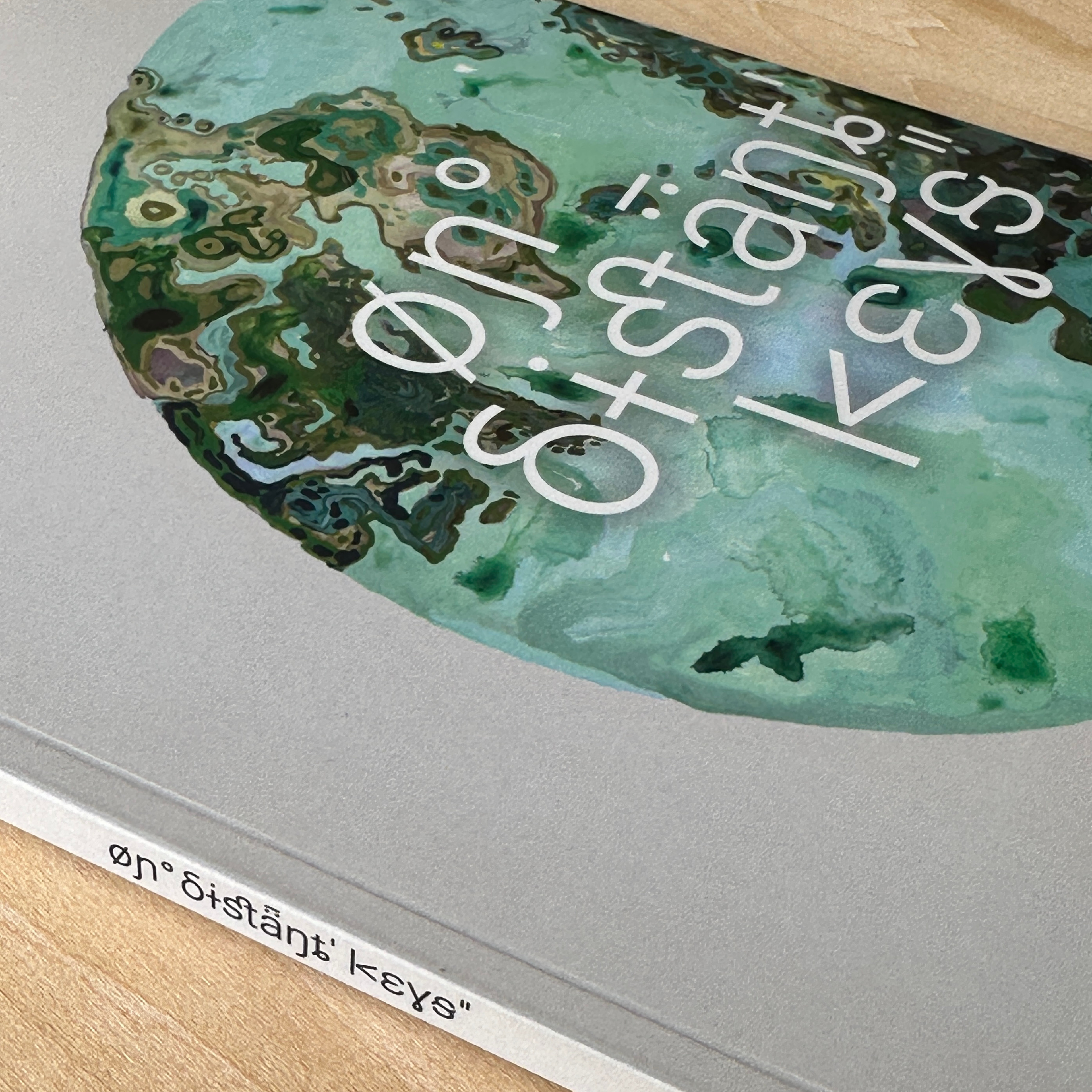
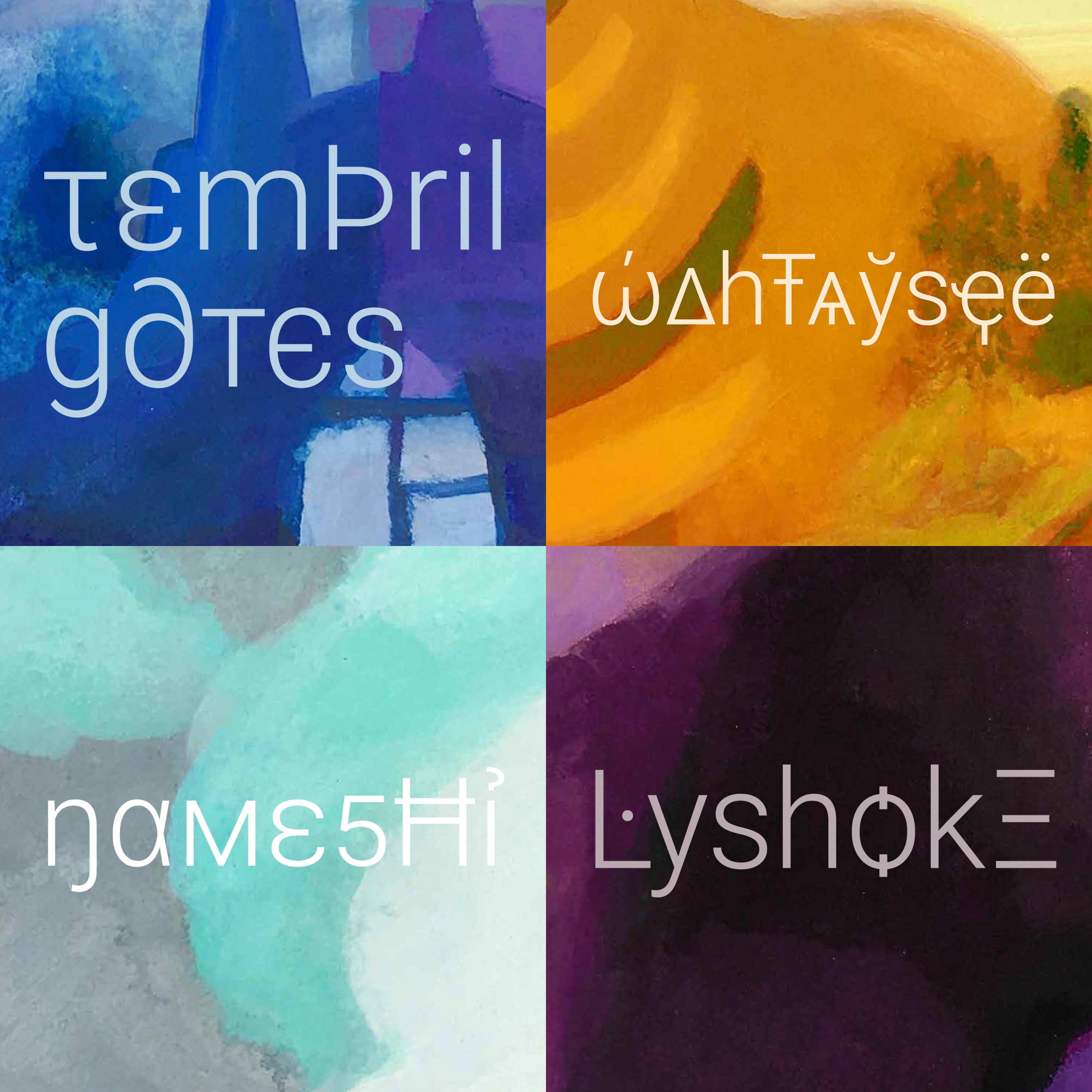
On Distant Keys
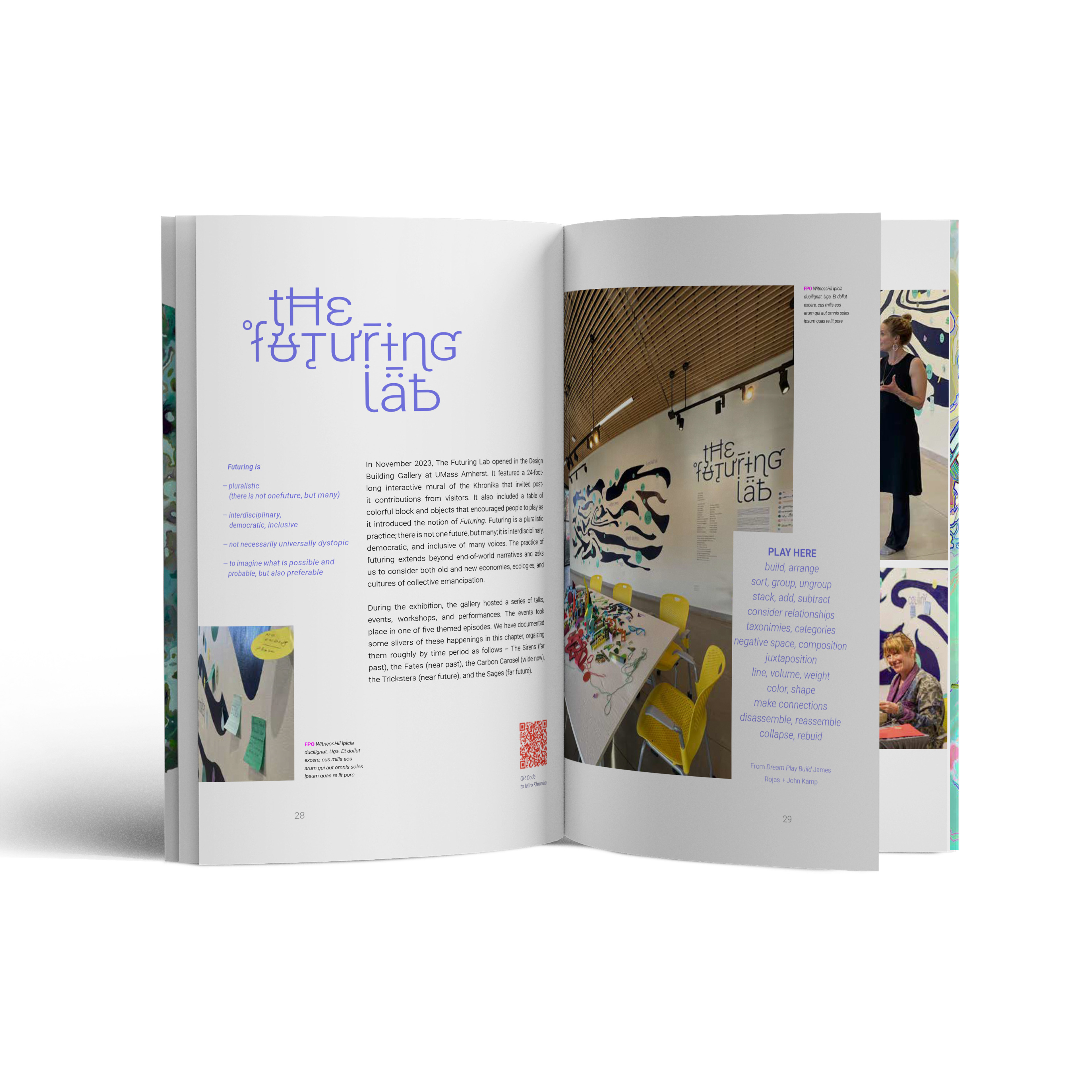
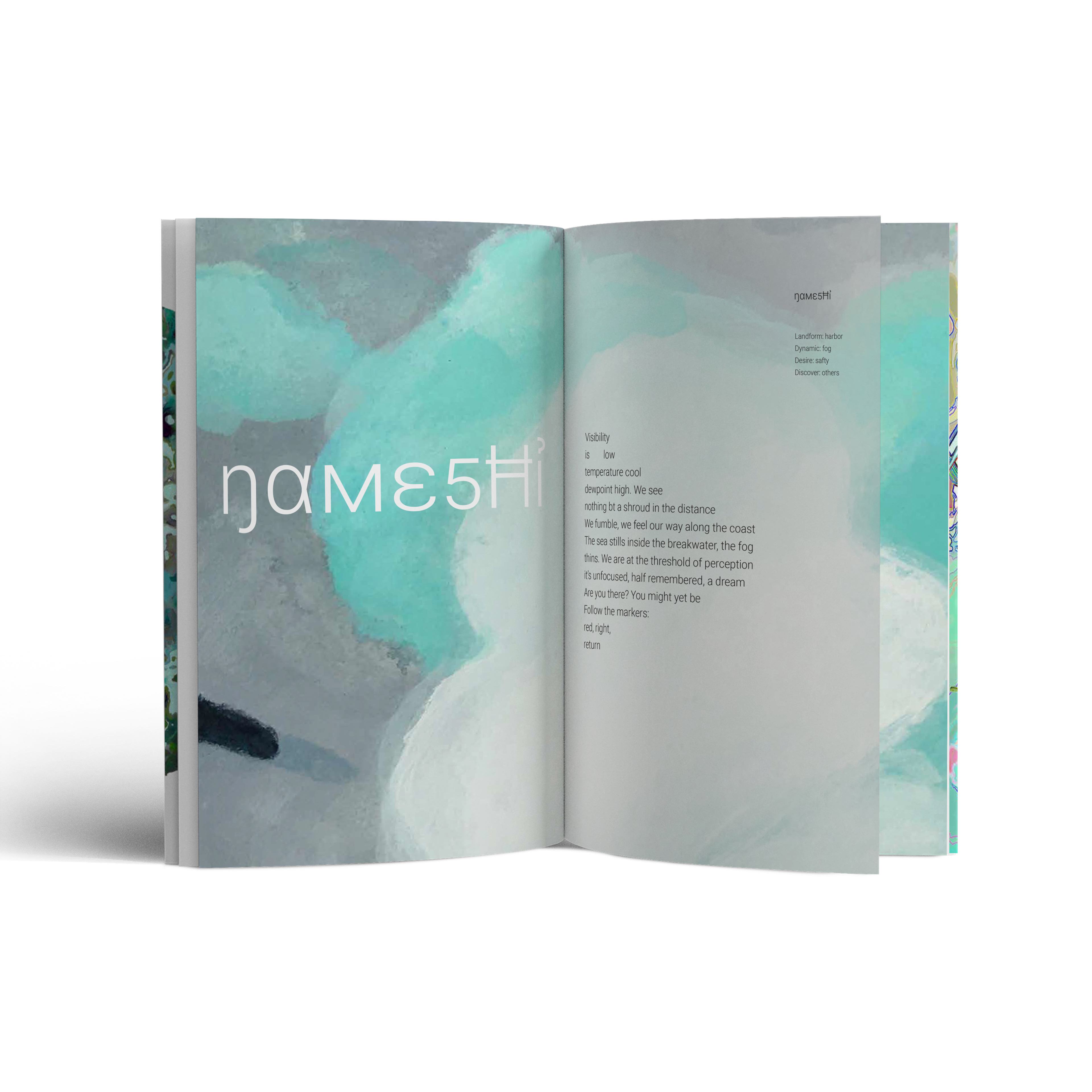
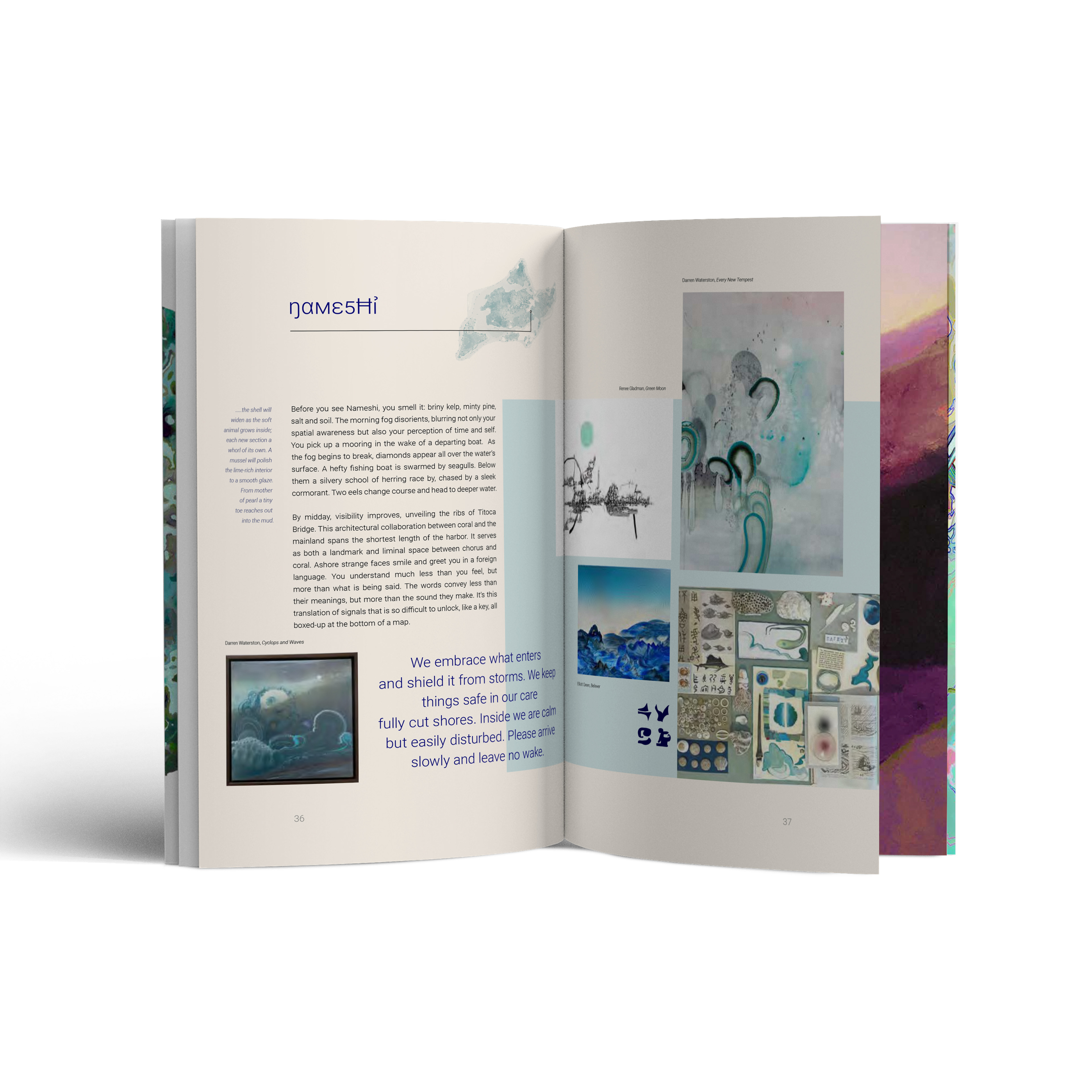
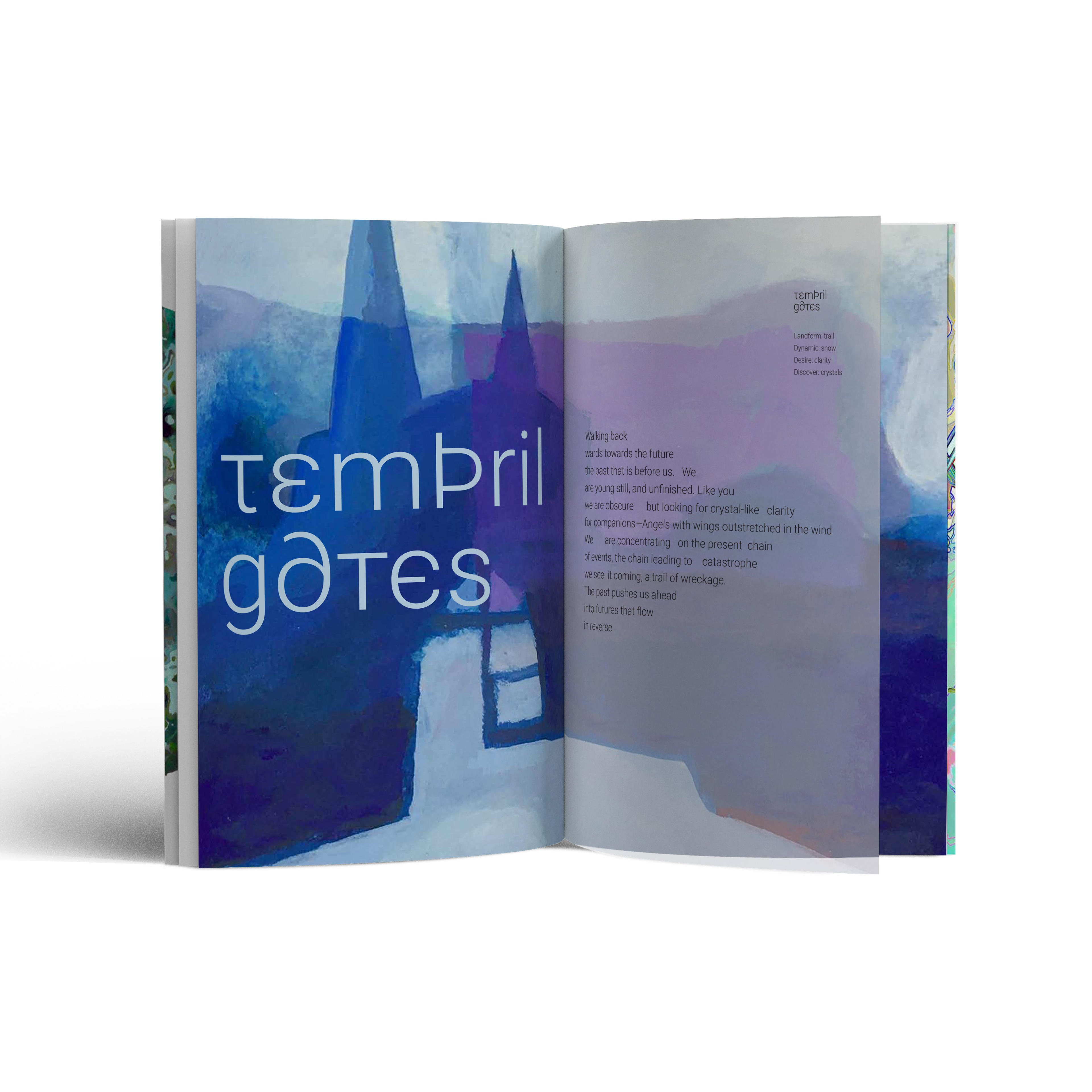
On Distant Keys is a growing collective of artists, designers, writers, scientists, and activists working collaboratively to generate speculative futures in the wake of climate change. This project highlights speculative modes of representation such as art, literature, and theory. ODK is a creative child of Sandy Litchfield, an artist and professor at UMass Amherst. What started as a personal journey became an intricate world of fantastical sentient lands and places. A world that spans over 2000 years on an intricate non-linear timeline that encourages participants to envision futures that are not only possible and probable but also preferable.
The visual identity is type-based where familiar letterforms interact with glyphs, diacritics, and accents from other languages. The identity serves as a symbolic translator between the places, the art, and the viewer.
Visual identity, signage, catalog.
The visual identity is type-based where familiar letterforms interact with glyphs, diacritics, and accents from other languages. The identity serves as a symbolic translator between the places, the art, and the viewer.
Visual identity, signage, catalog.
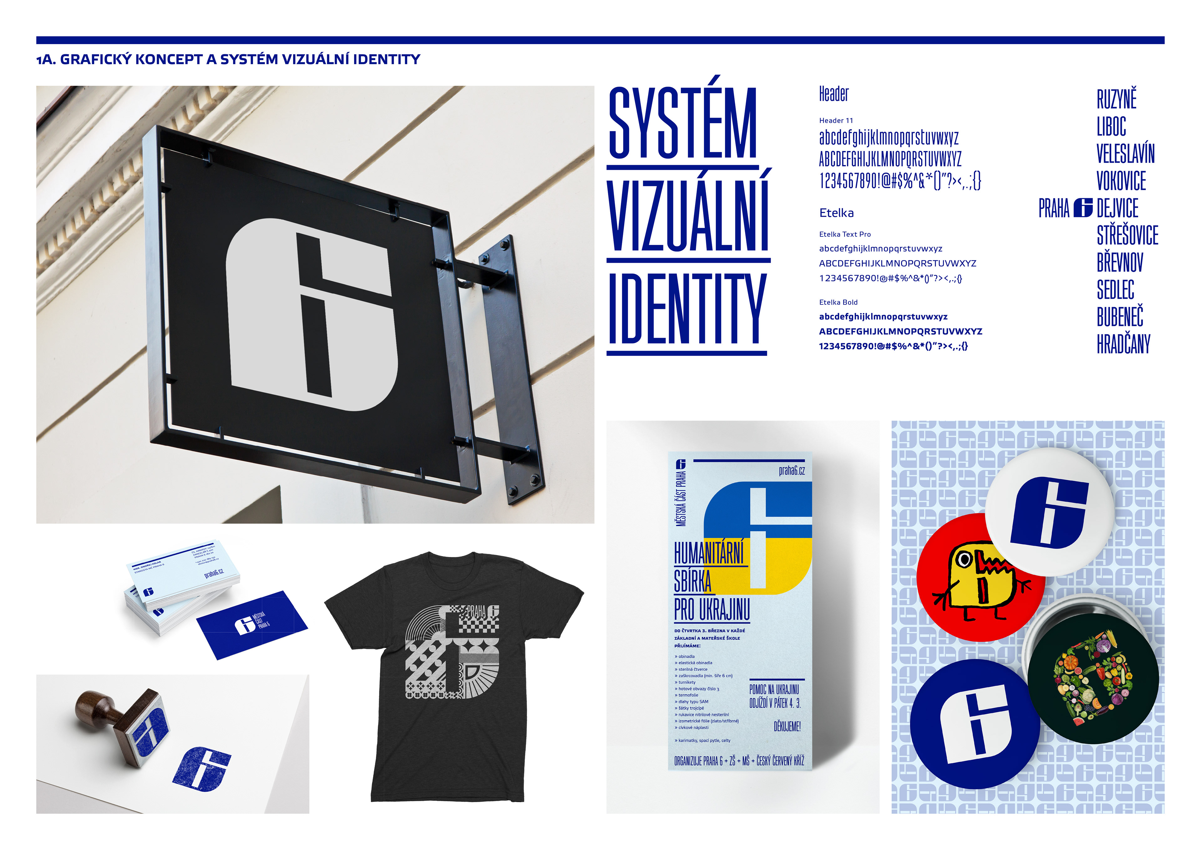
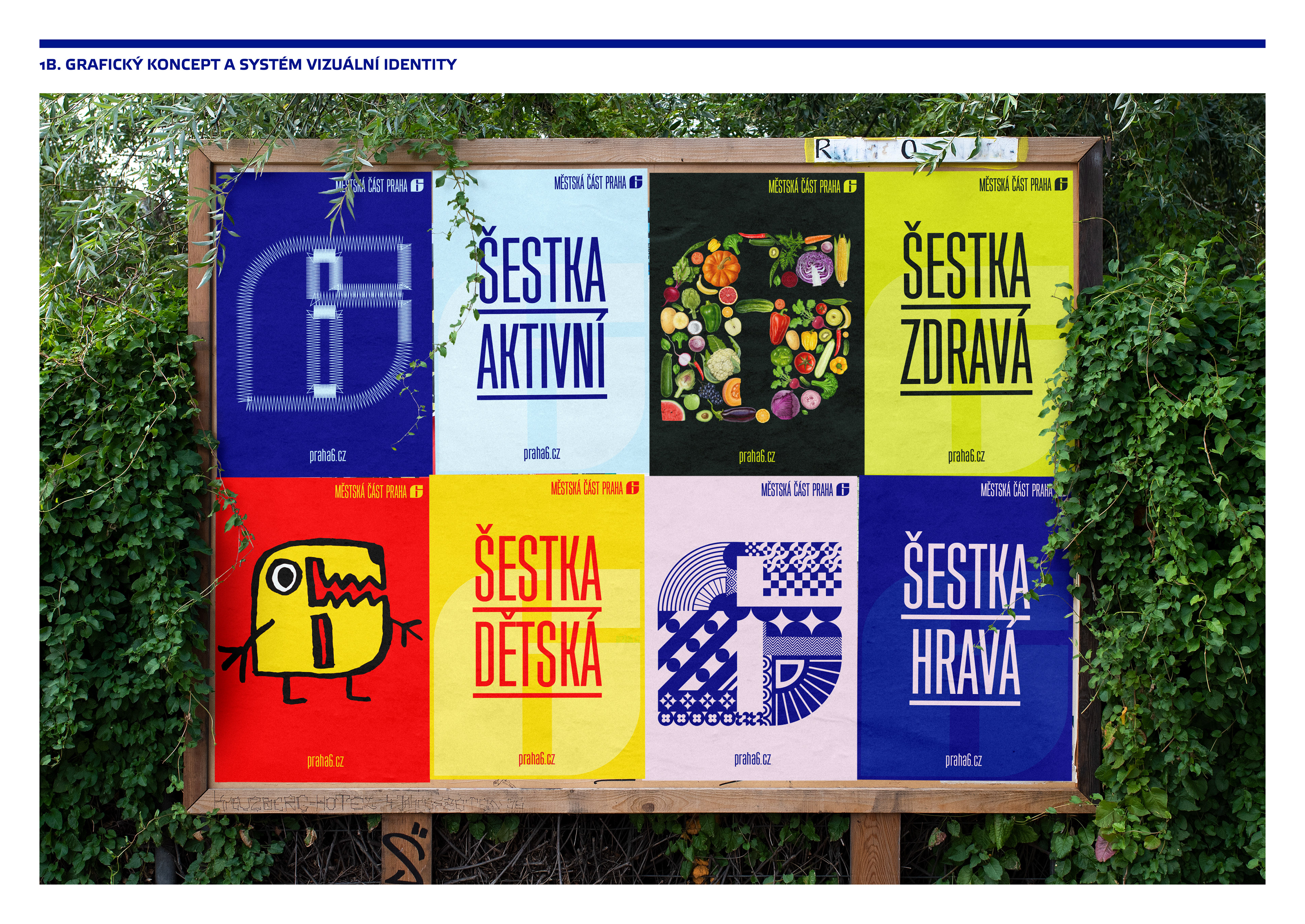
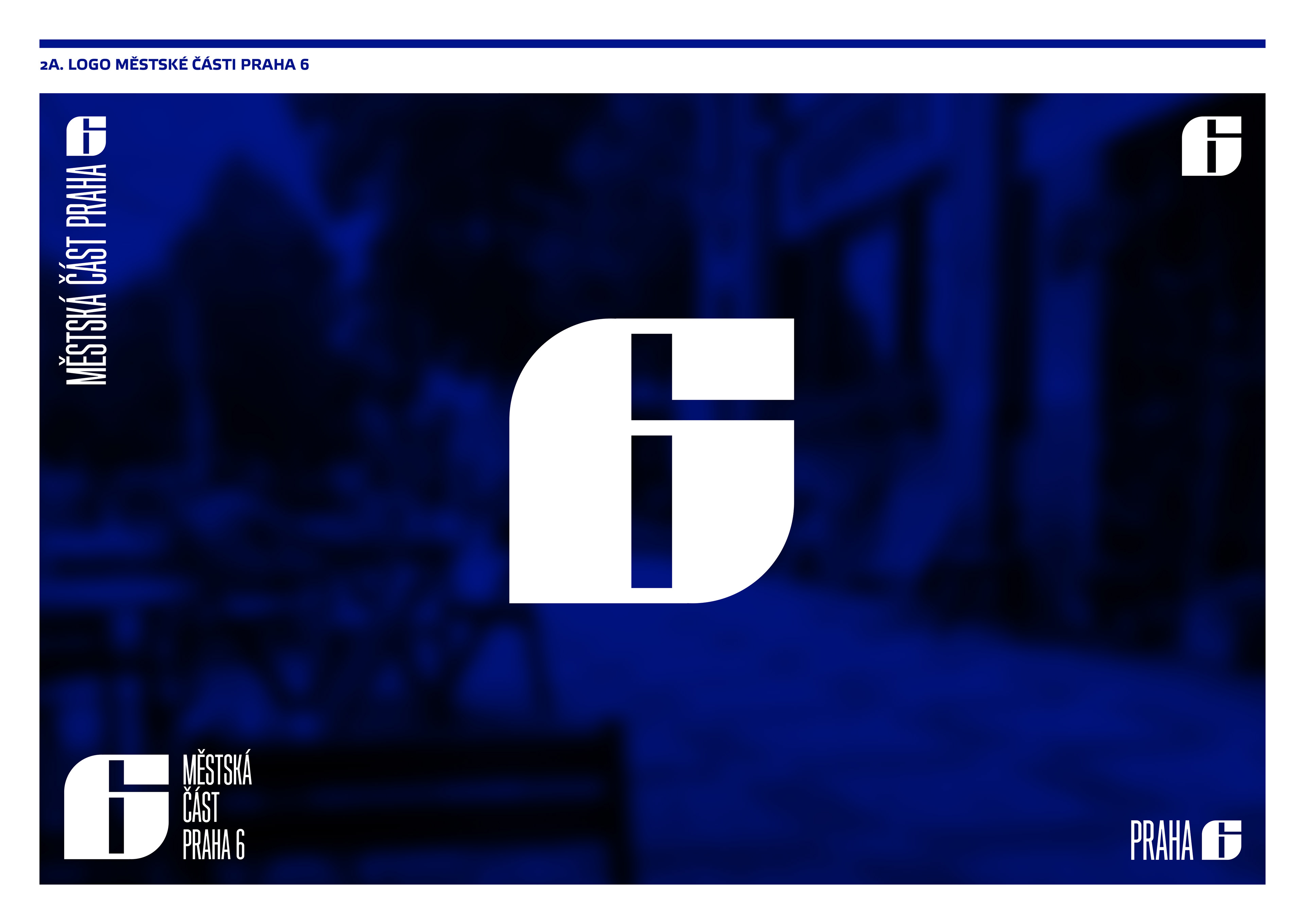
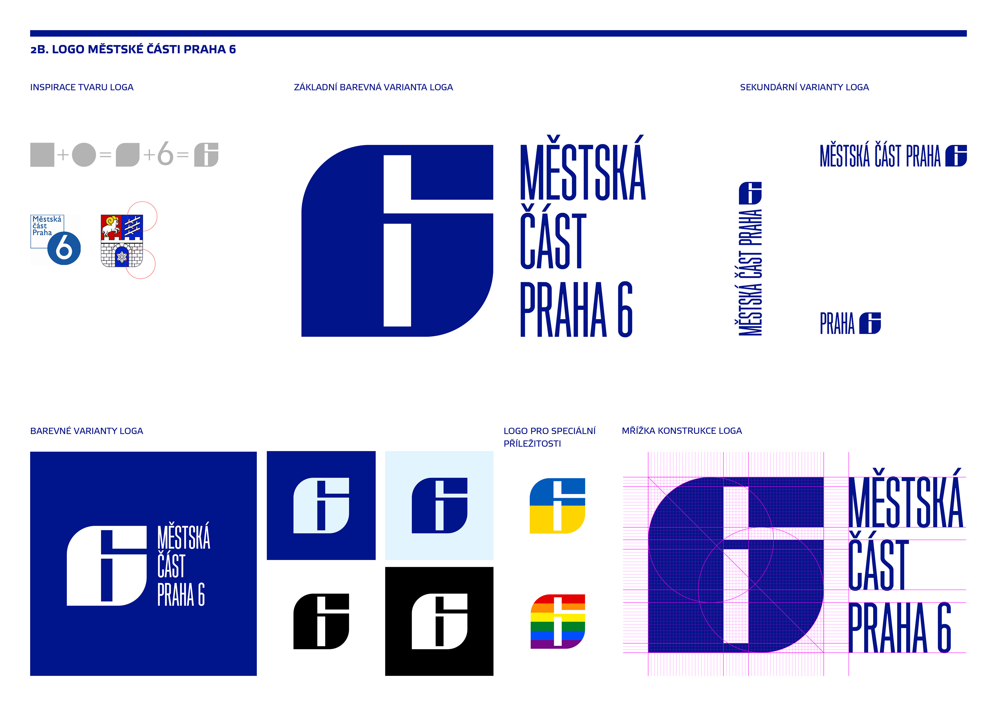
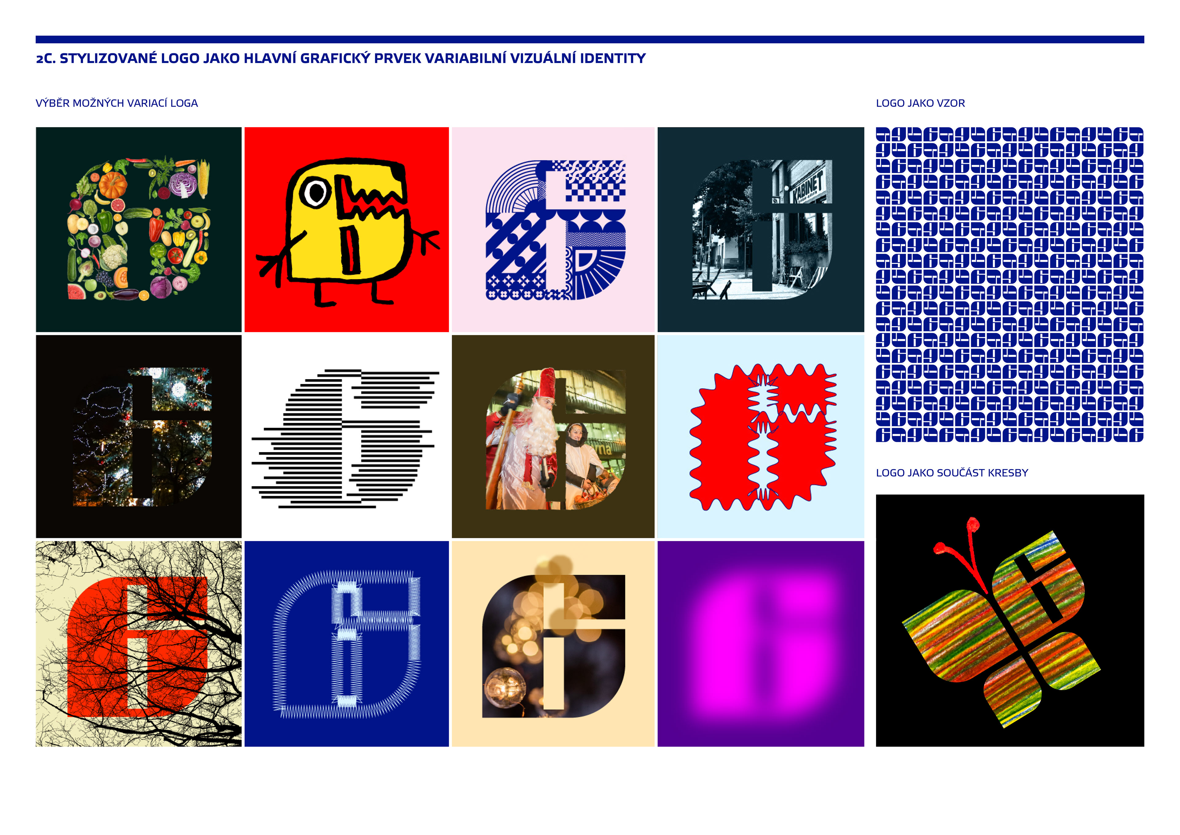
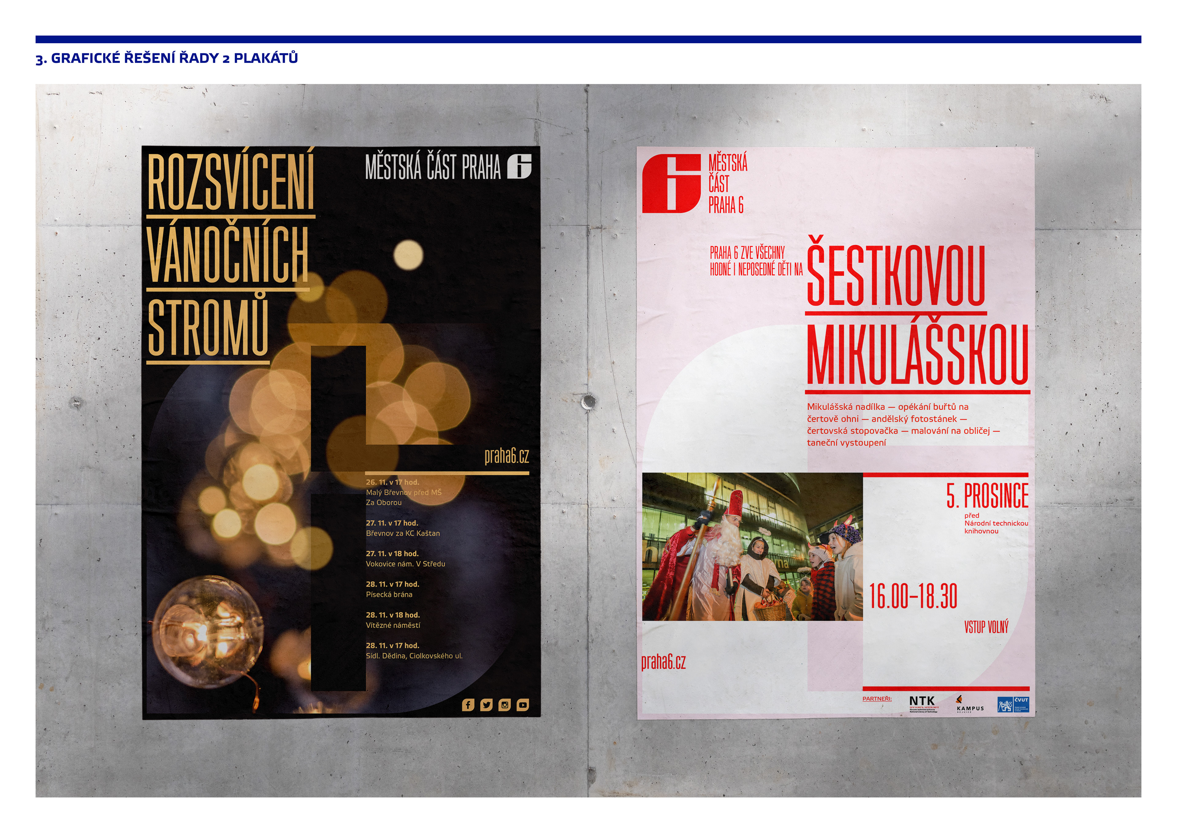
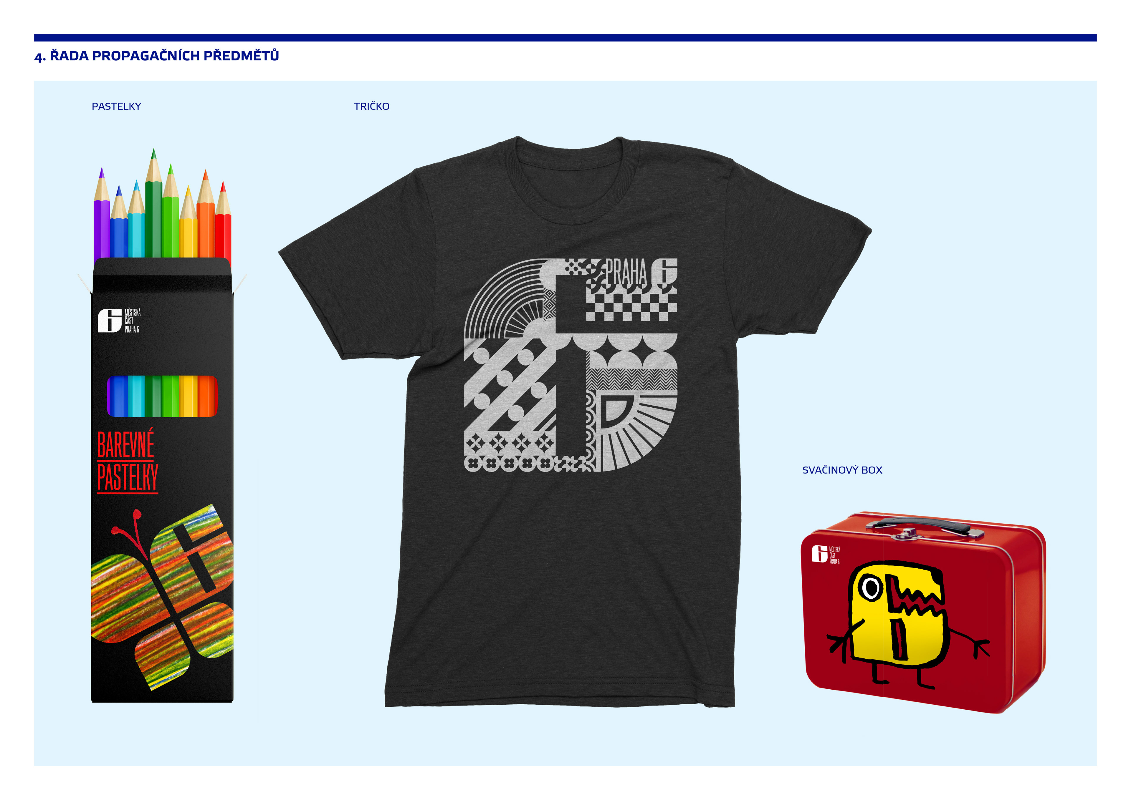
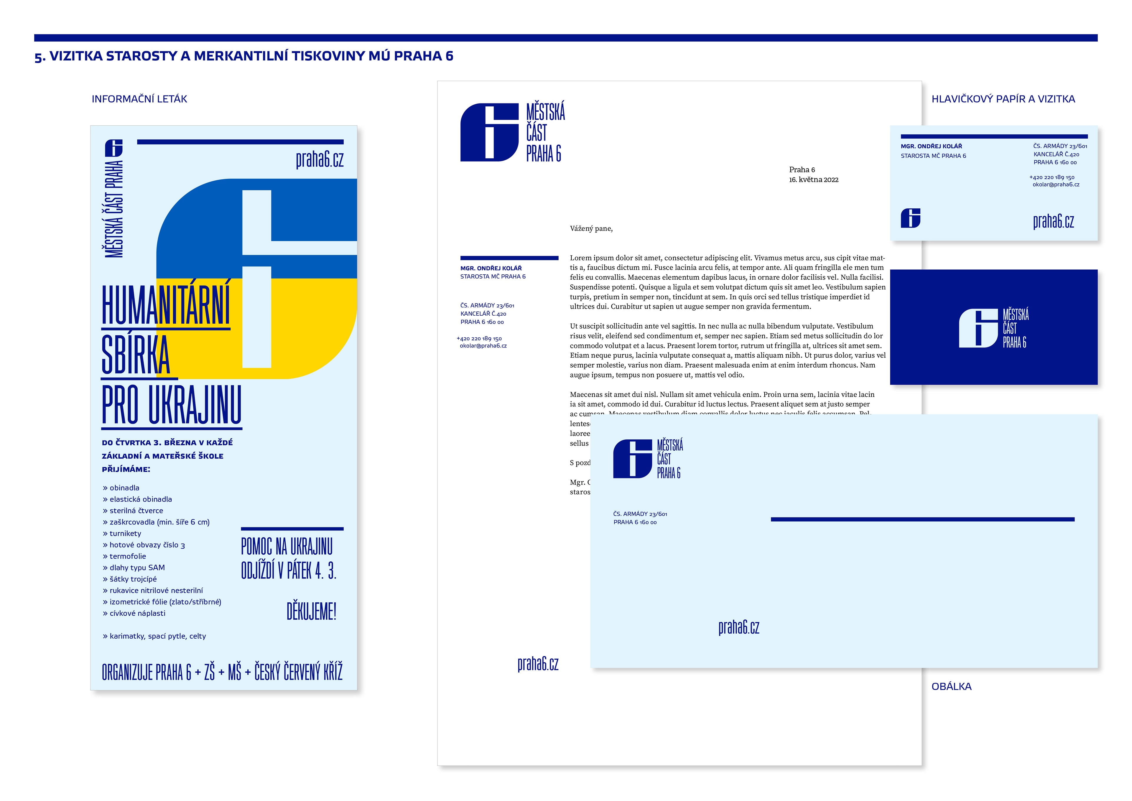
Praha 6
Proposed visual identity for the Prague 6 district in Prague, Czech Republic. Unrealized.
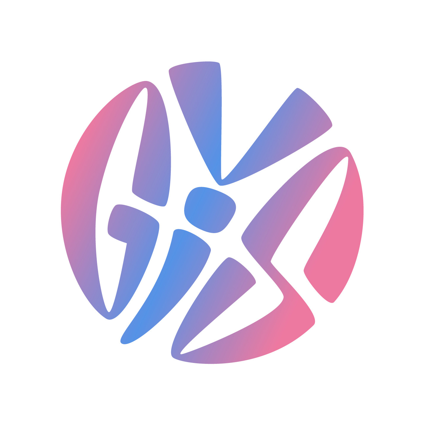
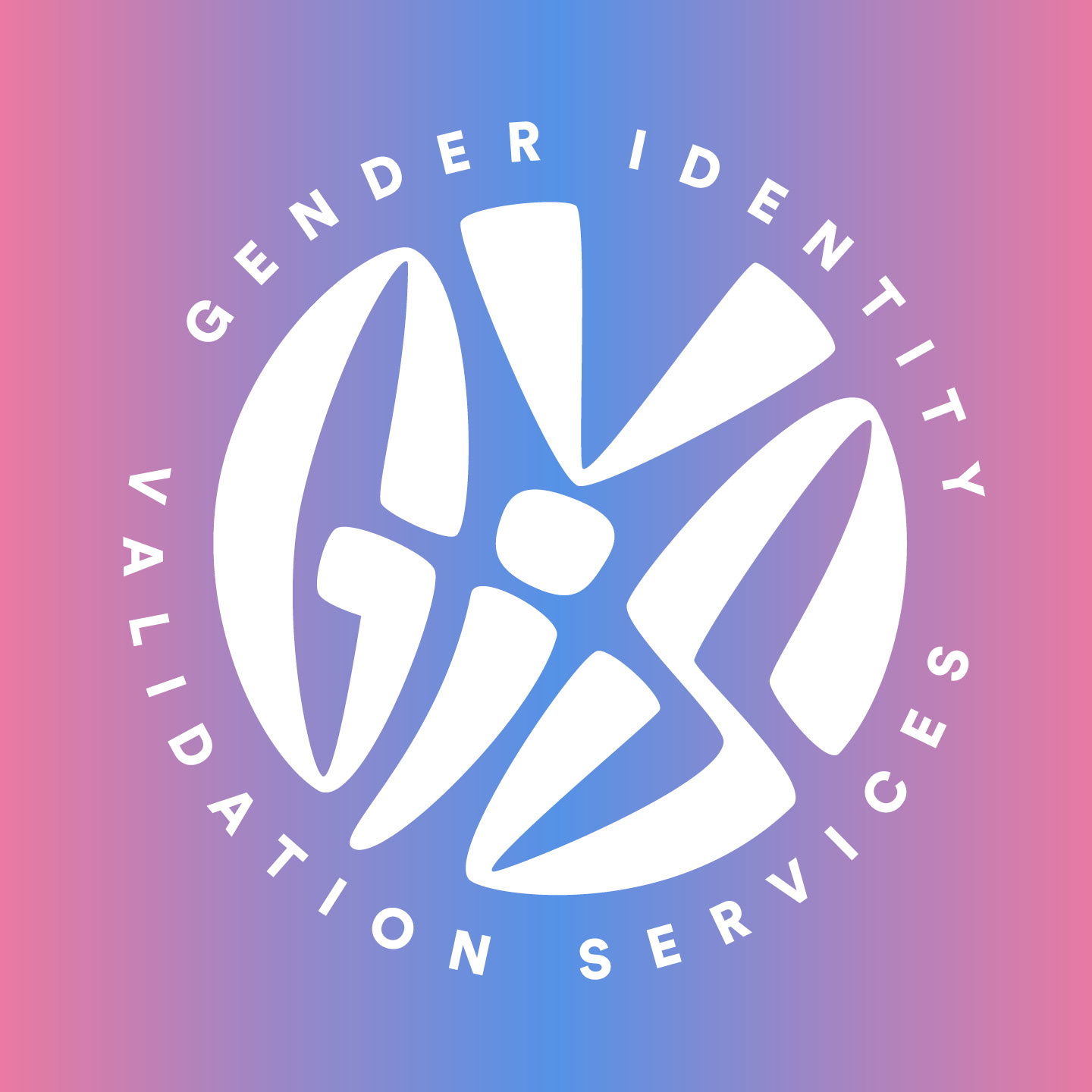
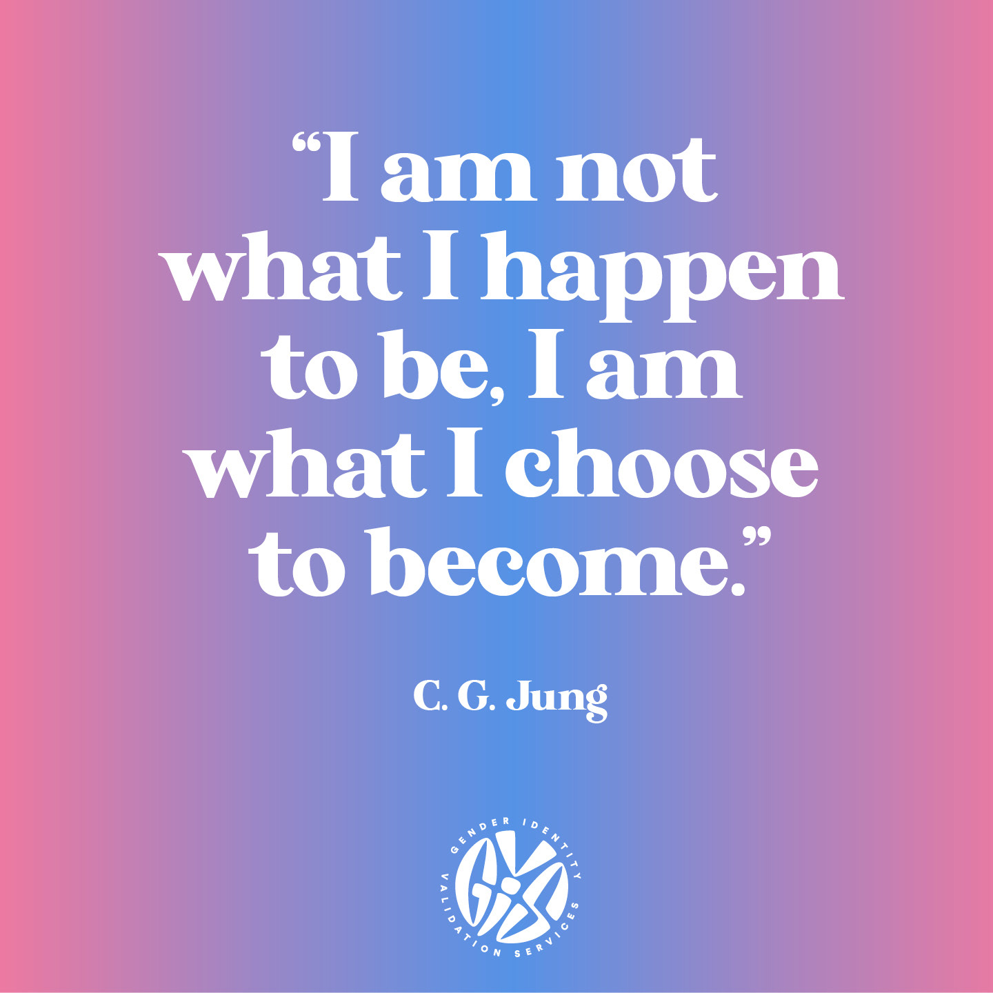
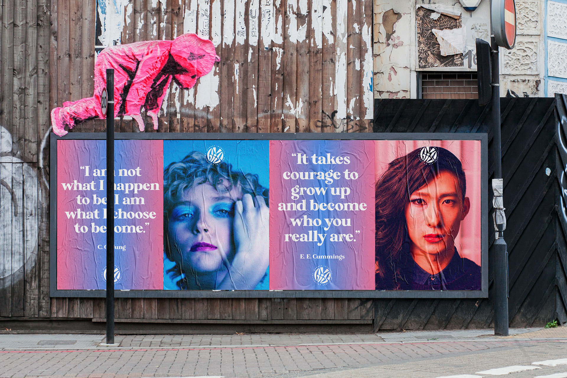
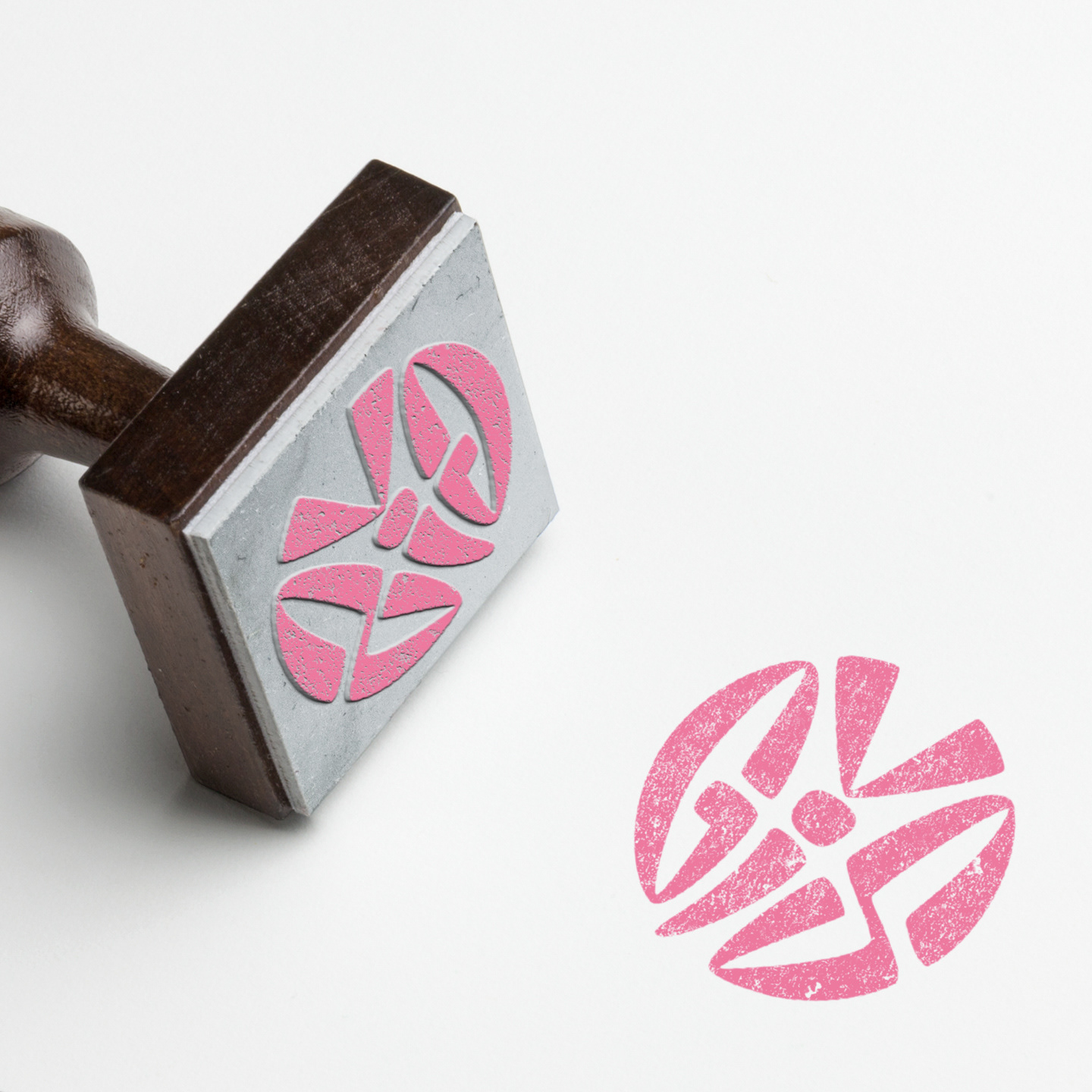
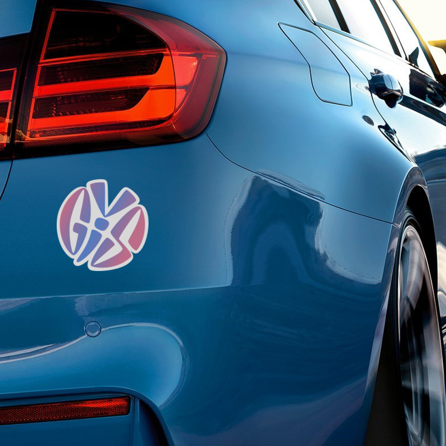
GIVS
Gender Identity Validation Services (GIVS) is a non-profit organization that provides psychological and legal support for gender diverse individuals. The typographic butterfly serves as a symbol of transformation and identification. The metamorphosis is supported by the color gradient that stems from the established transgender color palette.
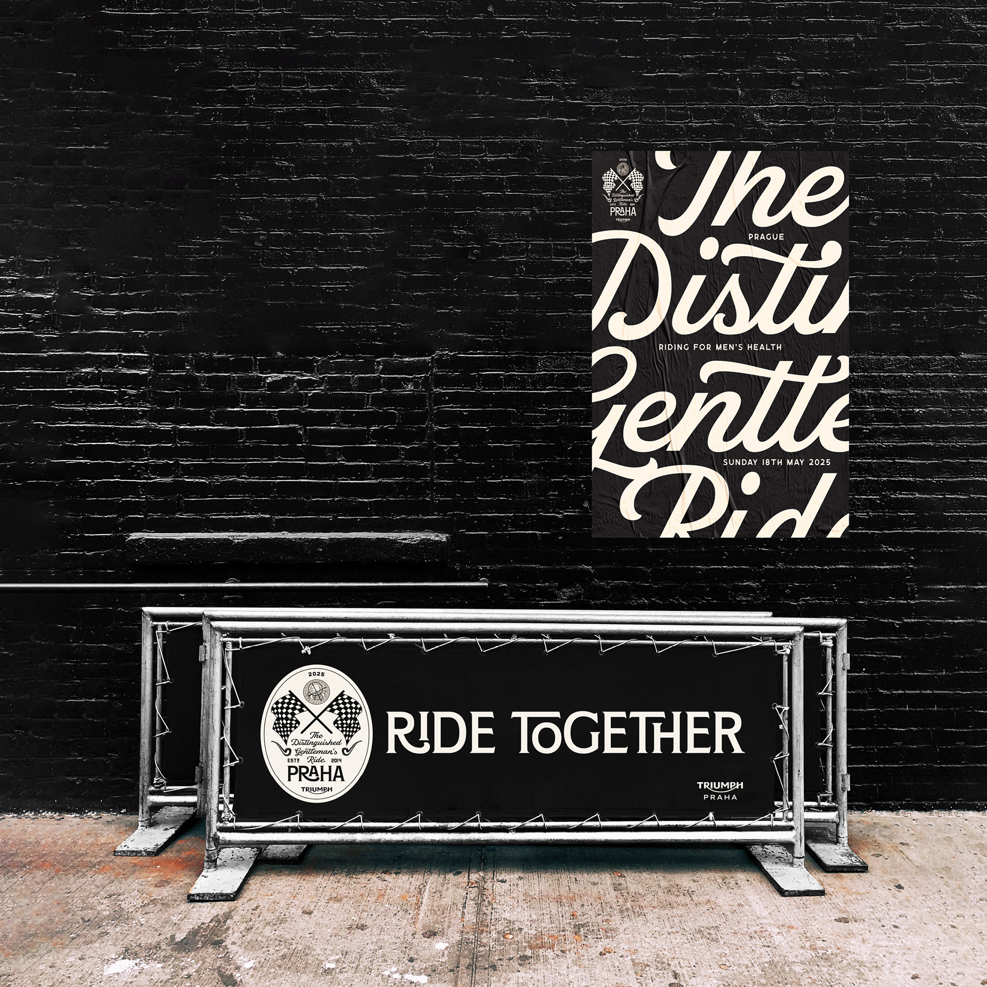
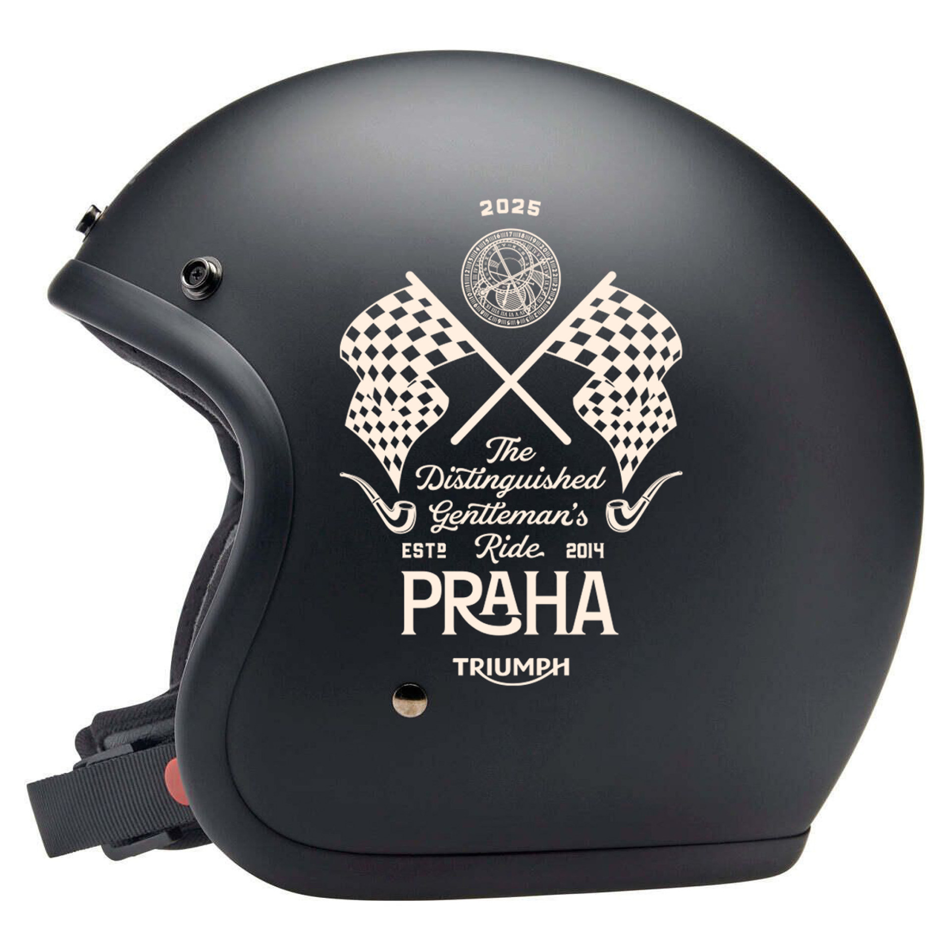
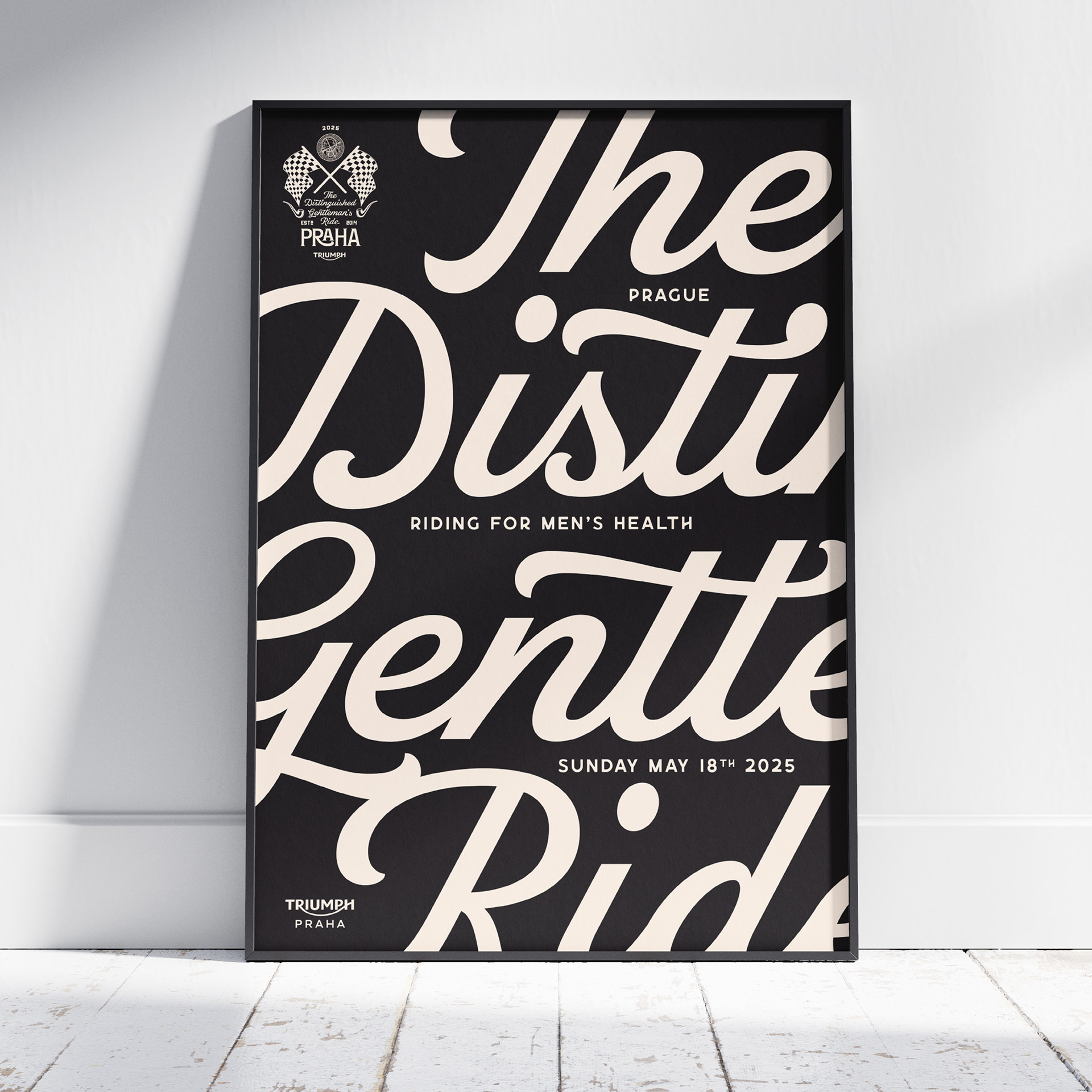
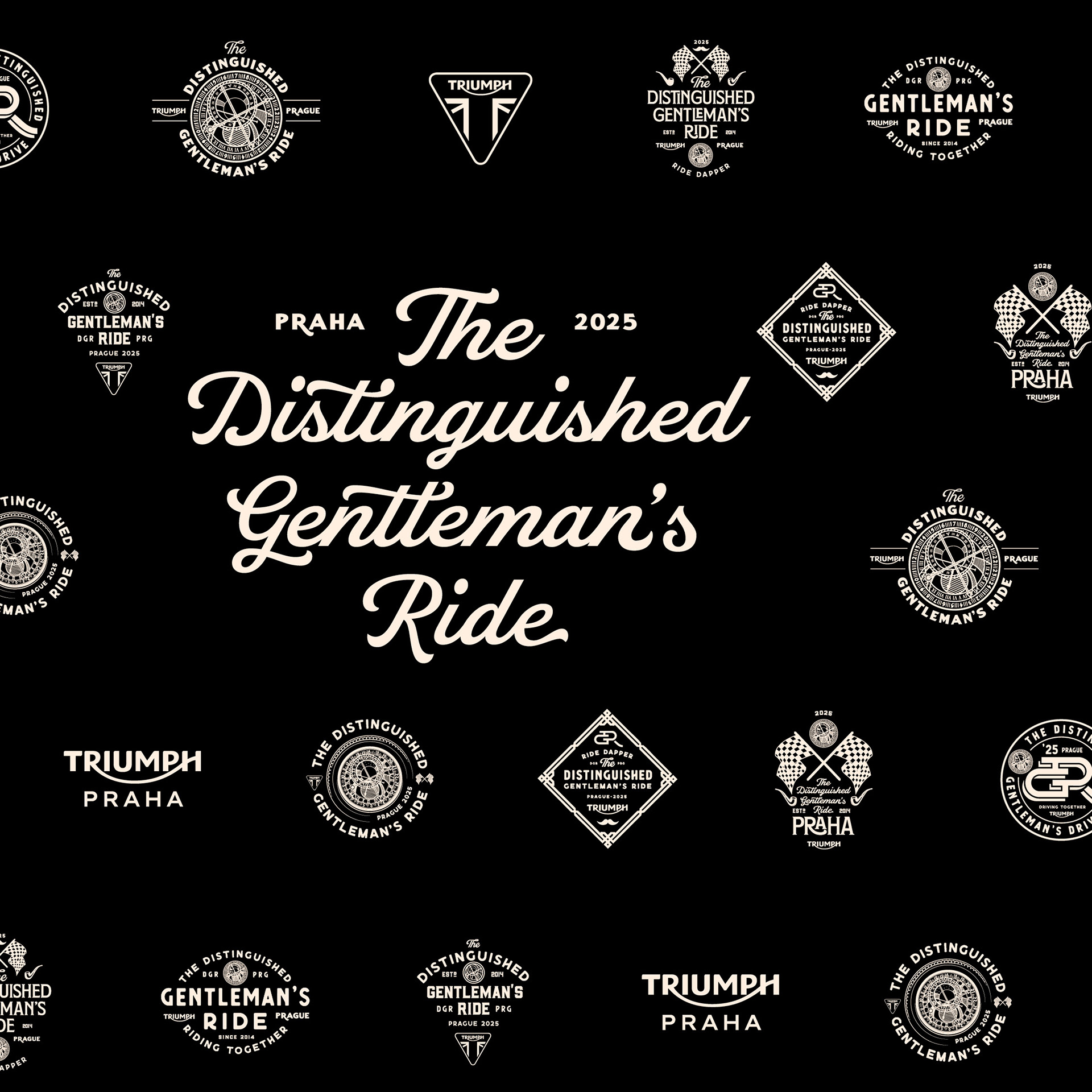
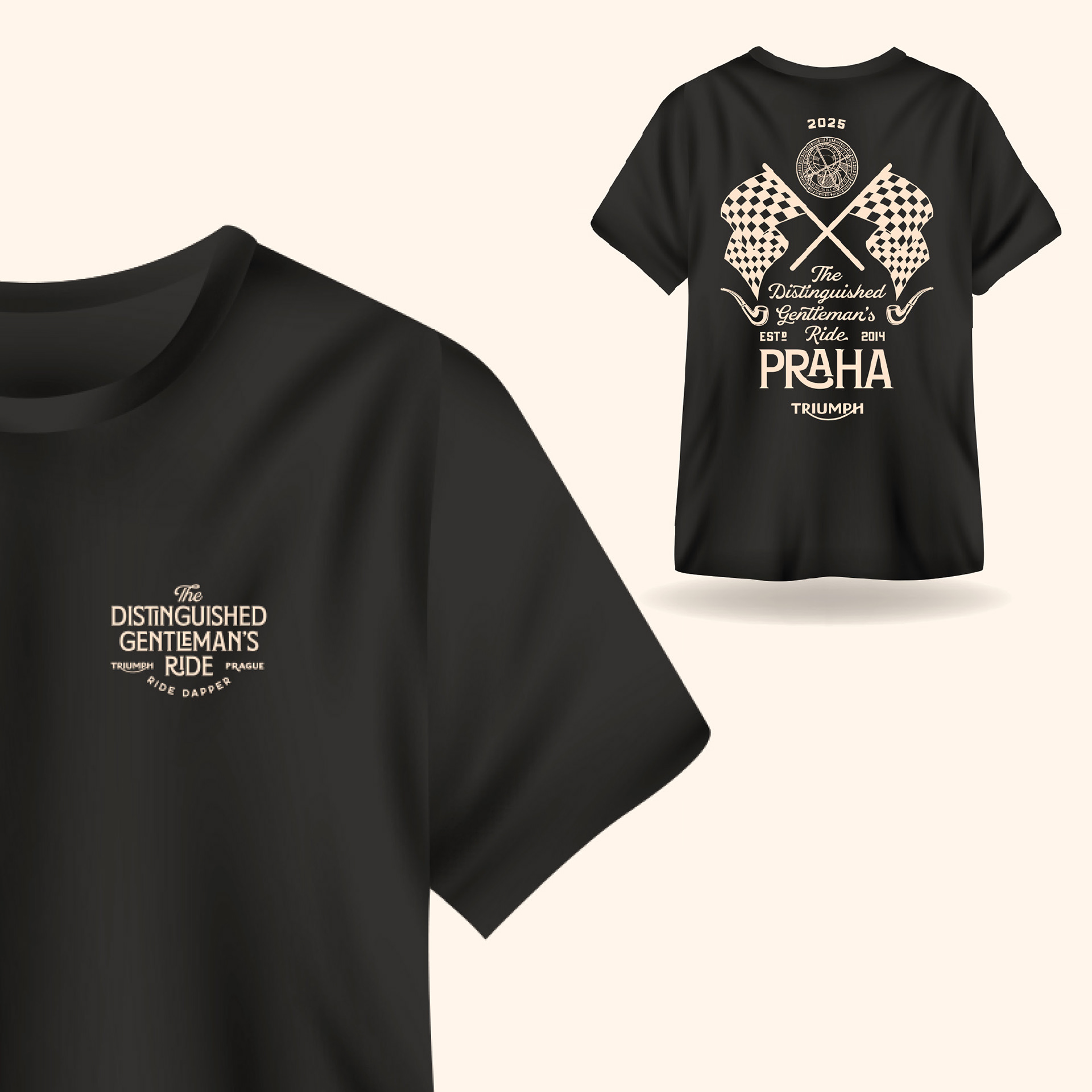
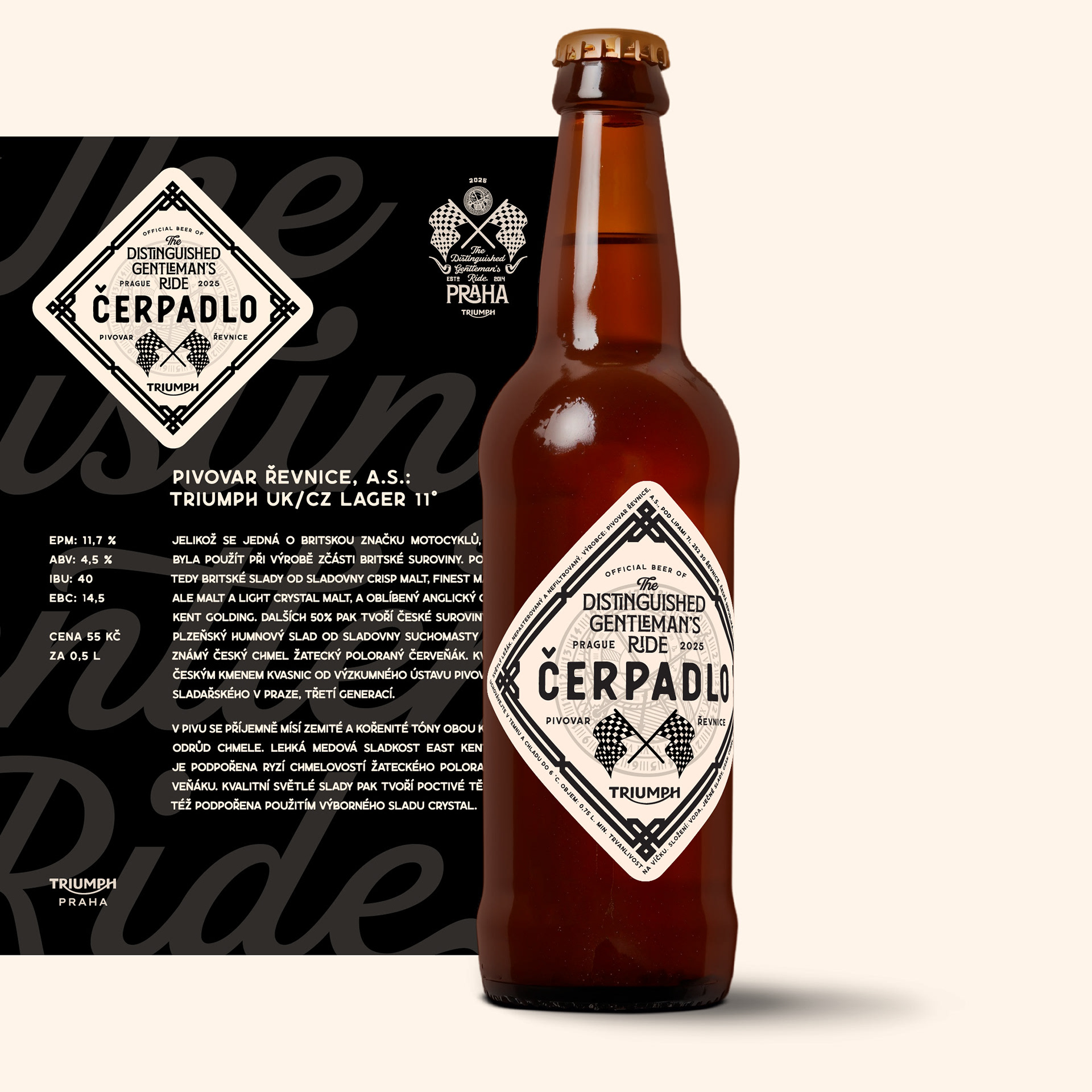
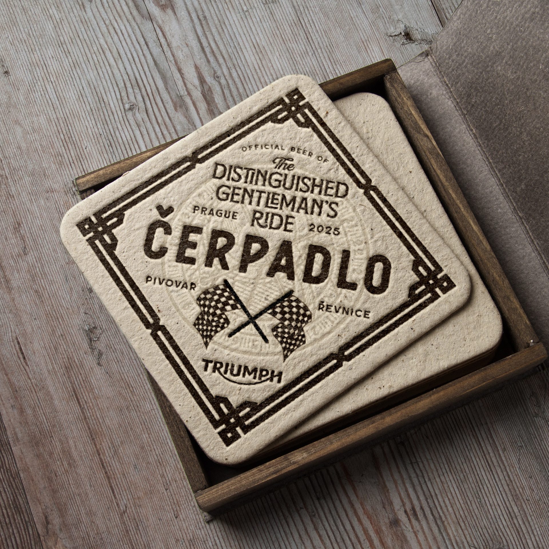
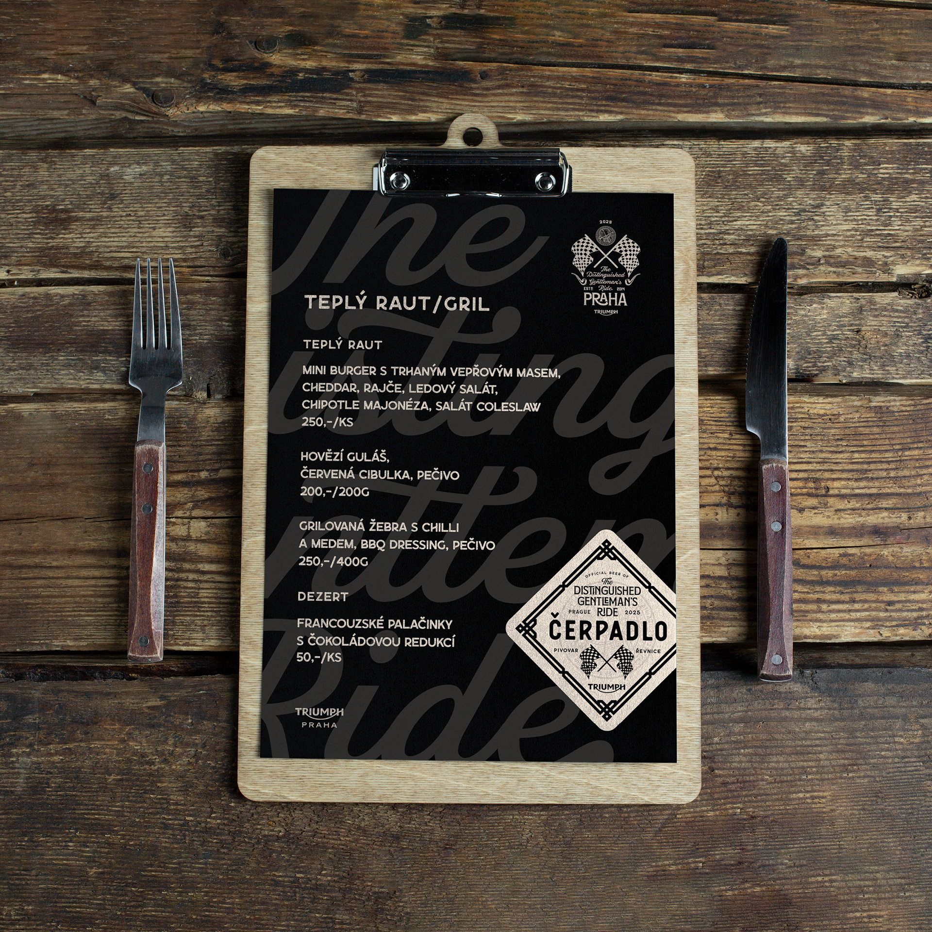
The Distinguished Gentleman’s Ride After Party in Prague.
Client: Triumph, Prague
The Distinguished Gentleman’s Ride unites classic and vintage-style motorcycle riders from all over the world to raise funds and awareness for prostate cancer research and men’s mental health.
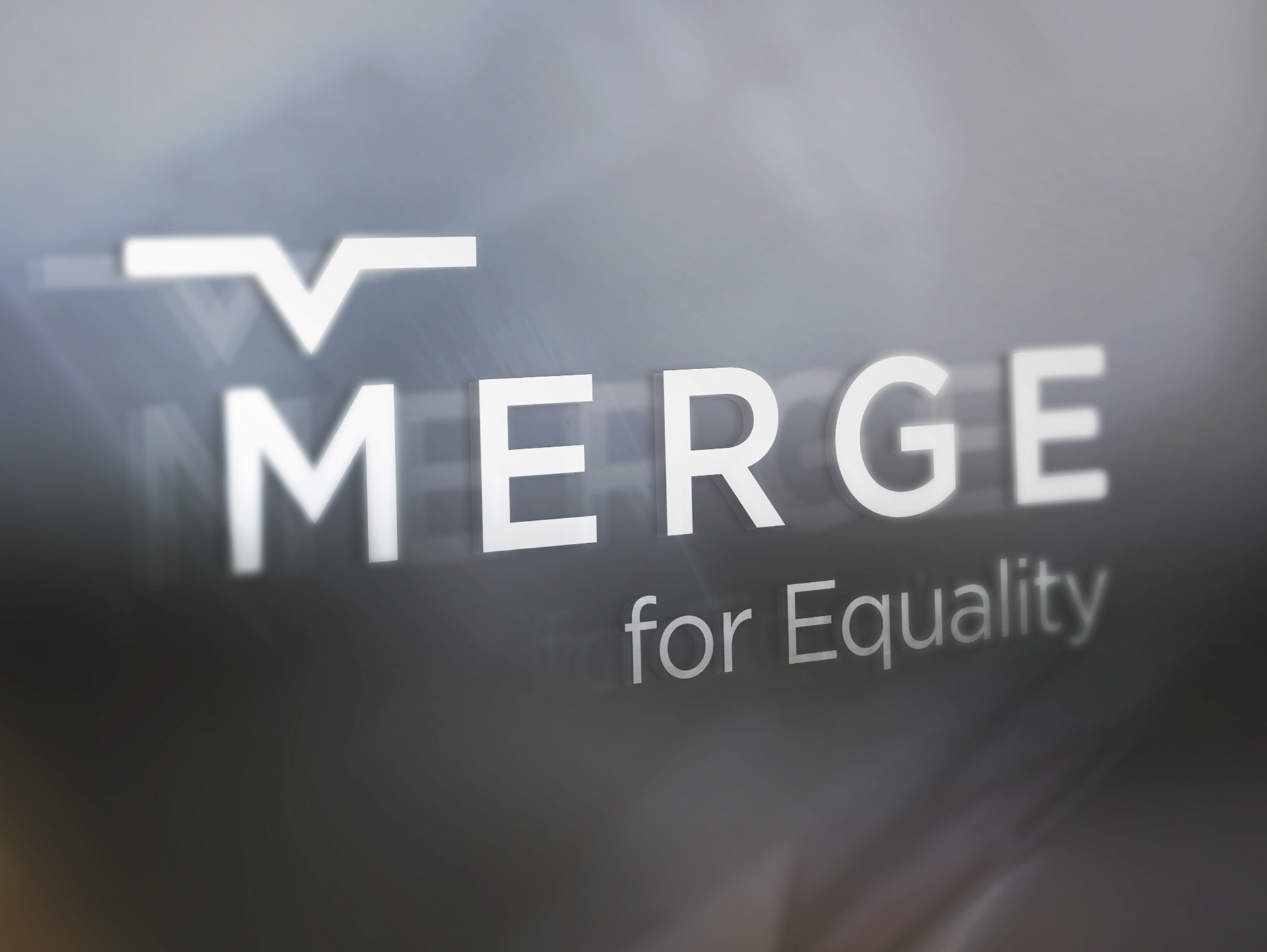
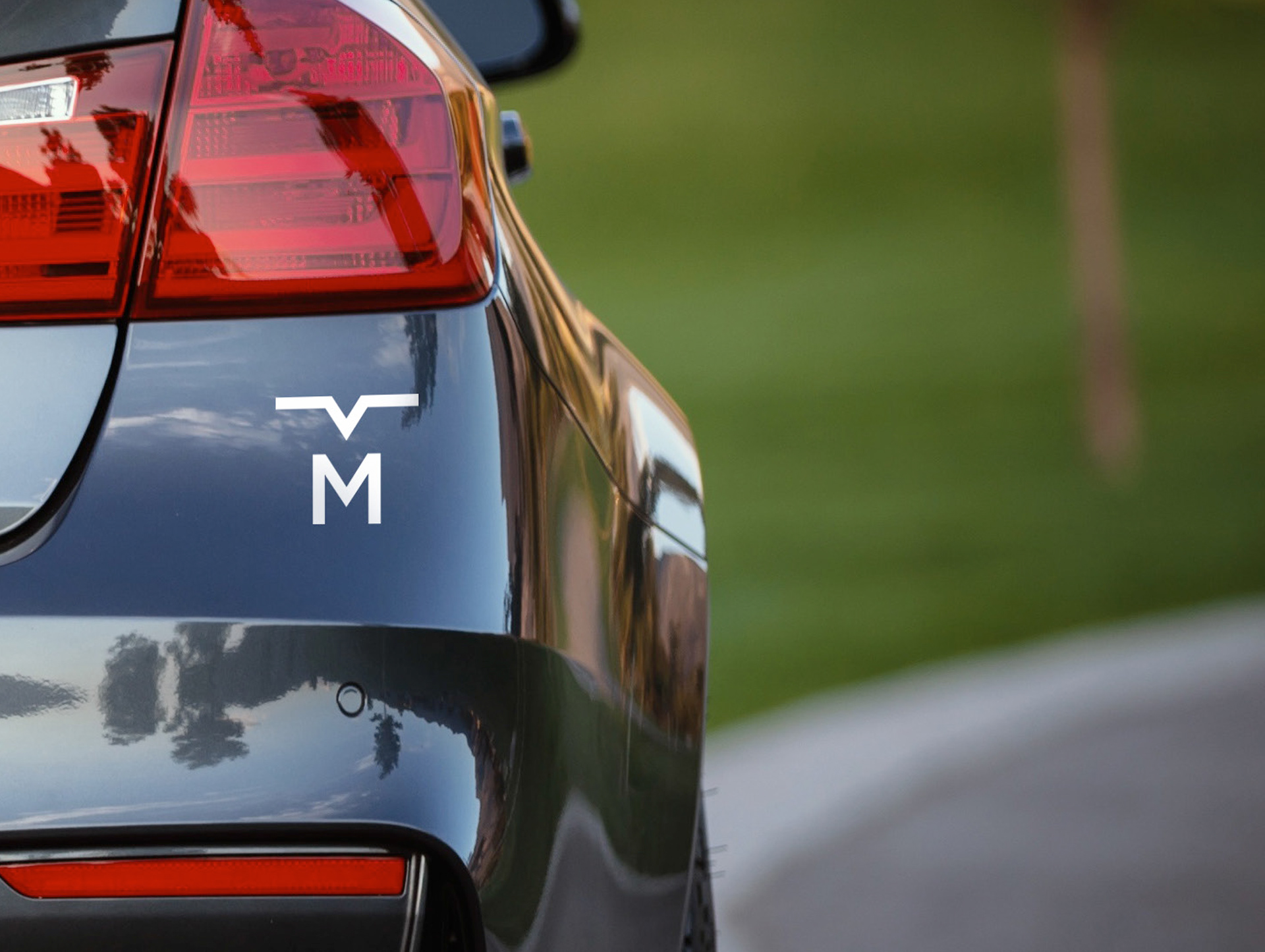
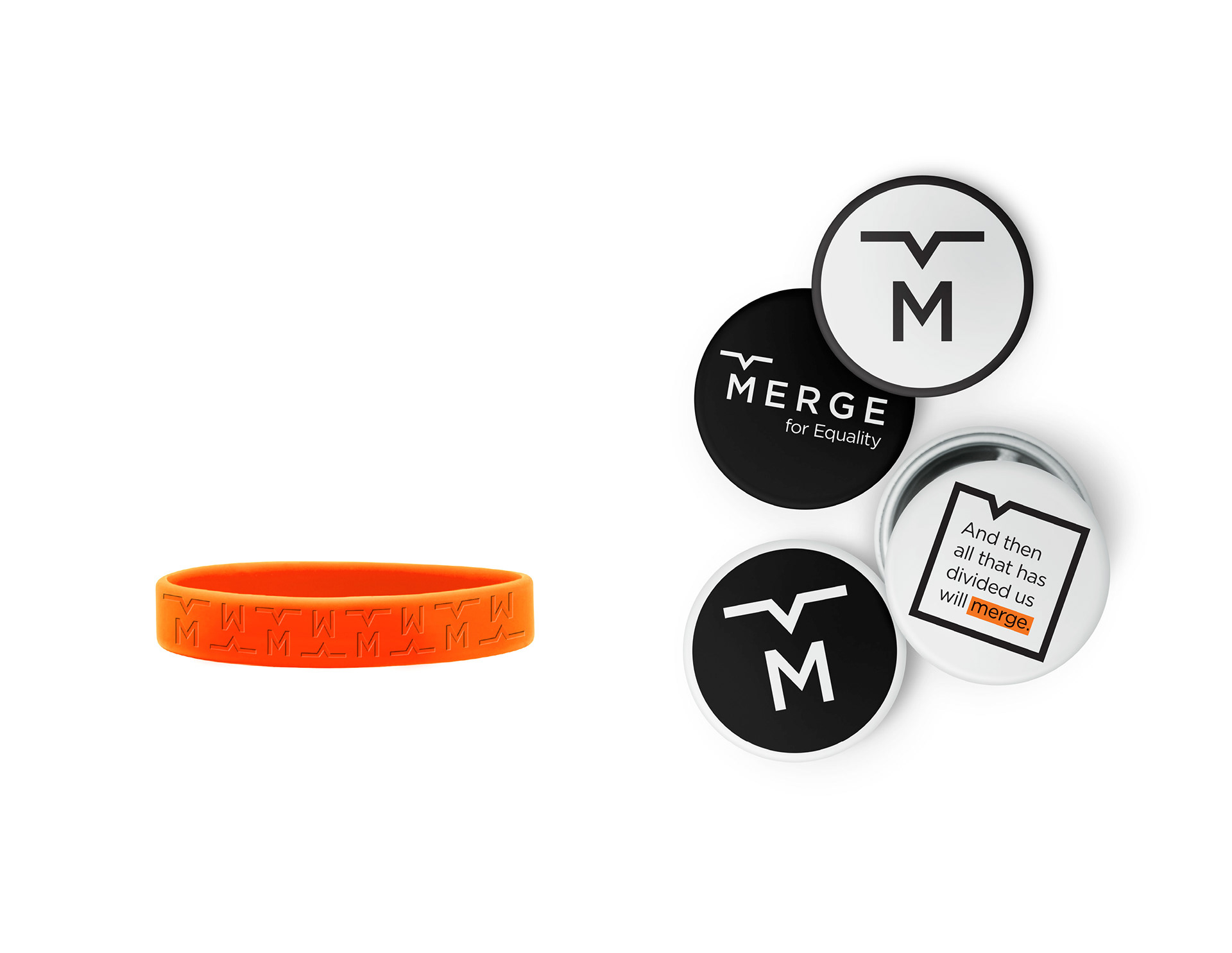
MERGE
Logo for a non-profit organization whose goal is to help reduce the number of domestic violence cases by focusing on prevention and education.
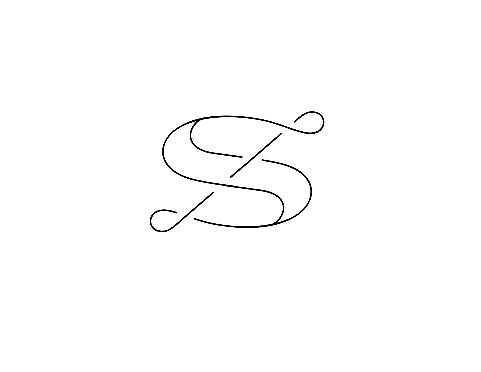
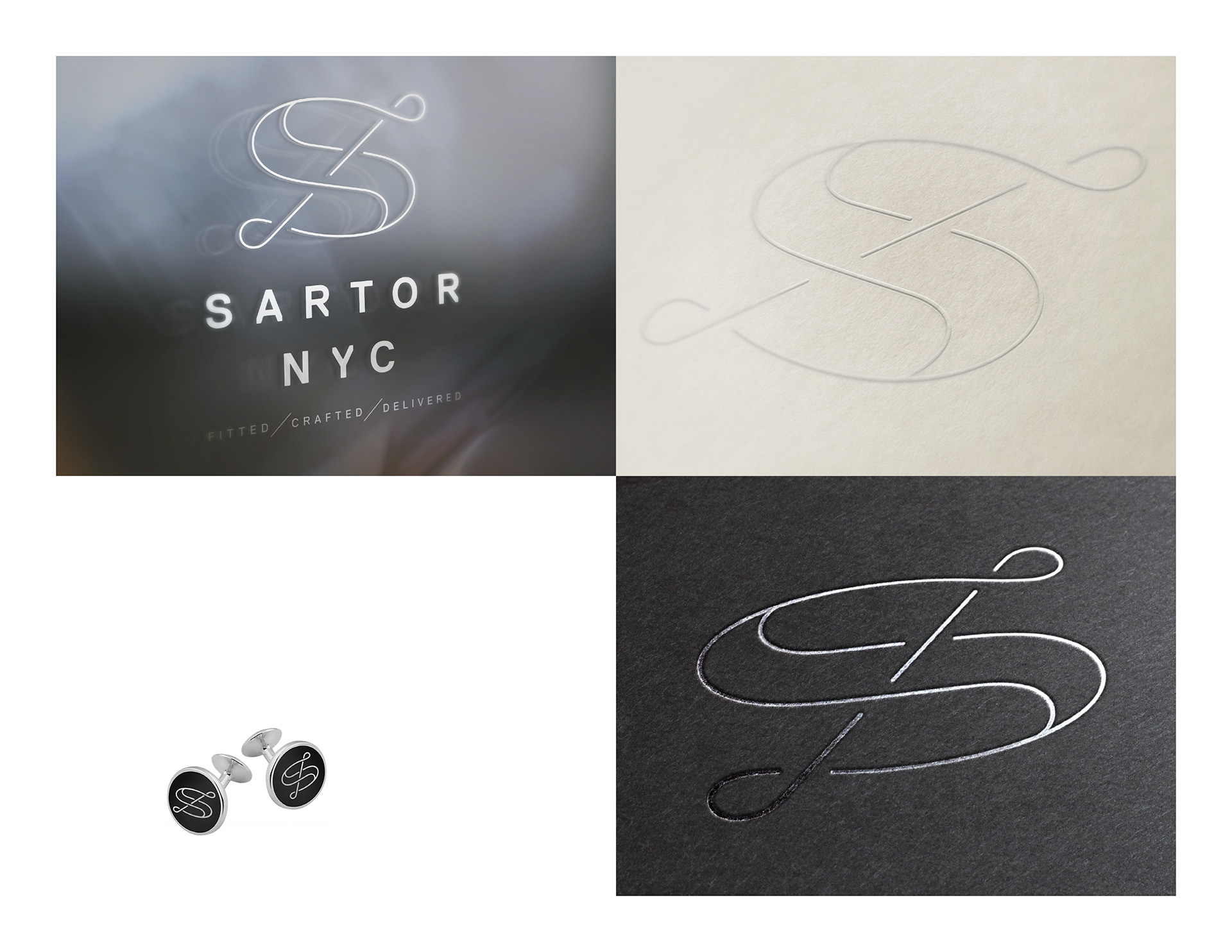
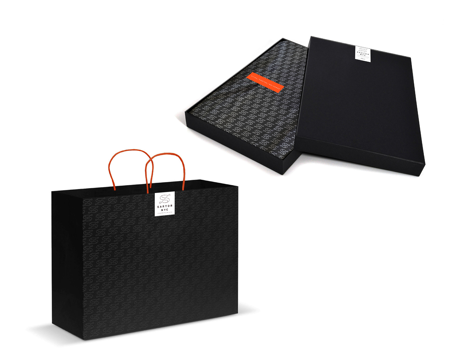
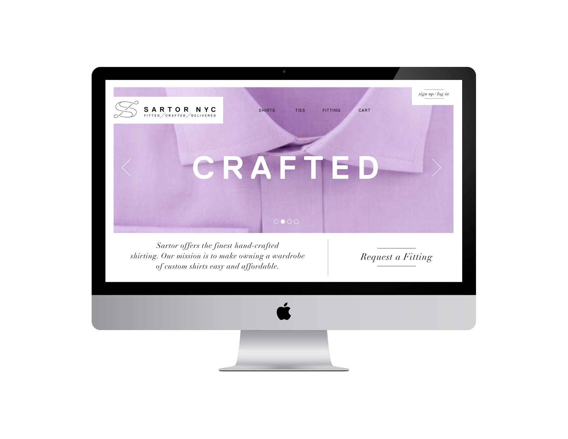
Sartor NYC
Identity for an online tailor and retail shop providing customers with high quality custom tailored shirts using a proprietary fitting method and high end materials for a reasonable price.
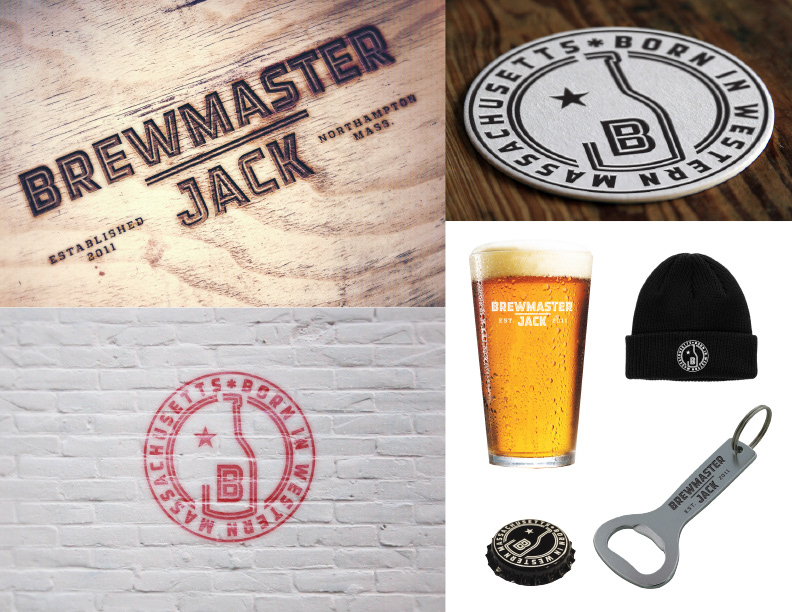
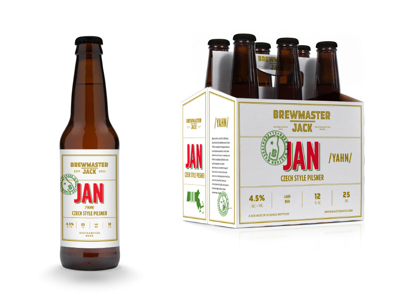
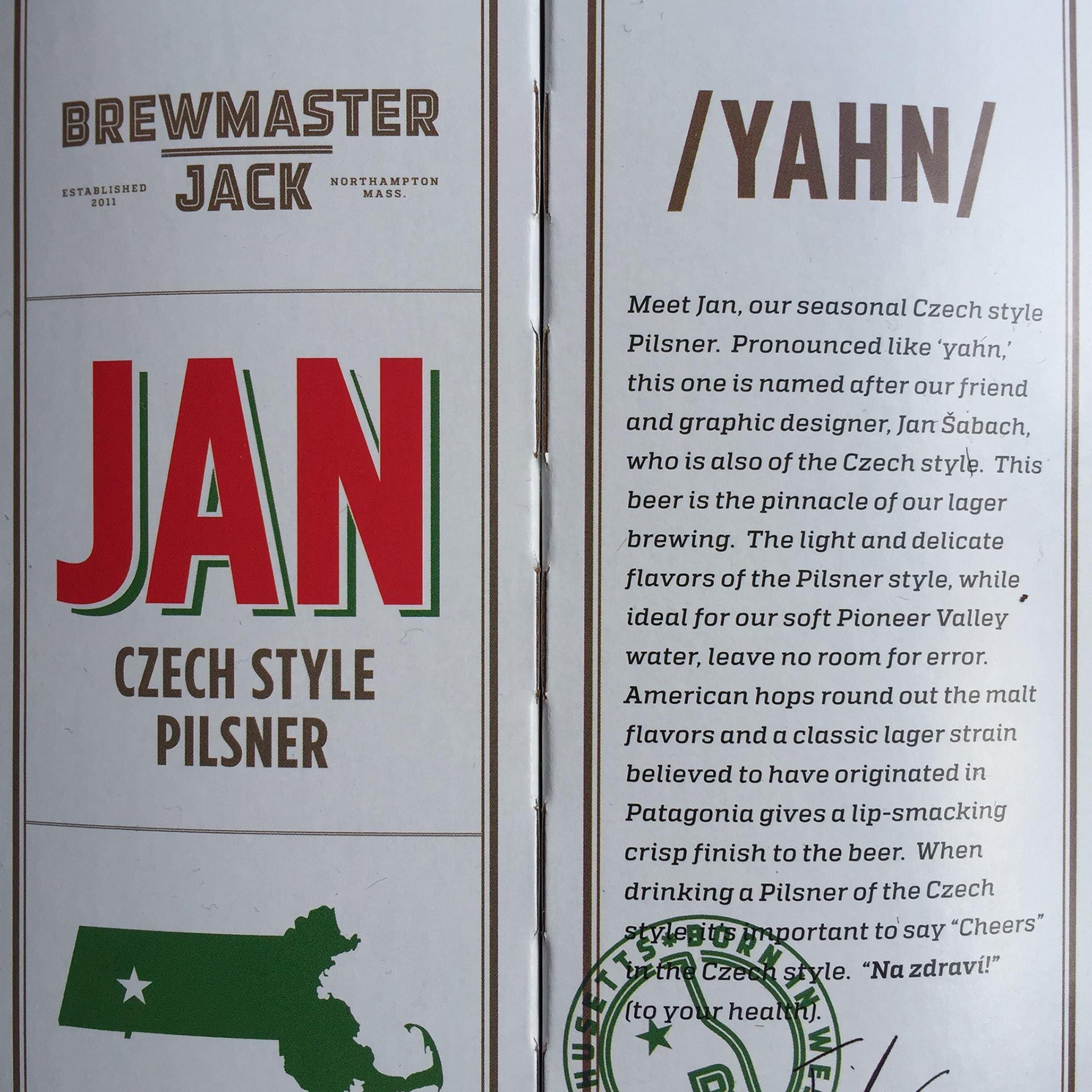
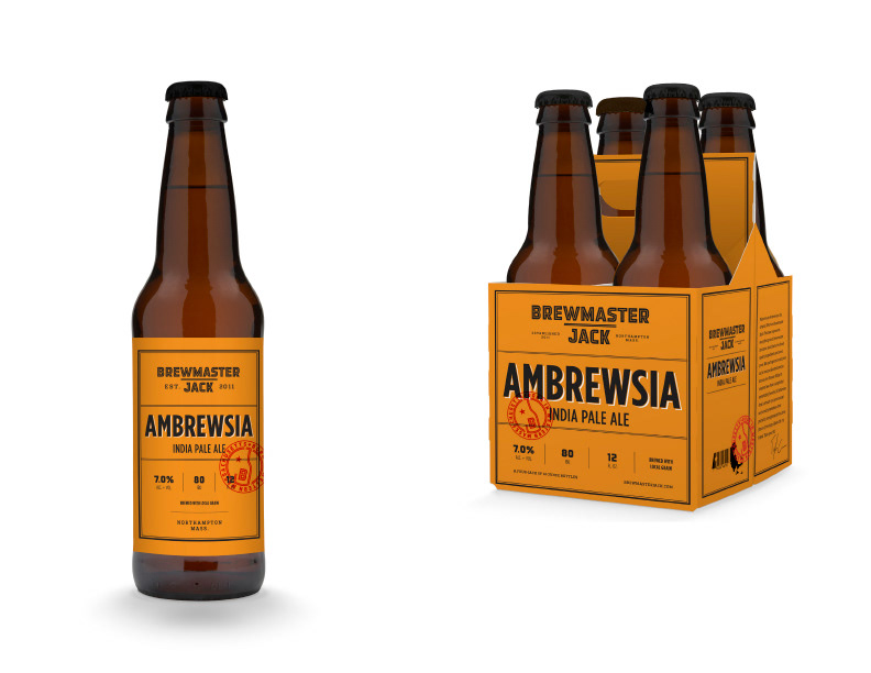
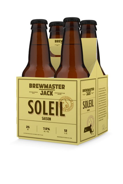
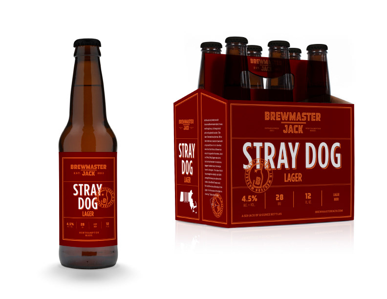
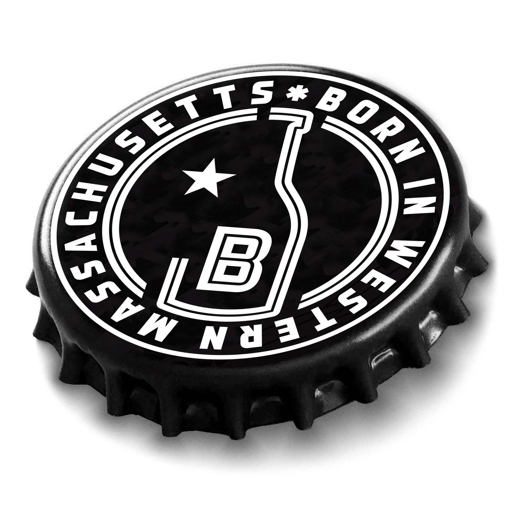
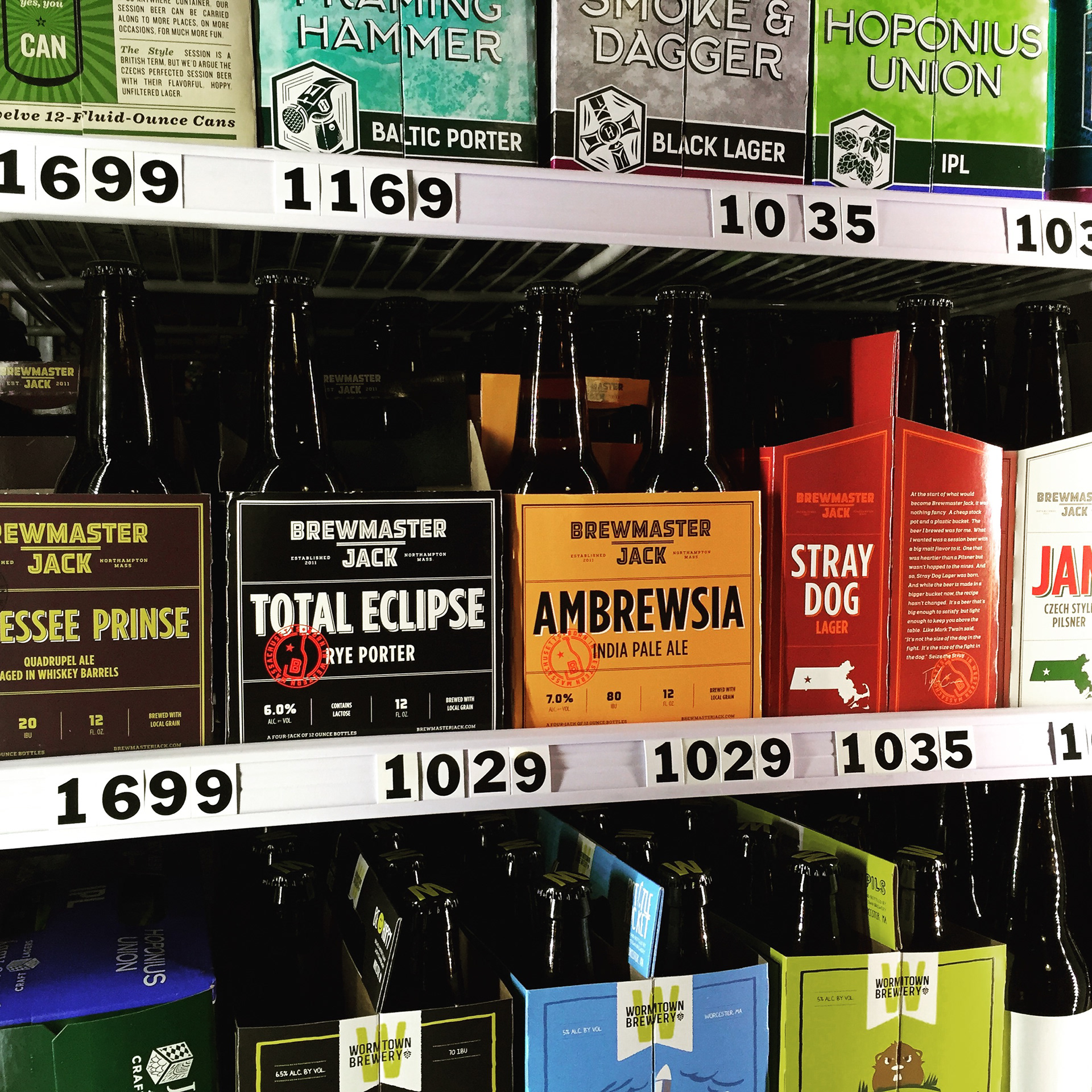
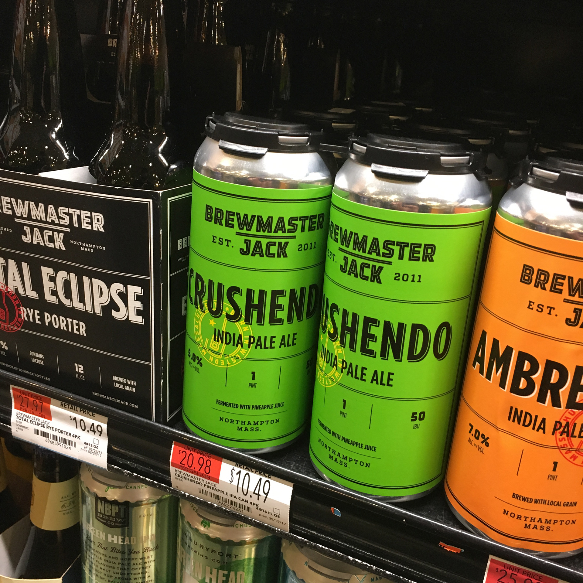
Brewmaster Jack
Identity and packaging design for a great Western Massachusetts brewery. Having a beer named after me was definitely a pinnacle of my career. I used the opportunity to teach people how to pronounce my first name :)
Brand identity and packaging.
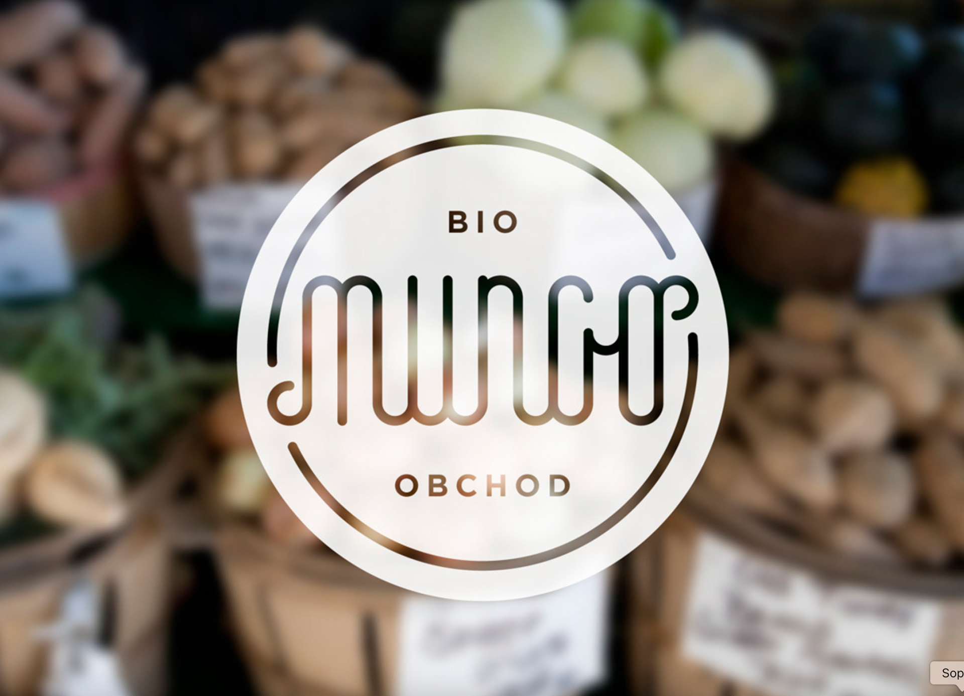
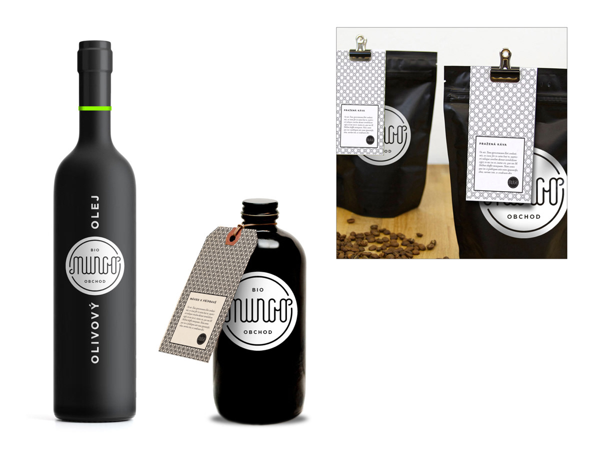
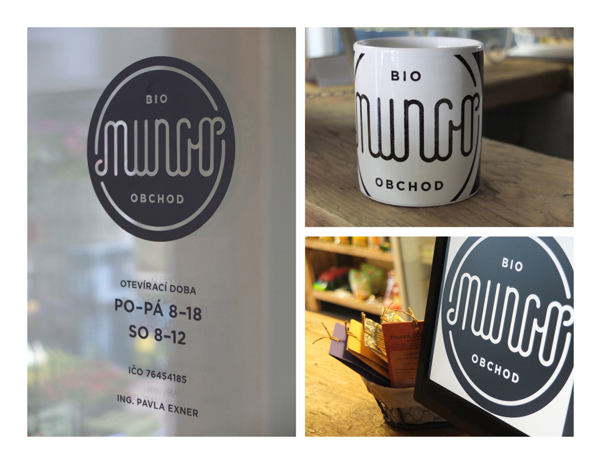
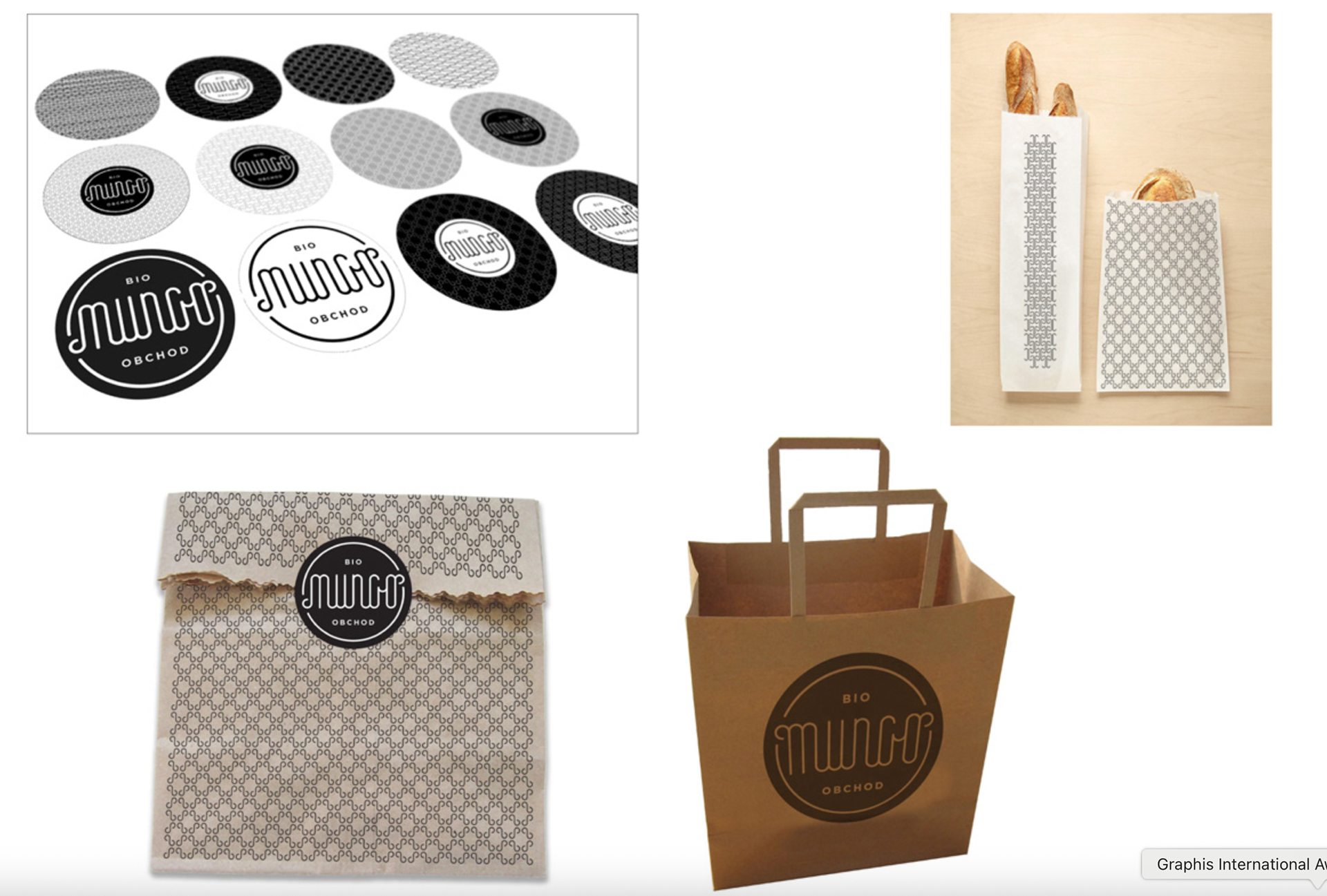
Mungo
Identity for a health food shop, Mungo in Dobřichovice, Czech Republic. Sprouting custom lettering for a name that means mung beans in Czech.
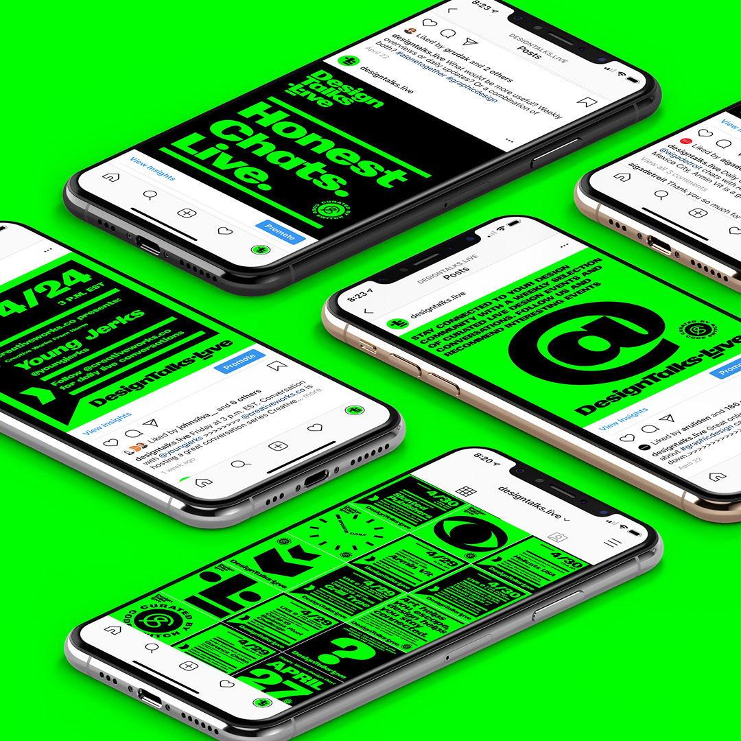
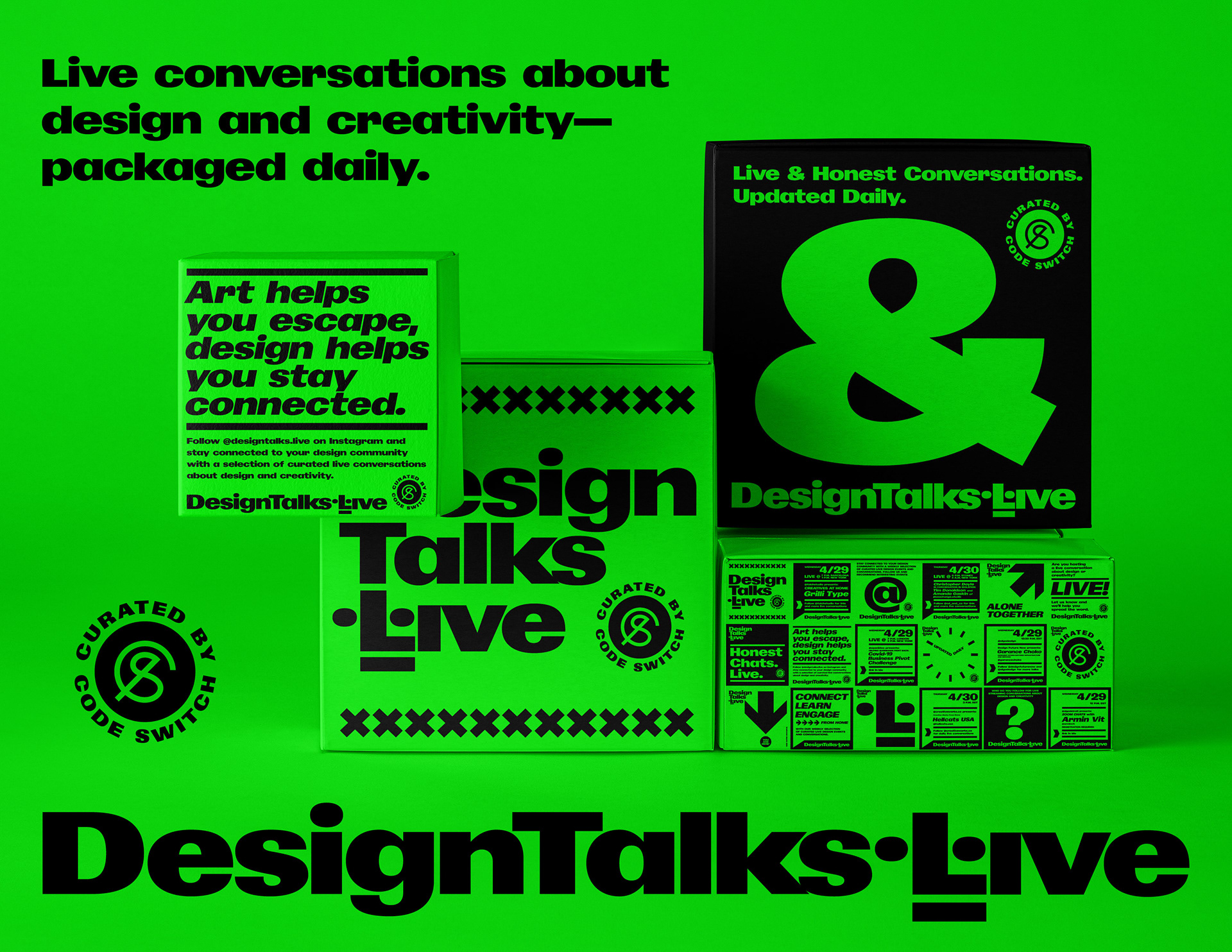
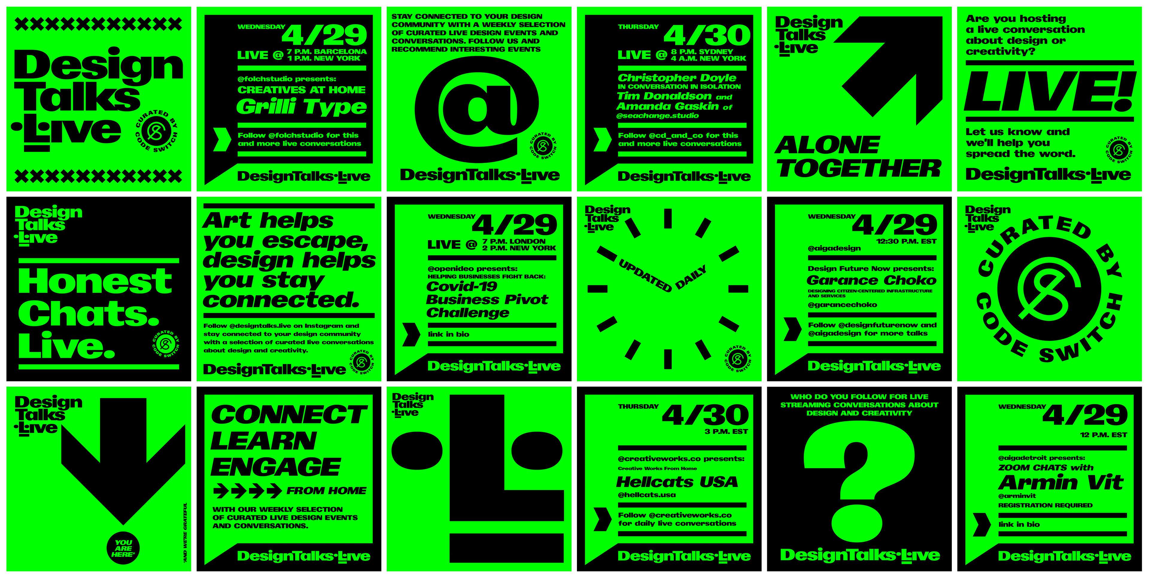
DesignTalks.Live
A platform for designers to stay connected from home during COVID-19.
After missing some interesting live streams (often the notifications just pop up in my feed when they start) I realized I might not be the only one and that other people might benefit from a platform that would let the design community know about interesting events and conversations about design and creativity happening online in advance in a more orderly and predictable fashion.
@designtalks.live was a social media-based platform to help the design community stay connected while working from home. We all listen to podcasts and watch pre-recorded webinars, but there is something about the honesty of LIVE, unedited, unpolished conversations that creates a sense of true connection in real time.
DesignTalks.Live was awarded an honorable mention in Fast Company's 2020 Innovation by Design Awards.
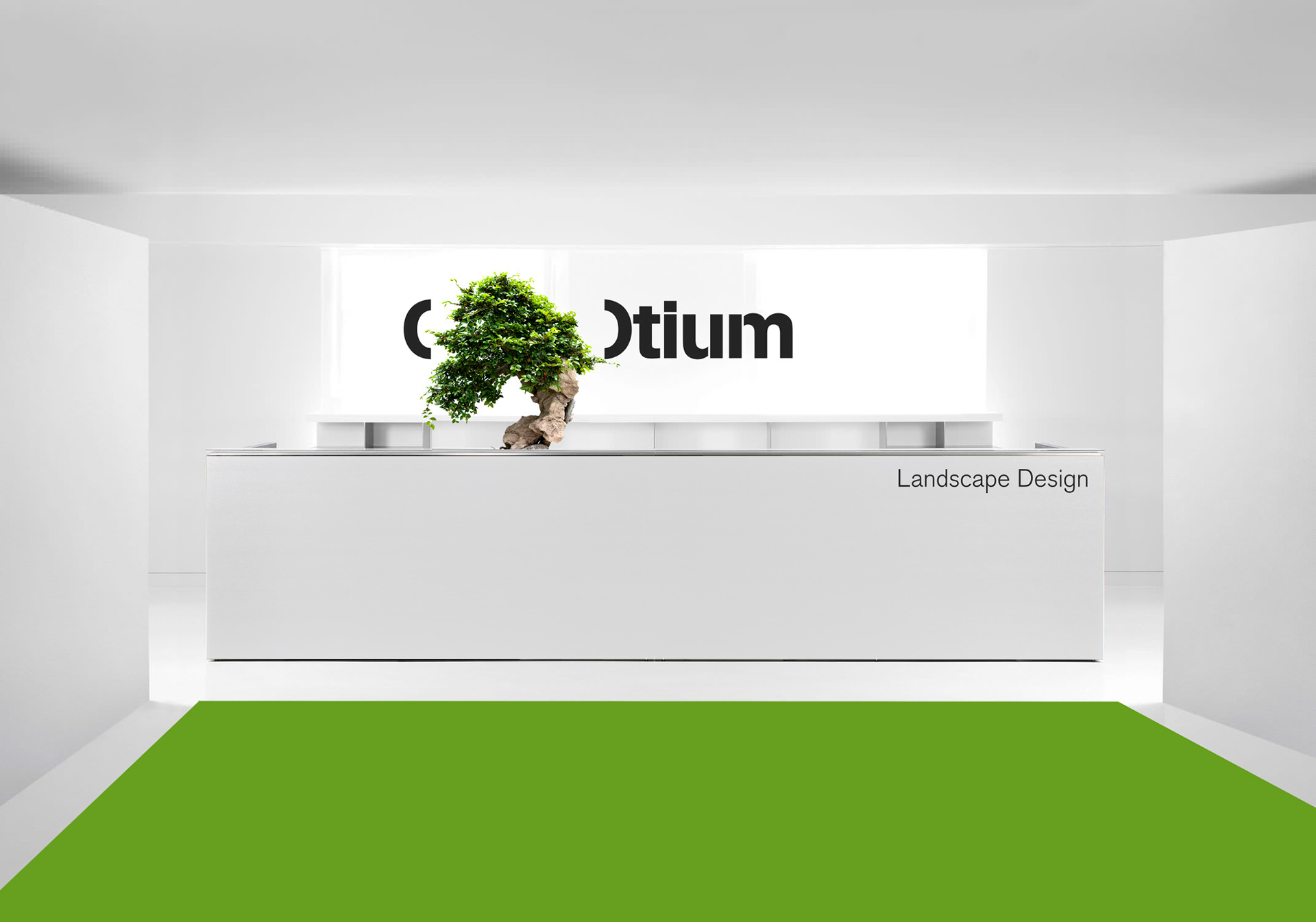
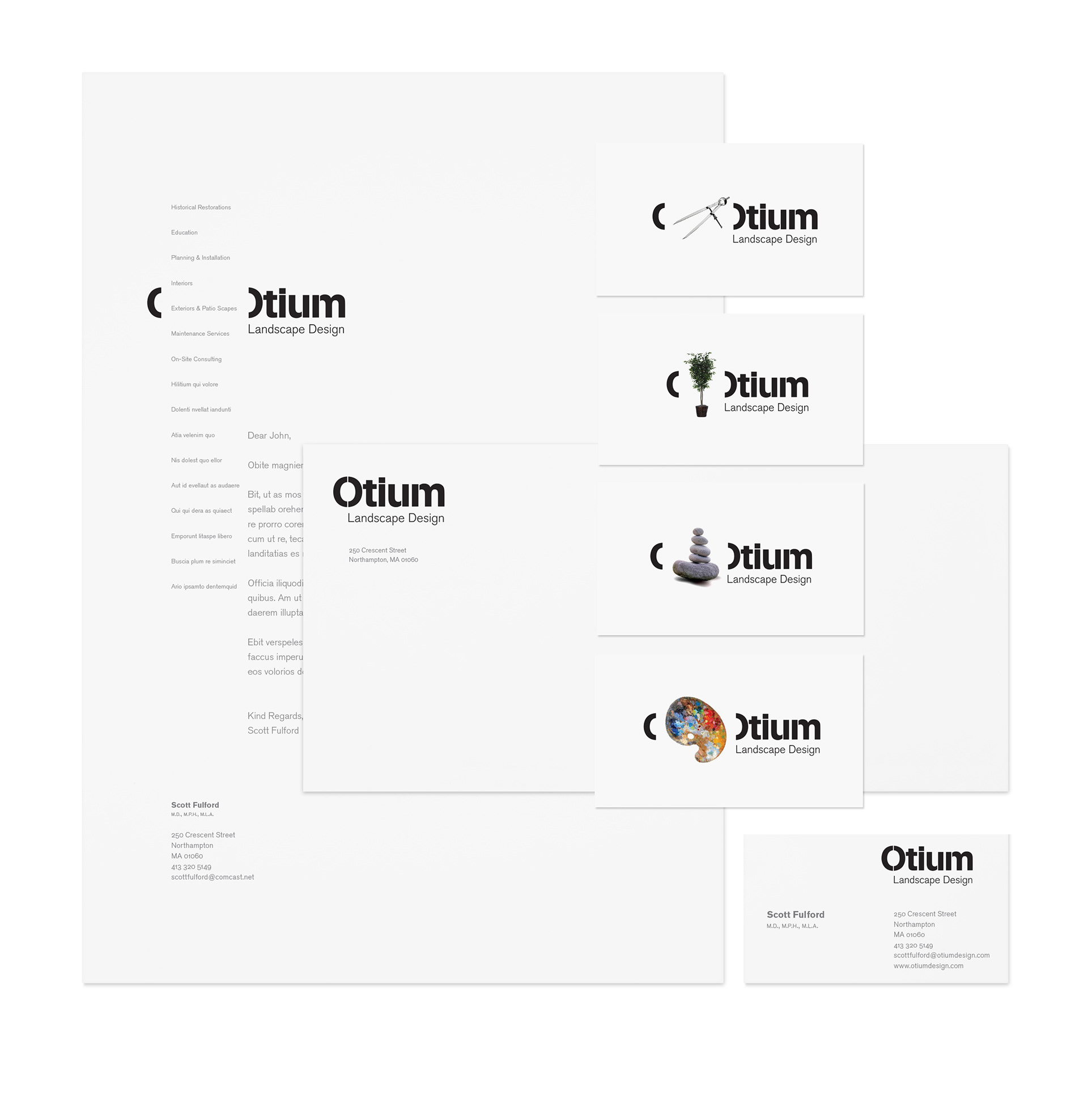
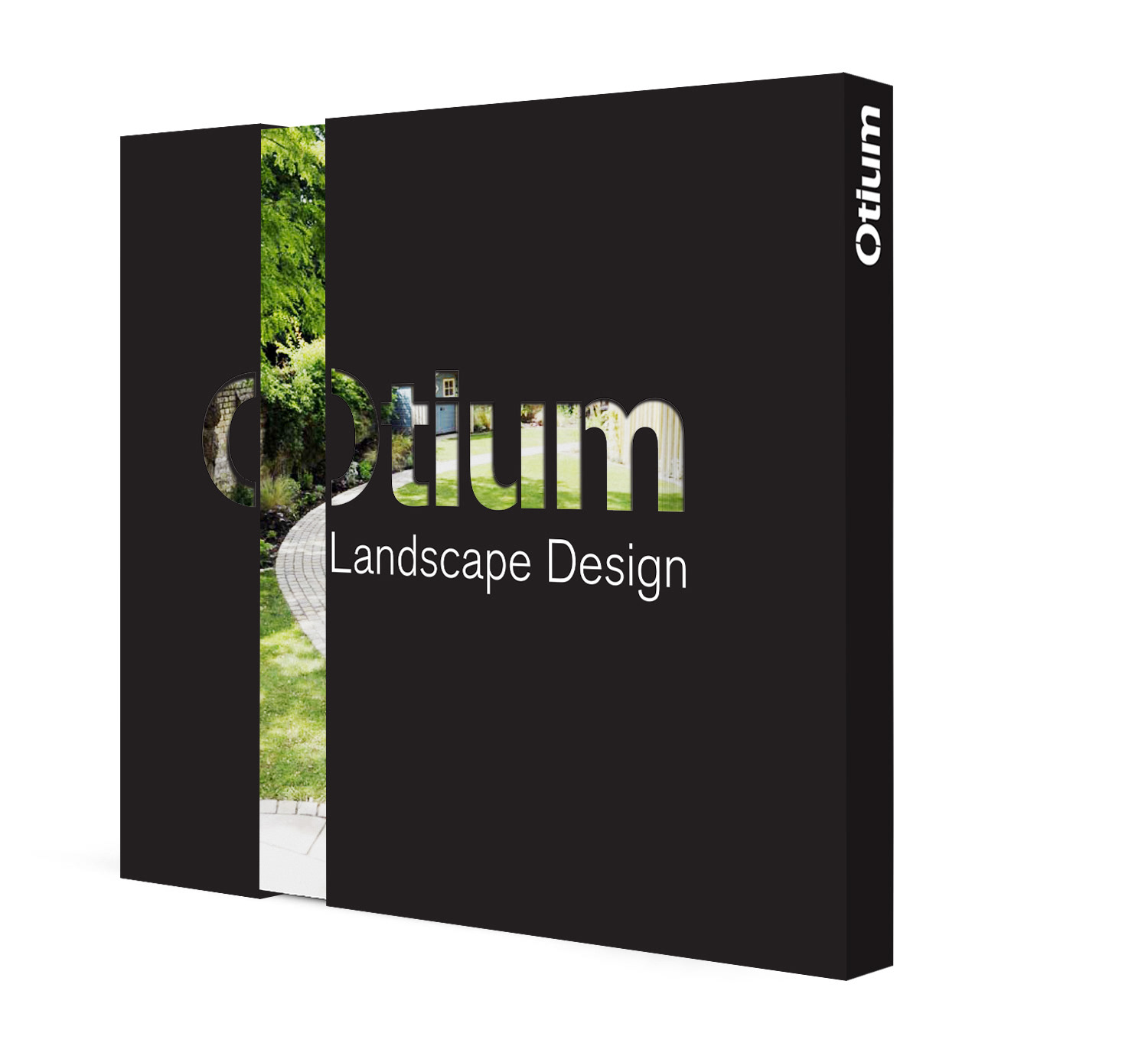
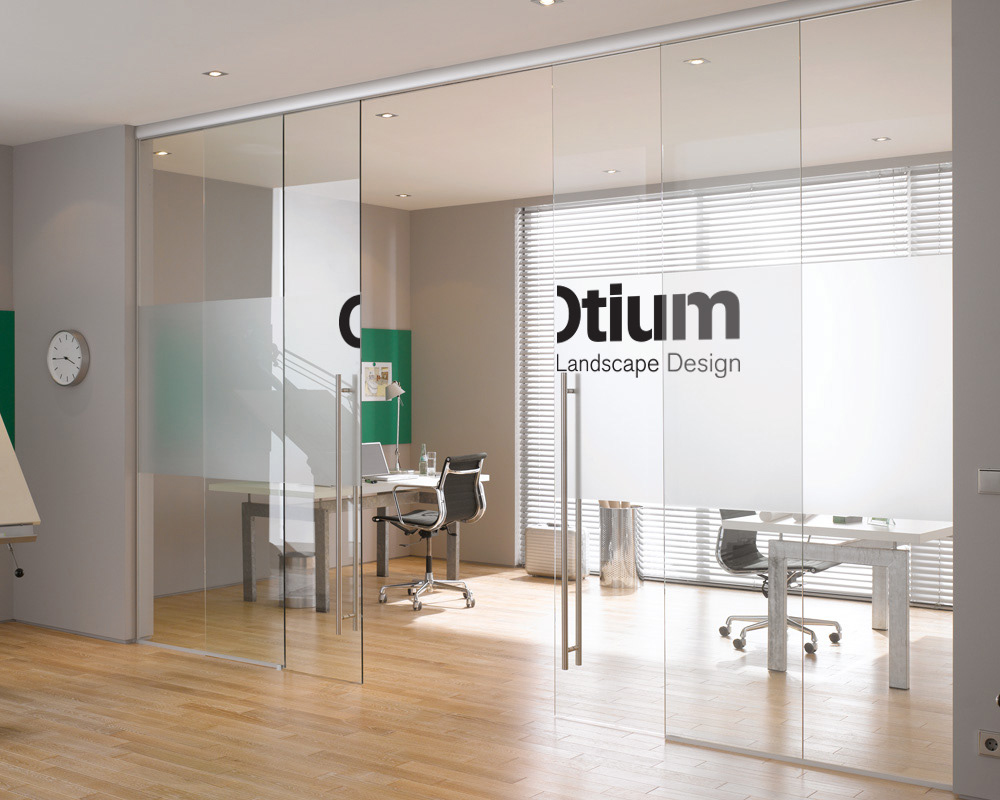
Otium
Identity for Landscape Design studio. Otium, a Latin abstract term, has a variety of meanings, including leisure time in which a person can enjoy eating, playing, resting, contemplation, and academic endeavors. In a similar sense, the "O" becomes a vessel for any activity one might enjoy in their spare time.
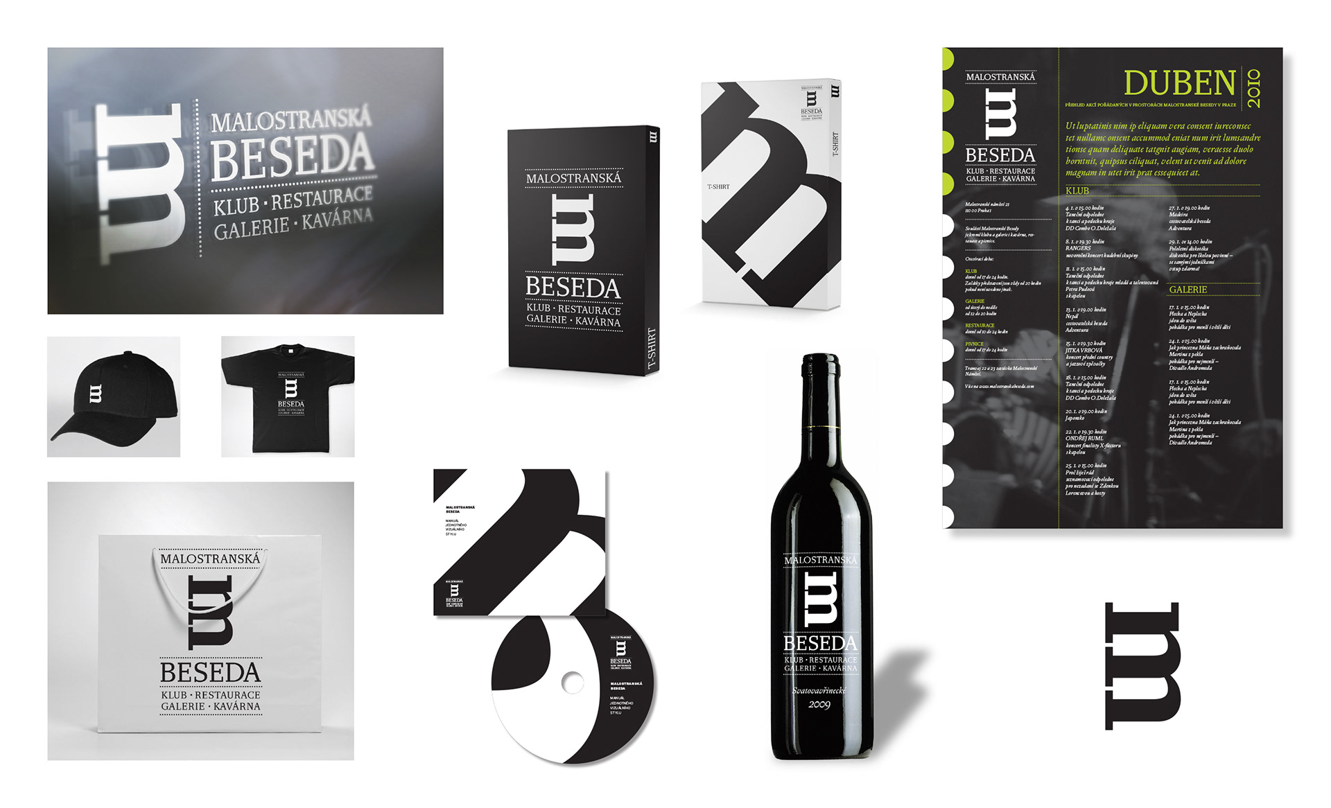
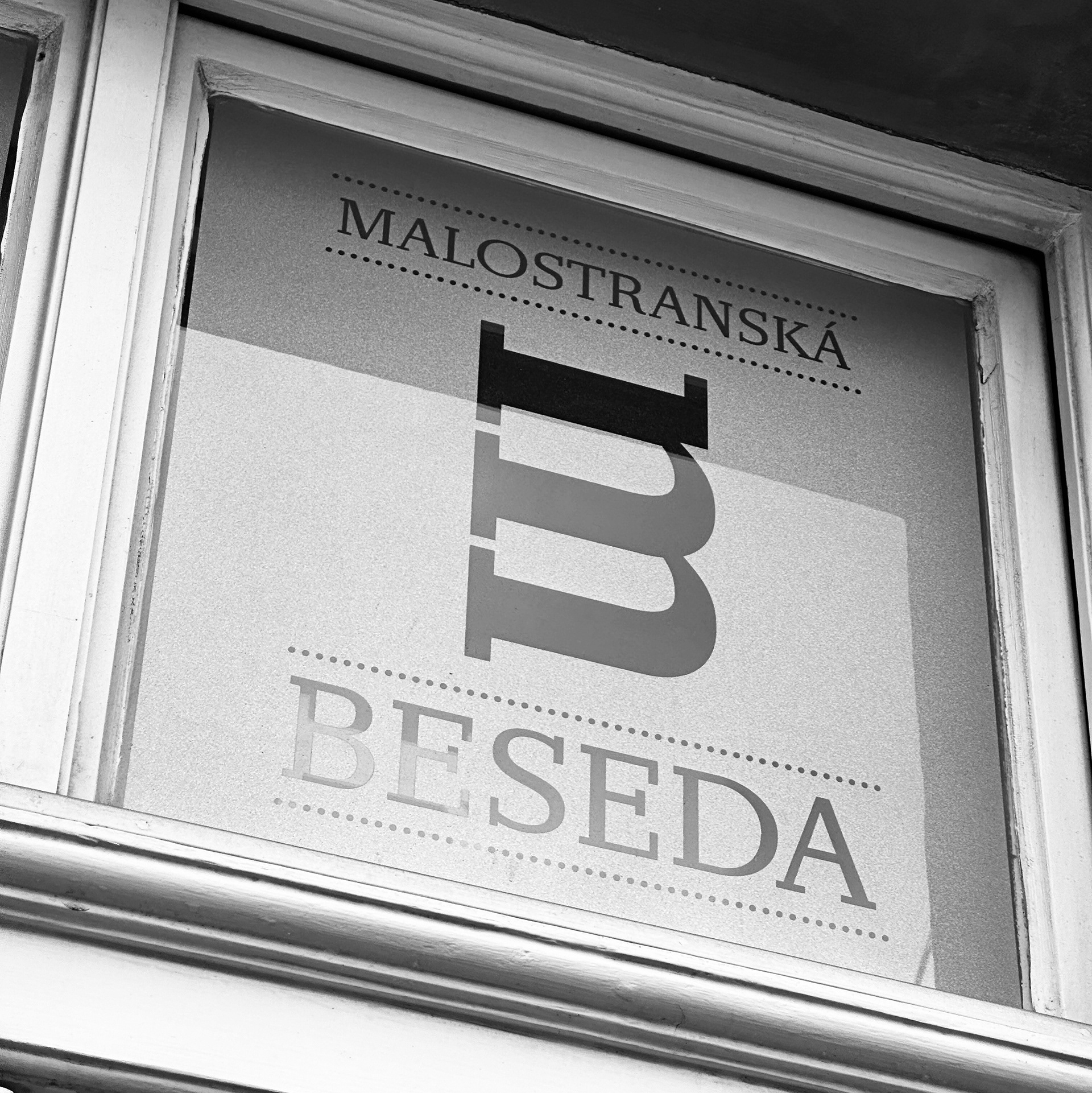
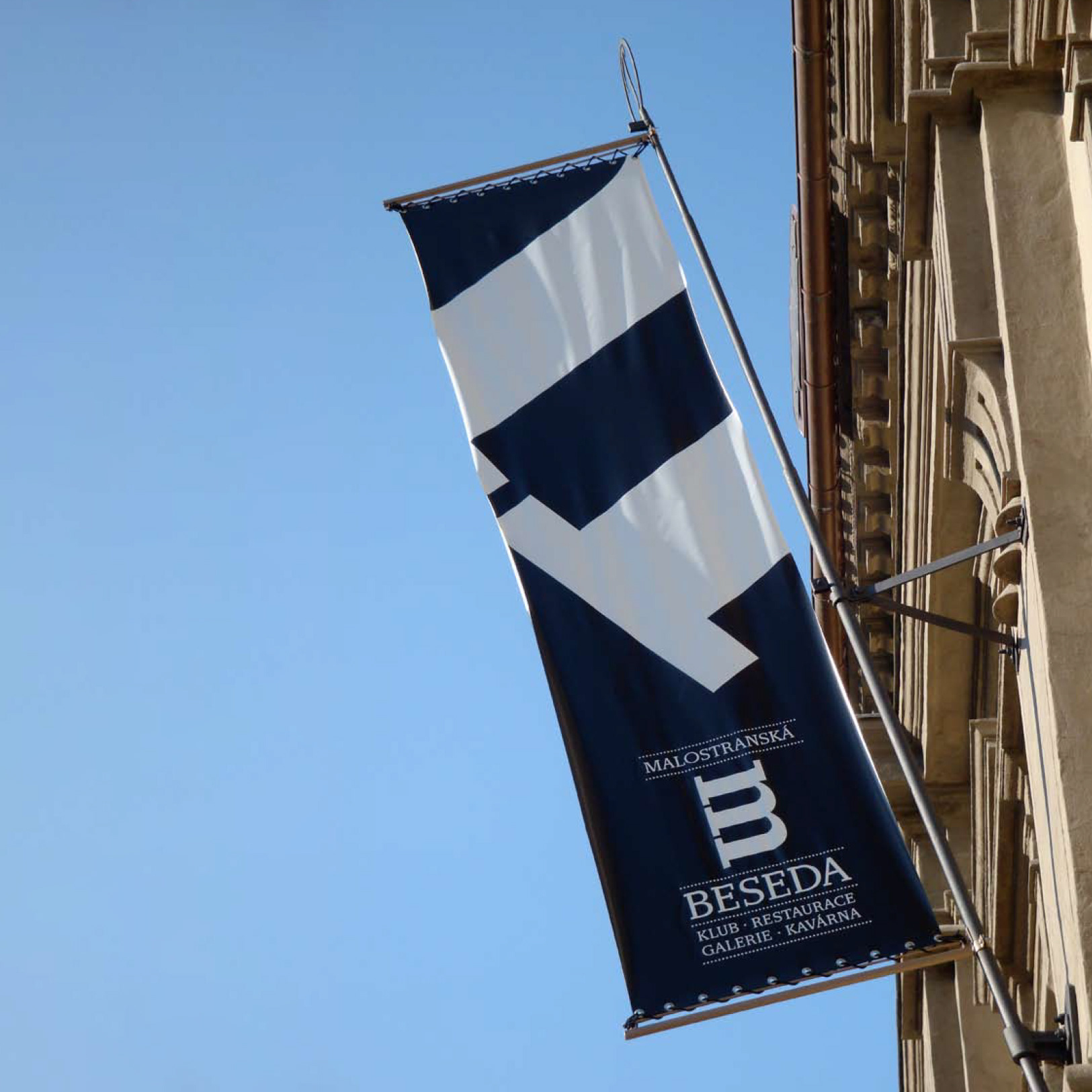
Malostranská Beseda
Identity for an iconic cultural institution in Prague.